A new audience
League owners, media teams and sponsors, not wedding studios.
Case study · Sports media · Sub-brand of FotoOwl · 2026
Designing where human insight meets machine imagination, from Mumbai.
Dugout is FotoOwl’s platform for sports media. I designed its identity from the first sketch to the Play Store, the web app, the launch and the expo stand.
All projects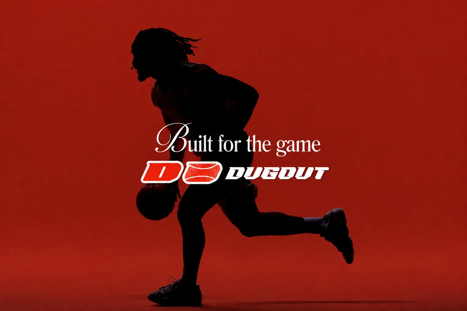
01 · Overview
Dugout is the operating system for modern sports leagues. Photographers shoot, every photo beams to the cloud, and AI tags the players and sponsors in it, so teams and fans get their moment in under 30 seconds.
Dugout runs on FotoOwl’s face-recognition AI, made for sport: leagues, matches, teams, players and sponsors in one media library. Leagues like IGPL, T20 Mumbai and the World Padel League already use it.
I joined as the Graphic and UI/UX Designer to give this new sub-brand its own look, voice and launch.
What I did
02 · The challenge
FotoOwl speaks warm yellow to wedding photographers. Sports leagues are a different crowd: loud, fast, built for stadiums.
My goal: a brand that stands on its own on match day, still carries FotoOwl’s trust, and explains a whole platform in one glance.
League owners, media teams and sponsors, not wedding studios.
Beam, face scan, sponsor tagging, FanCam, secure sharing, player galleries: all to be understood in passing.
Cricket, football, padel, basketball. The brand couldn’t belong to just one.
03 · Research
With the FotoOwl team, I mapped everyone who touches a photo between the shot and the share, and studied how leagues post on match day.
Who I designed for
Thousands of photos a match. Needs them sorted, branded and out fast.
Wants every photo they’re in, without asking anyone.
Sponsors want to be seen. Fans want proof they were there.
What I learned
A goal photo is old news in an hour, so speed had to be in the design itself: italics, forward lean, motion.
Sponsor visibility became a feature to show off, not hide.
Personal galleries turn every player into a channel for the league.
04 · Inspiration
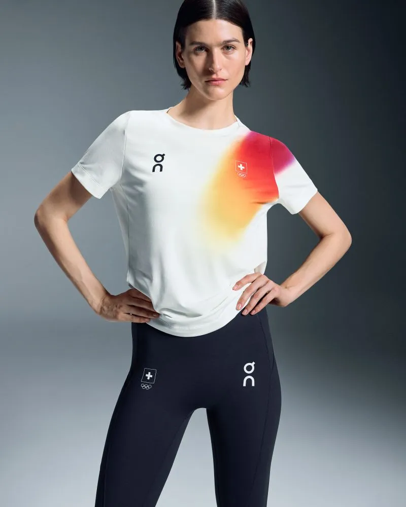
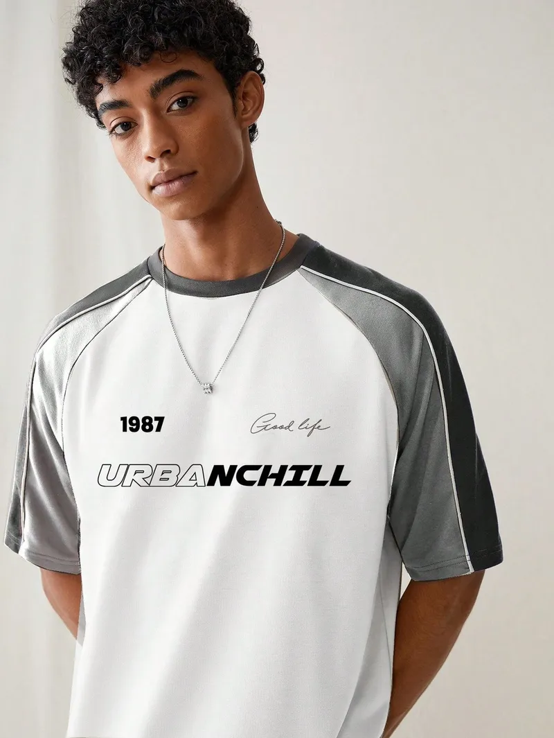
I looked at performance sportswear and streetwear drops: clean fabric, one loud colour, type that leans forward. And at stadium scoreboards, where everything reads from the last row.
The idea: the curved seam that every ball shares. Cricket, tennis, football, basketball. One line, every sport.
05 · Logo
Round 1 · Badges

Navy crests, one per ball. Friendly, but it looked like a kids’ club.
Round 2 · Symbols
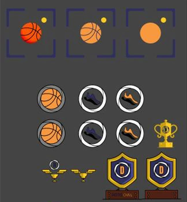
Each told part of the story. None told all of it.
Round 3 · Wordmark
Closer. But still tied to one sport, and too soft.
Final · The mark
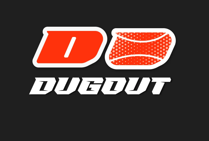
A forward-leaning D next to a ball with one seam. Every sport, one shape.
Rounds 1–3 from my Figma logo board, in the first FotoOwl-style palette.
06 · Identity
FotoOwl owns yellow, so Dugout took red: the colour of a whistle, a card, a scoreboard. Black lets match photos glow.
Colour
Typography

Reads like a scoreboard. Two or three words fill a phone screen.
Uppercase only · store screens, rollupsCreate secure galleries and control who can see them.
Light 300 · ExtraBold 800 in red for the words that matterA soft red grid behind every store screen, like field markings.
Light backgrounds · store, flyers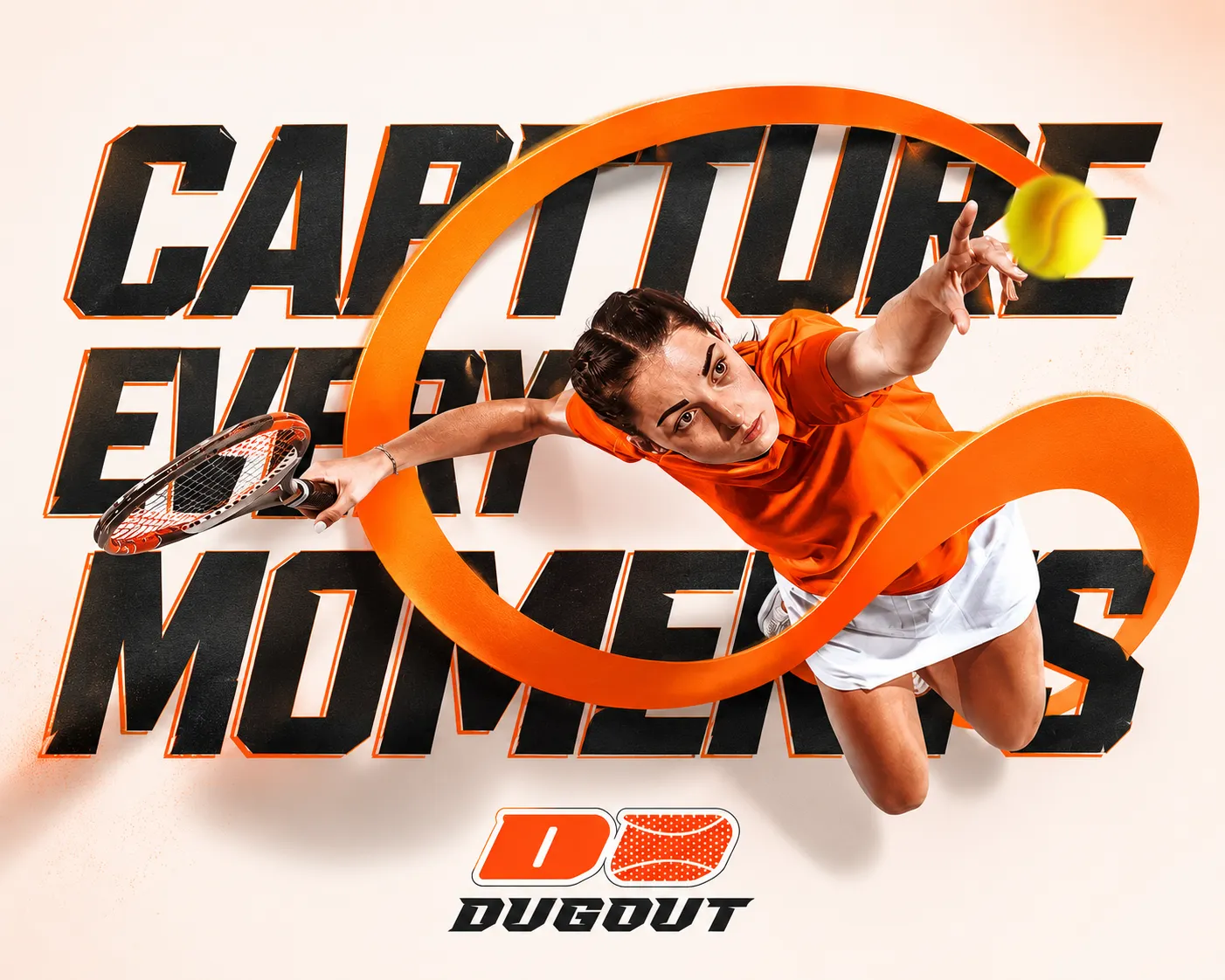
07 · Brand in use
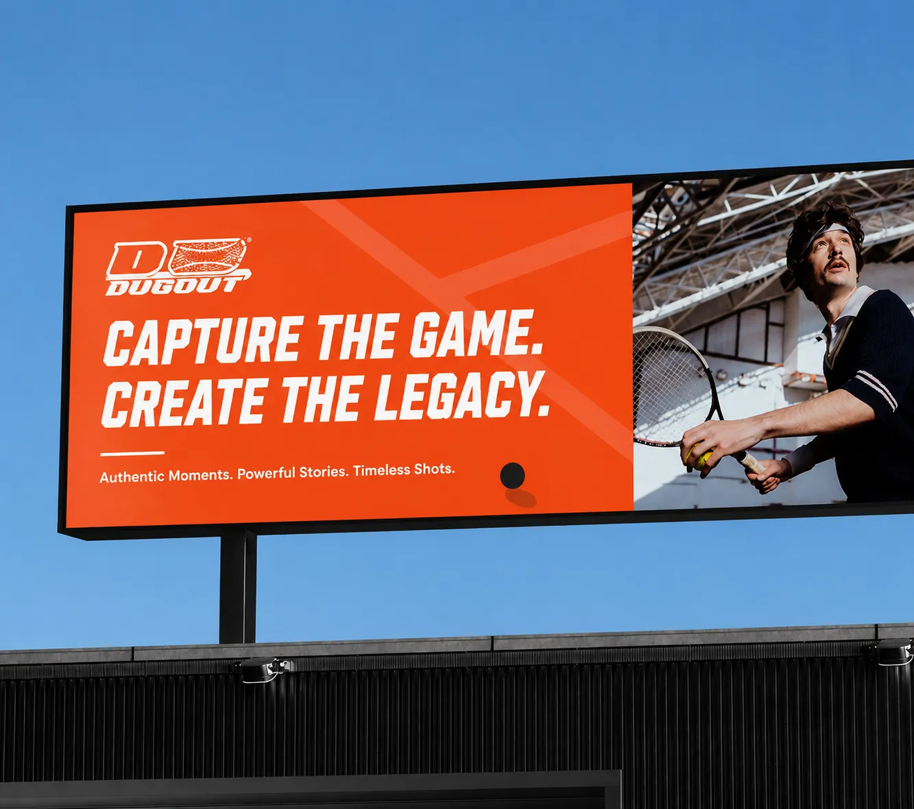
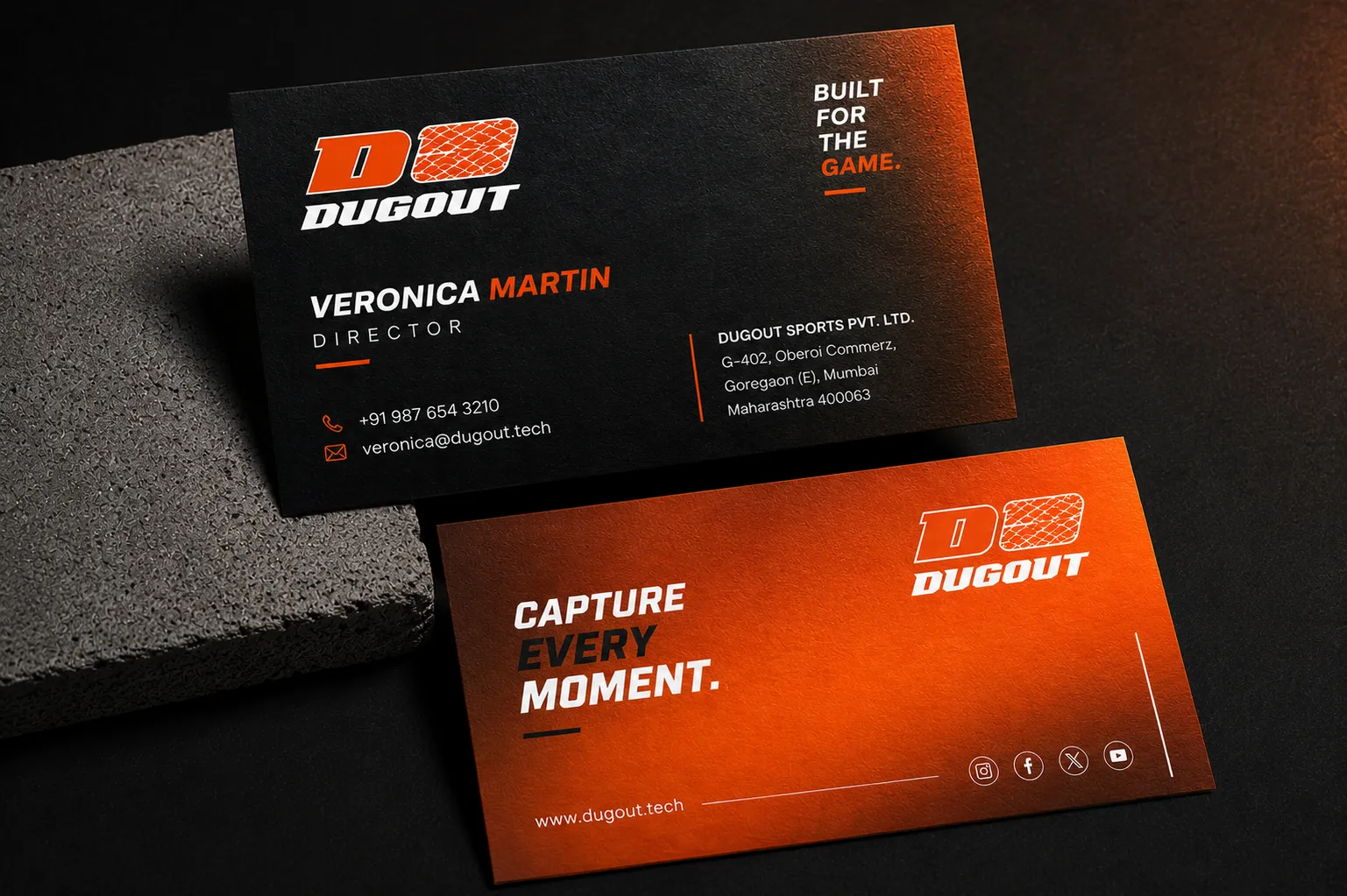
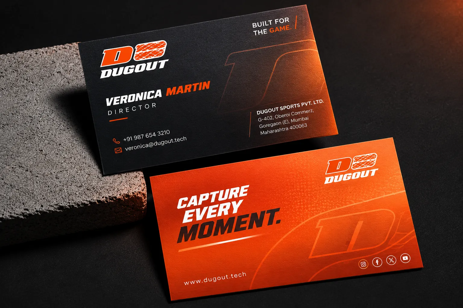
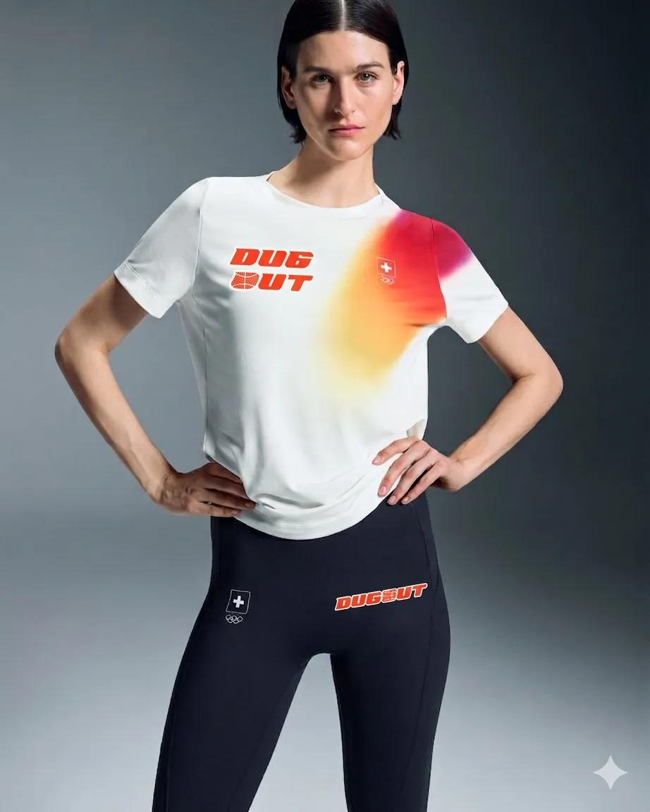
A brand for leagues has to work where leagues are: at the gate, in the stands, on the staff. So the identity went onto cards, passes and wristbands.
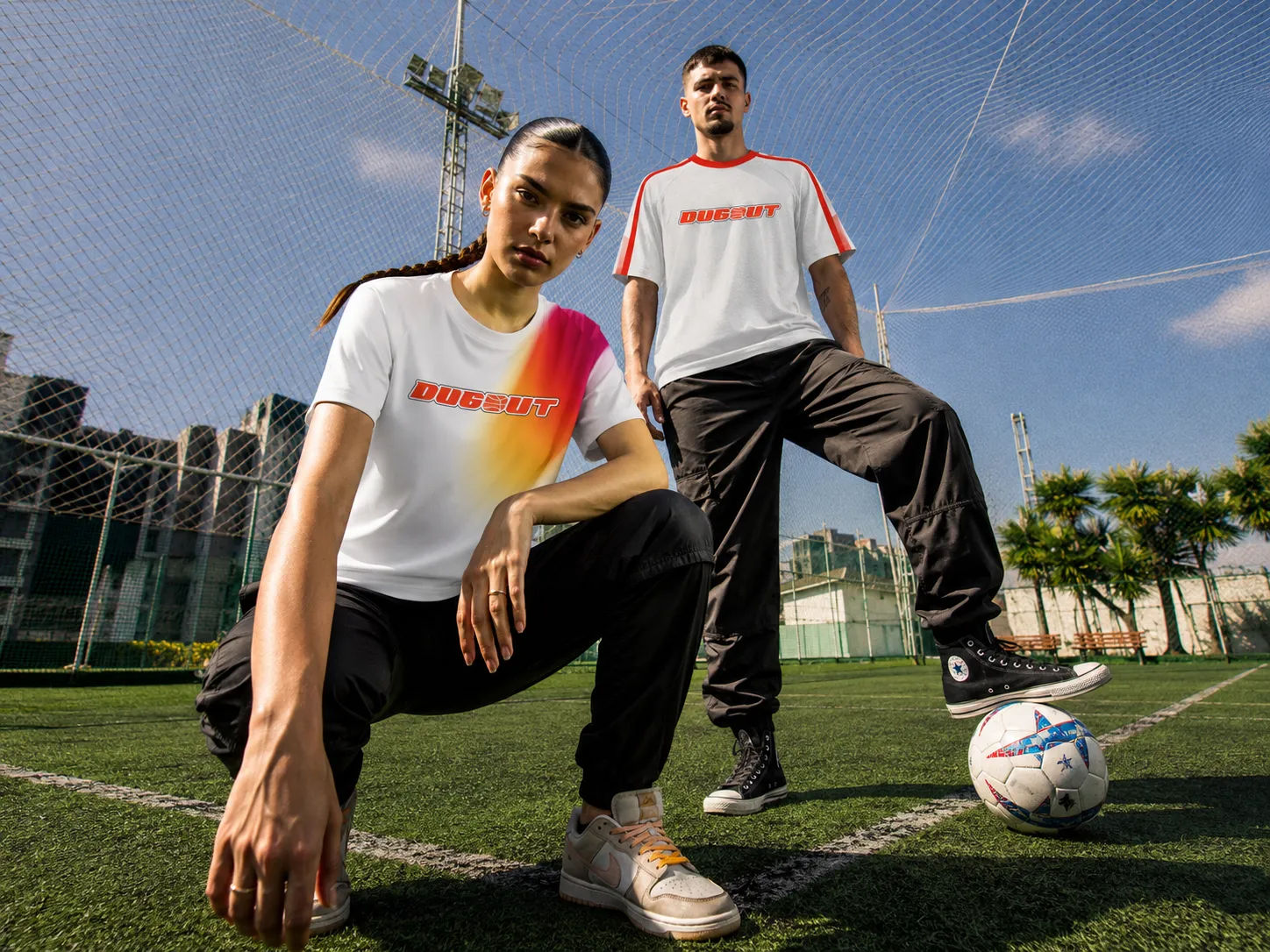
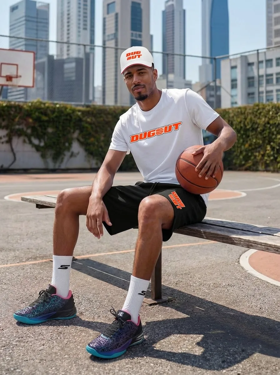
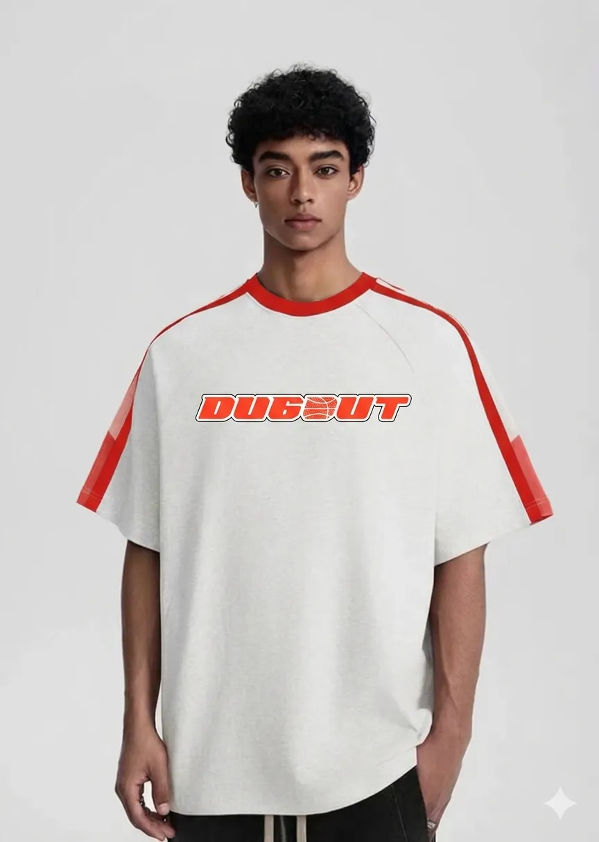
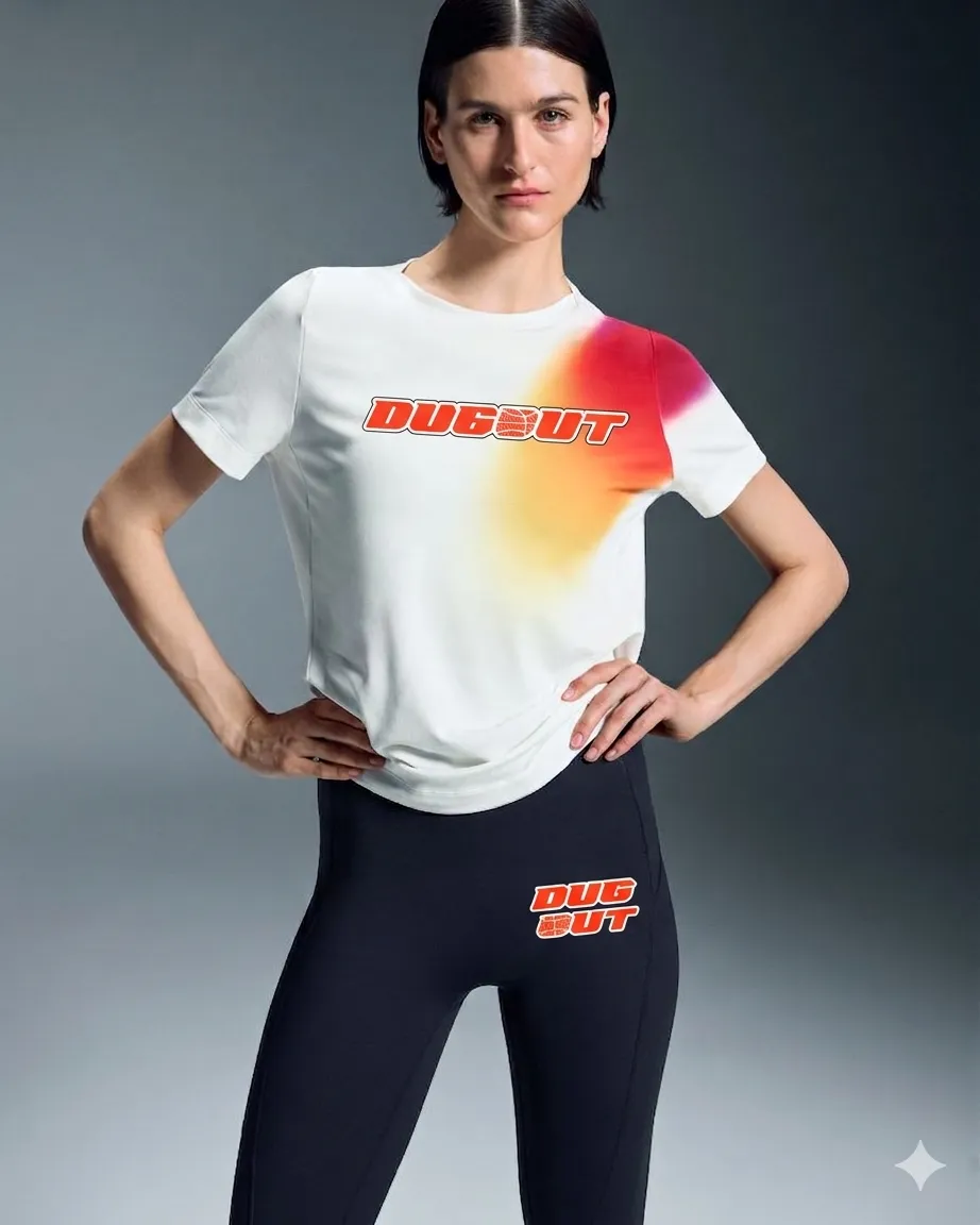
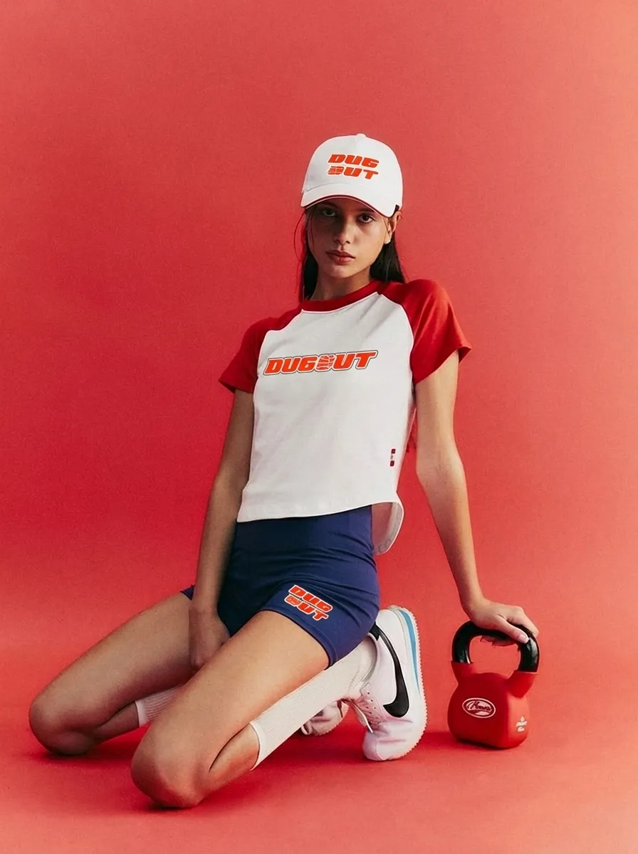
Then onto clothes people would actually wear off the pitch: raglan tees, caps and training wear in red, black and white.
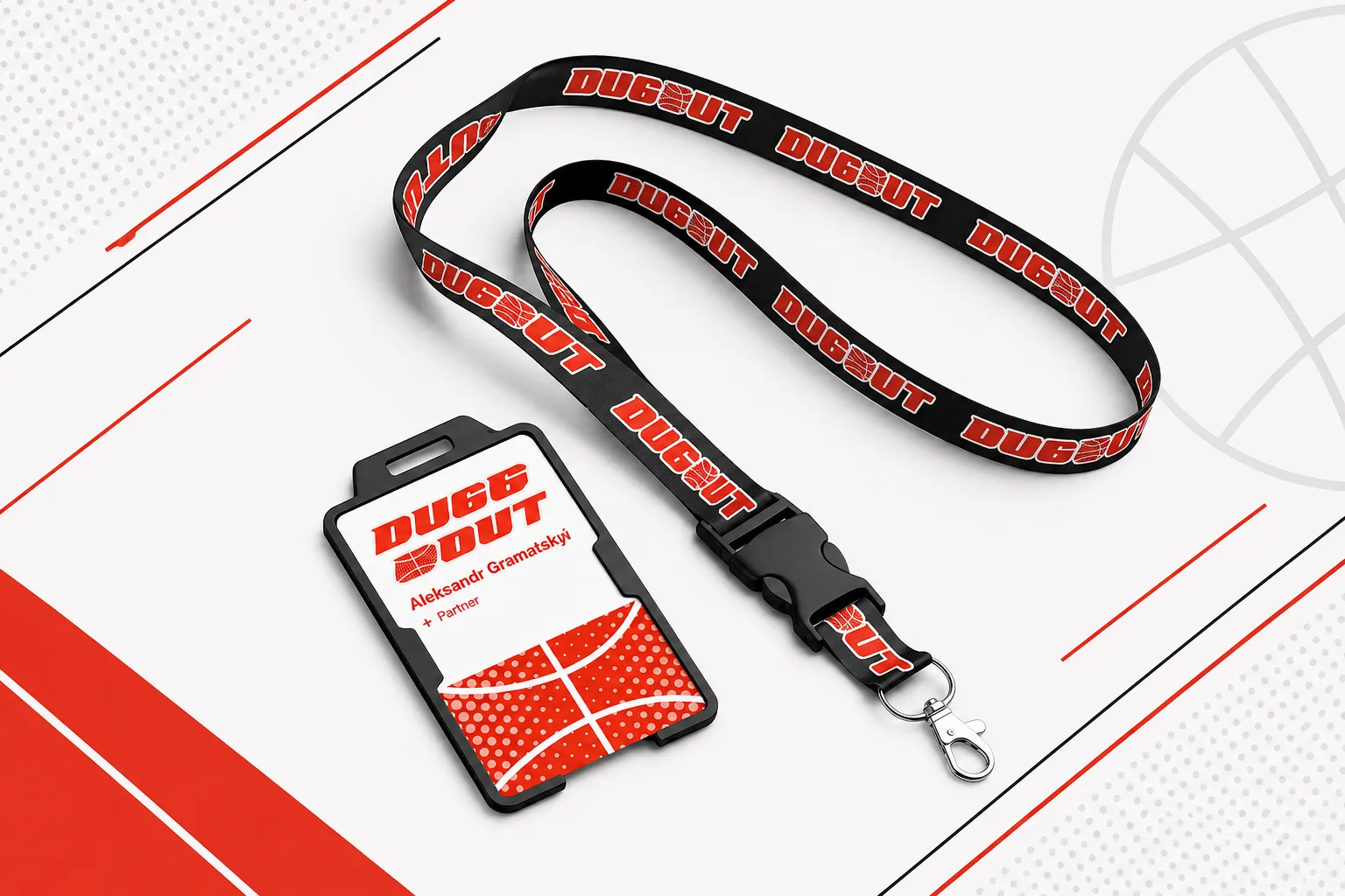
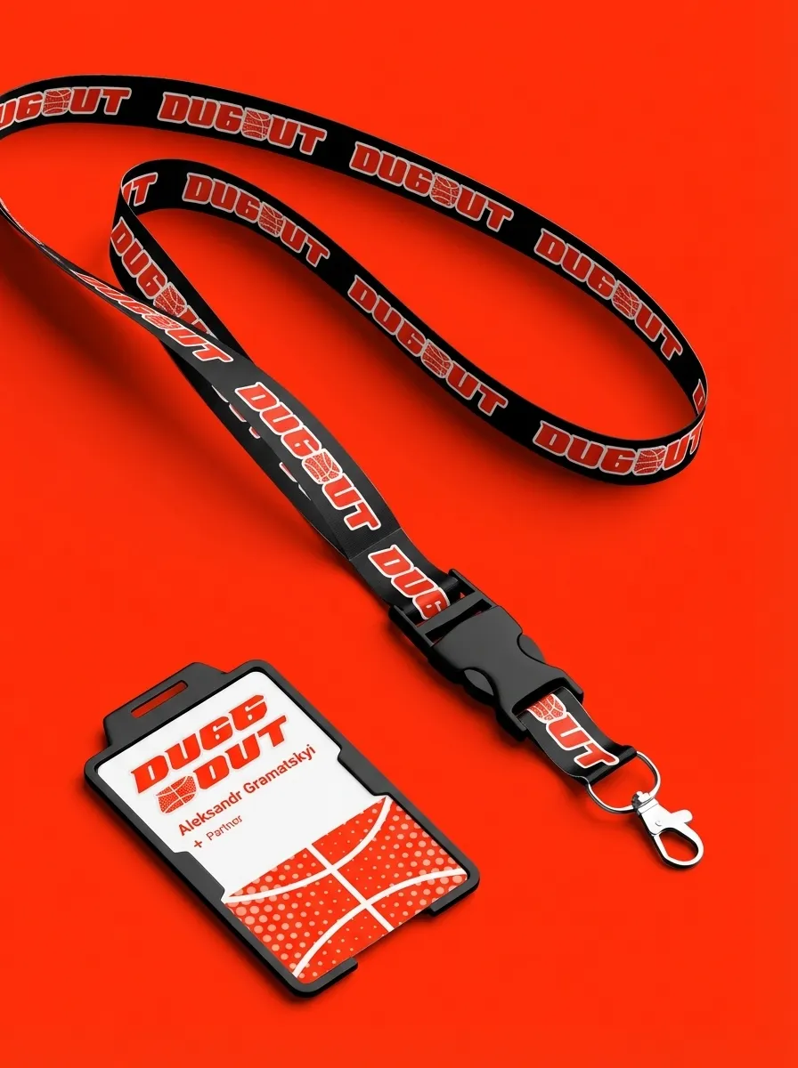
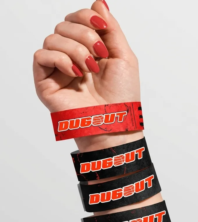
Scroll · the merch drop
01 / 07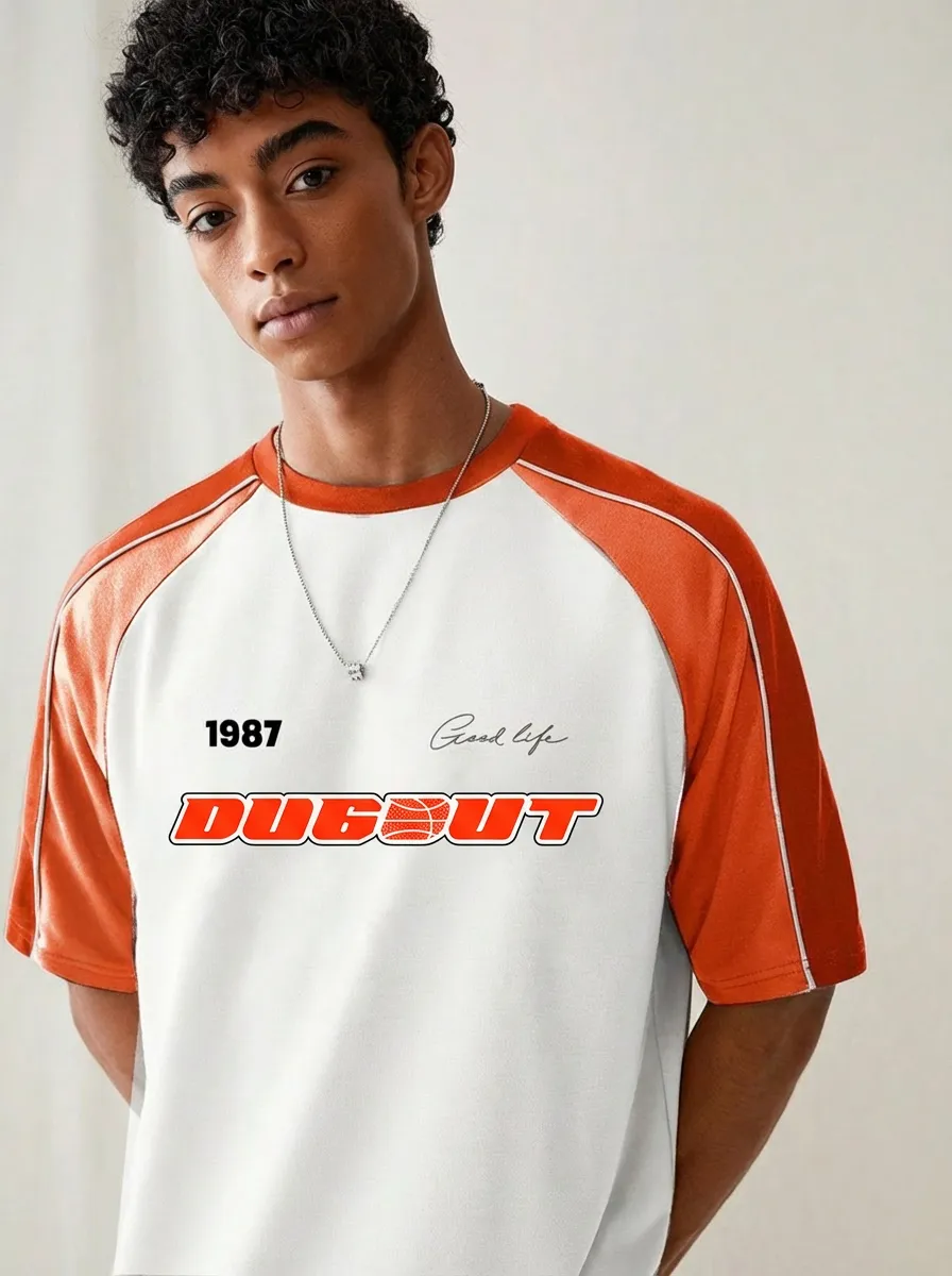
08 · Play Store
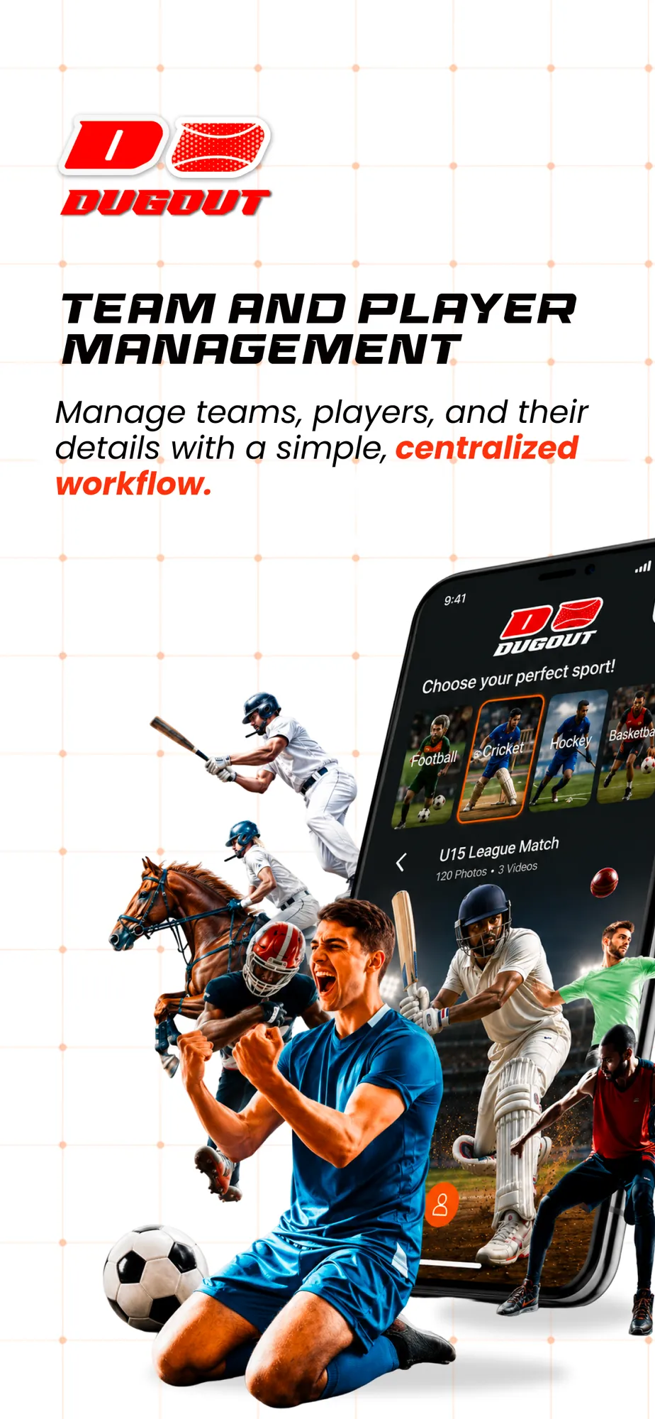
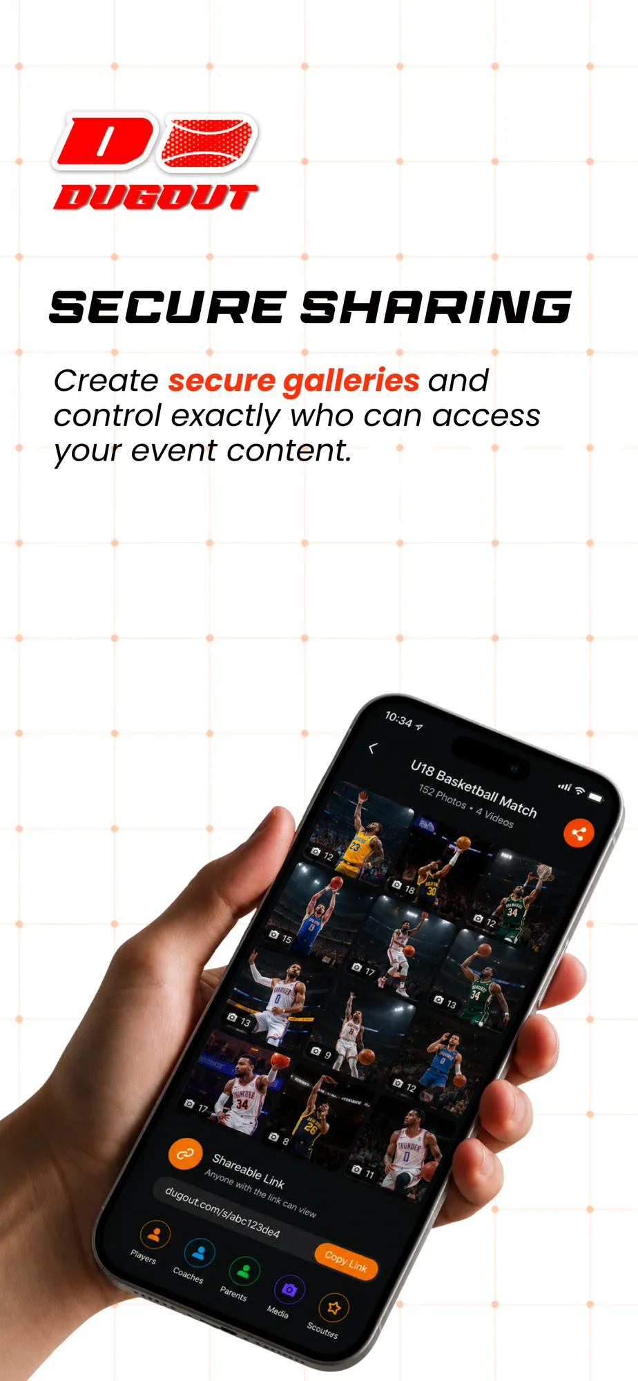
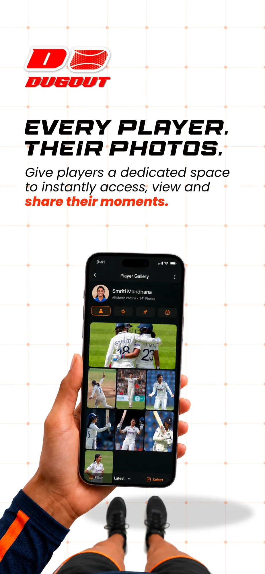
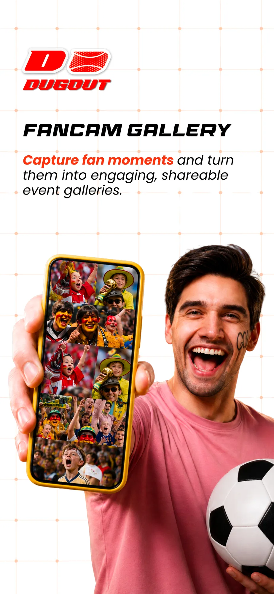
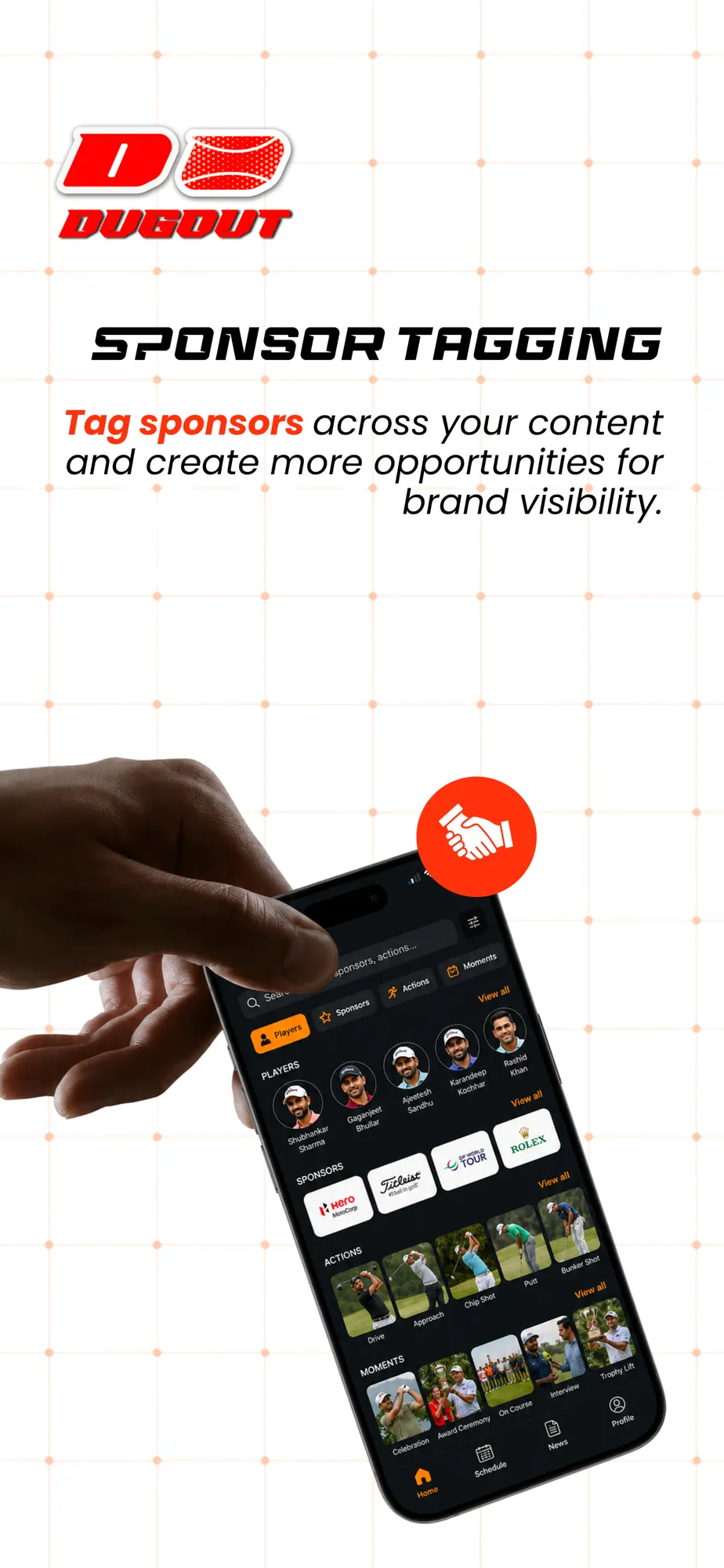
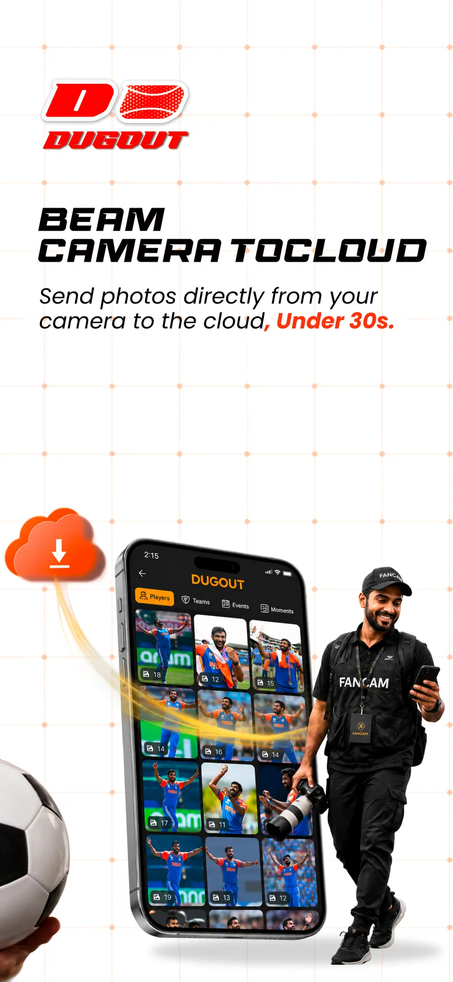
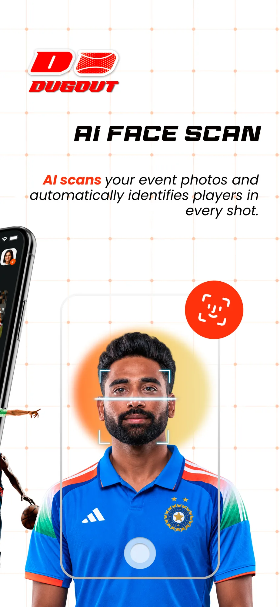
An app is judged on its store page in a few swipes. So each screen sells one feature in two or three words.
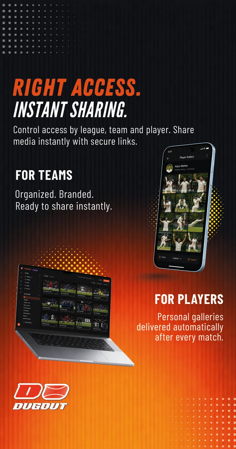
The system: the logo top left, a wide headline, one Poppins line with the key words in red, the real app on a real phone, and an athlete breaking out of the frame.
Scroll · the store listing
01 / 08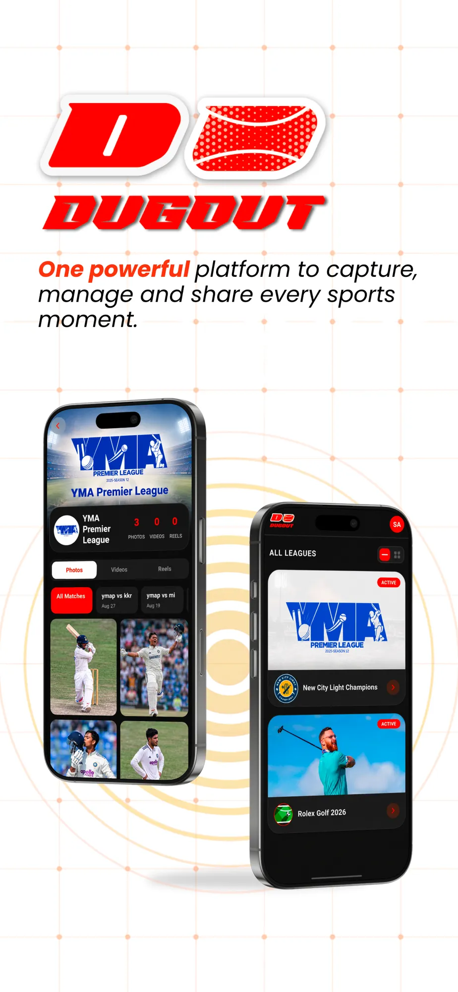
09 · Web app
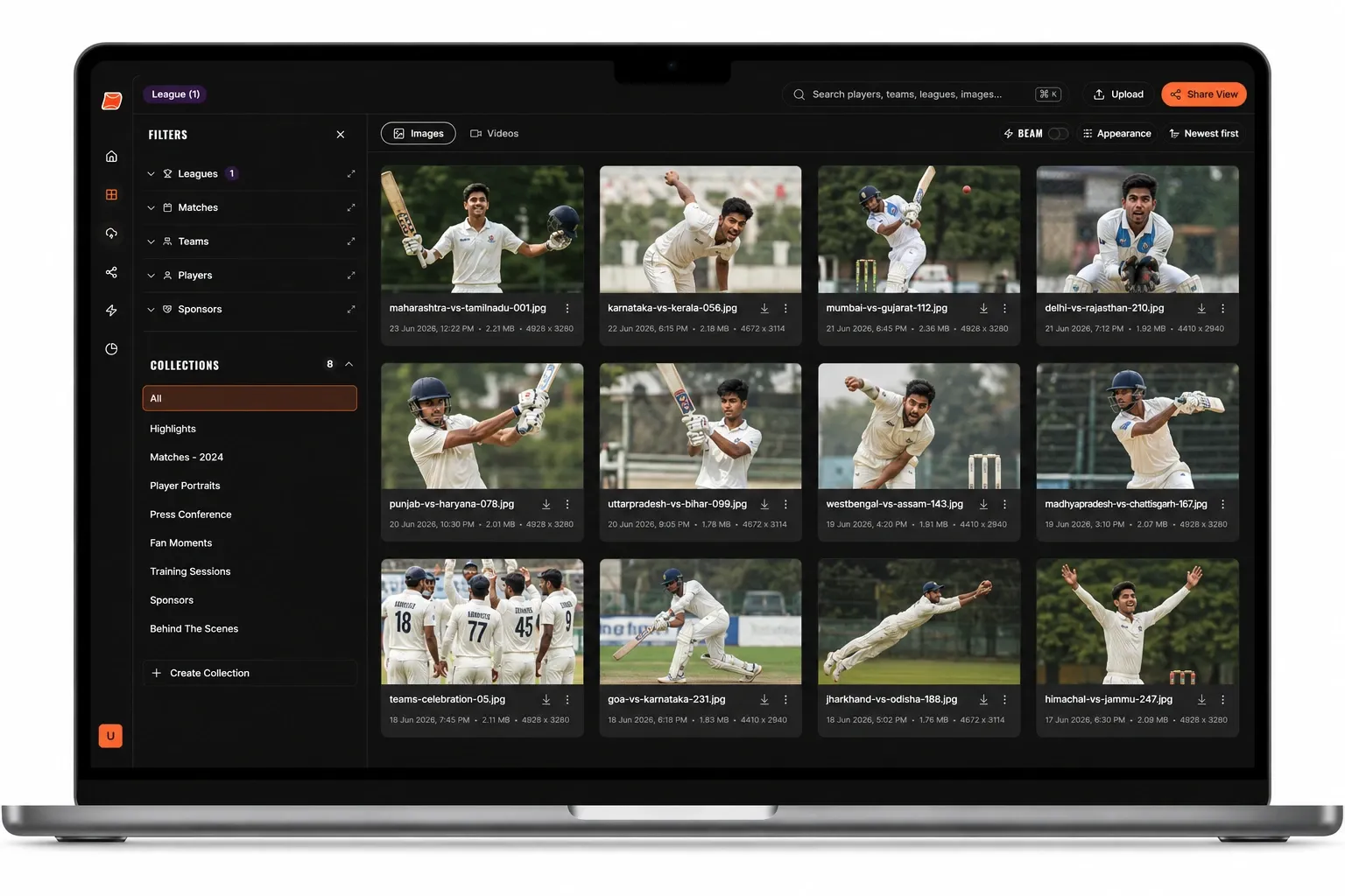
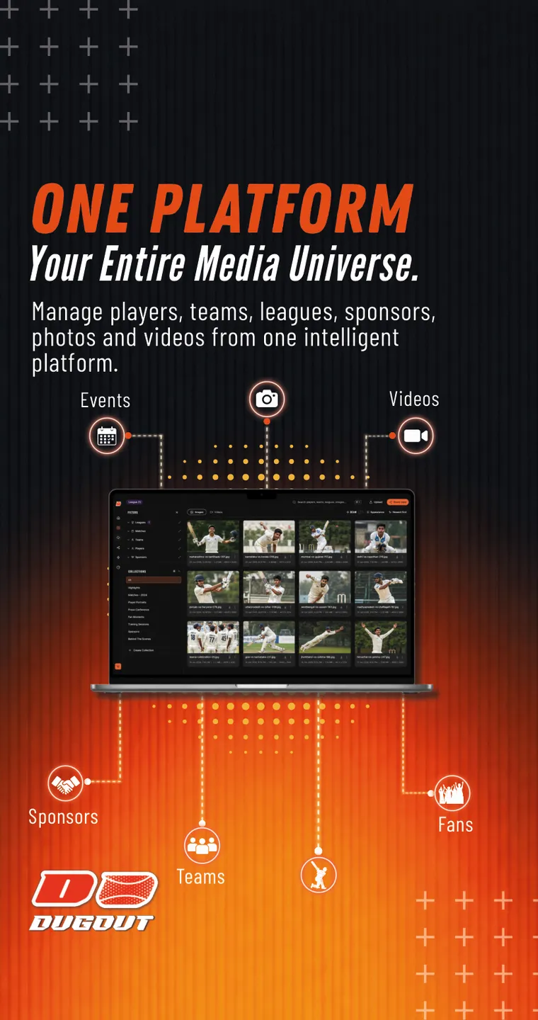
For media teams I designed the desktop library: every photo and video of a season, filtered in a click and shared in two.
10 · Launch & expo
The teaser
“This is not just sports.” A 15-second vertical film for launch week: real match energy, the features in quick beats, and the logo lighting up like floodlights. Made with Higgsfield.
Flyers
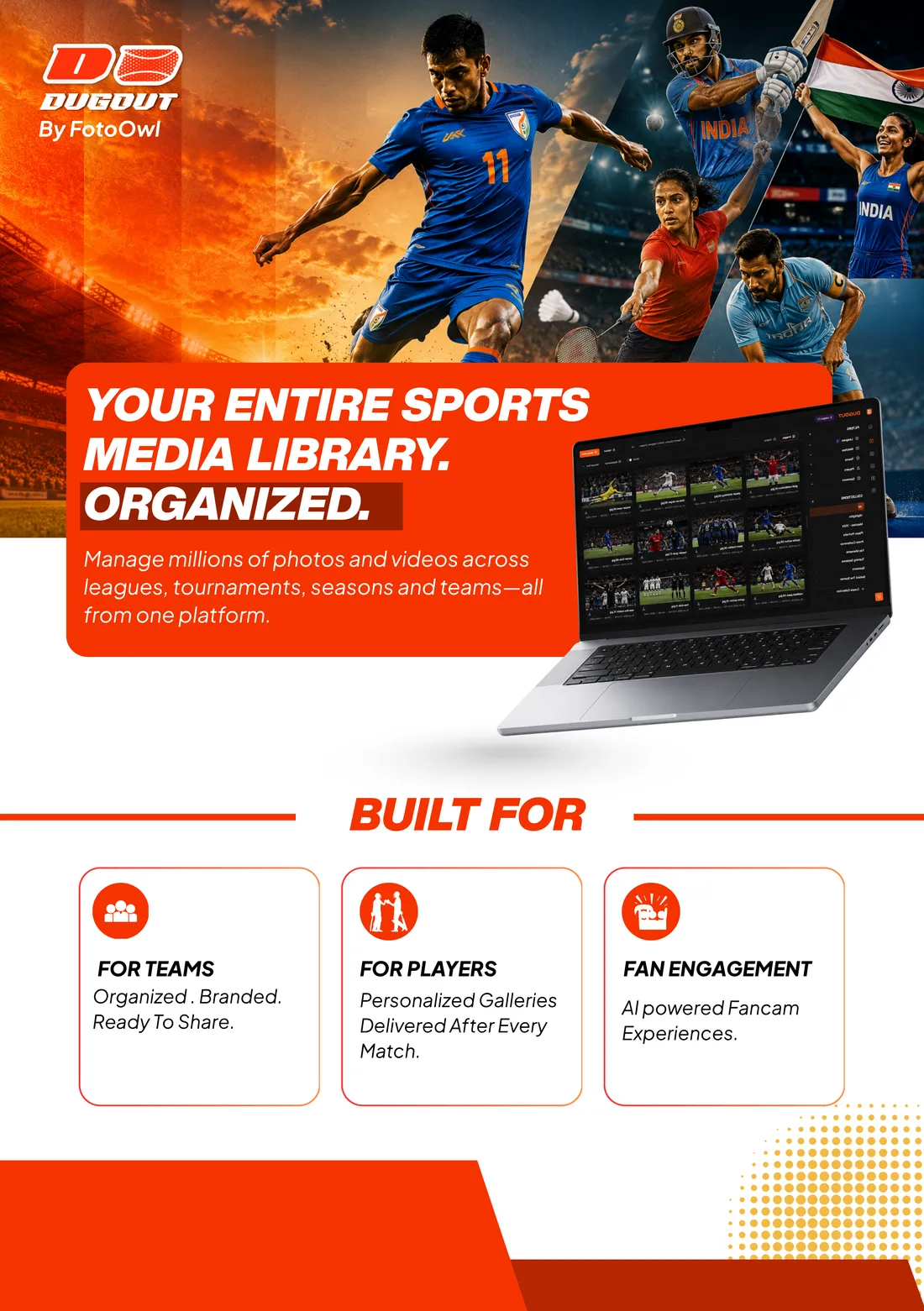
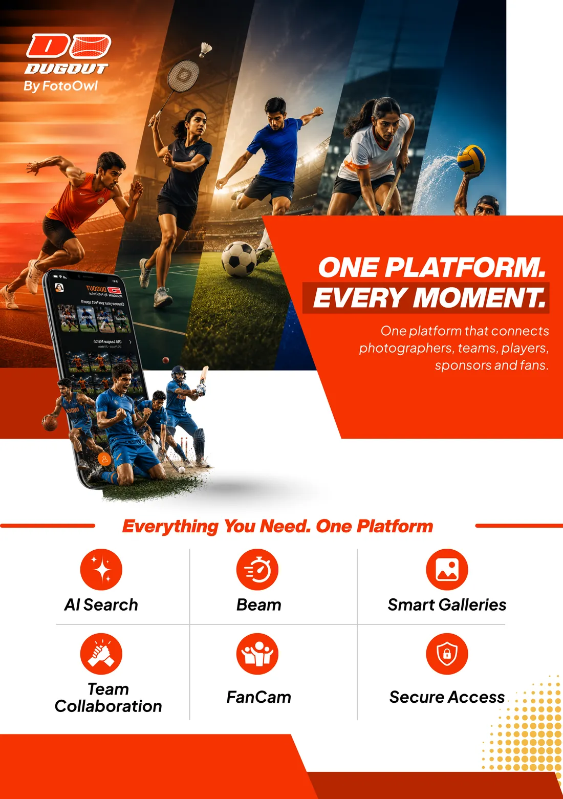
One for league owners (“your entire sports media library, organized”), one for everyone else (“one platform, every moment”), with the six features as icons.
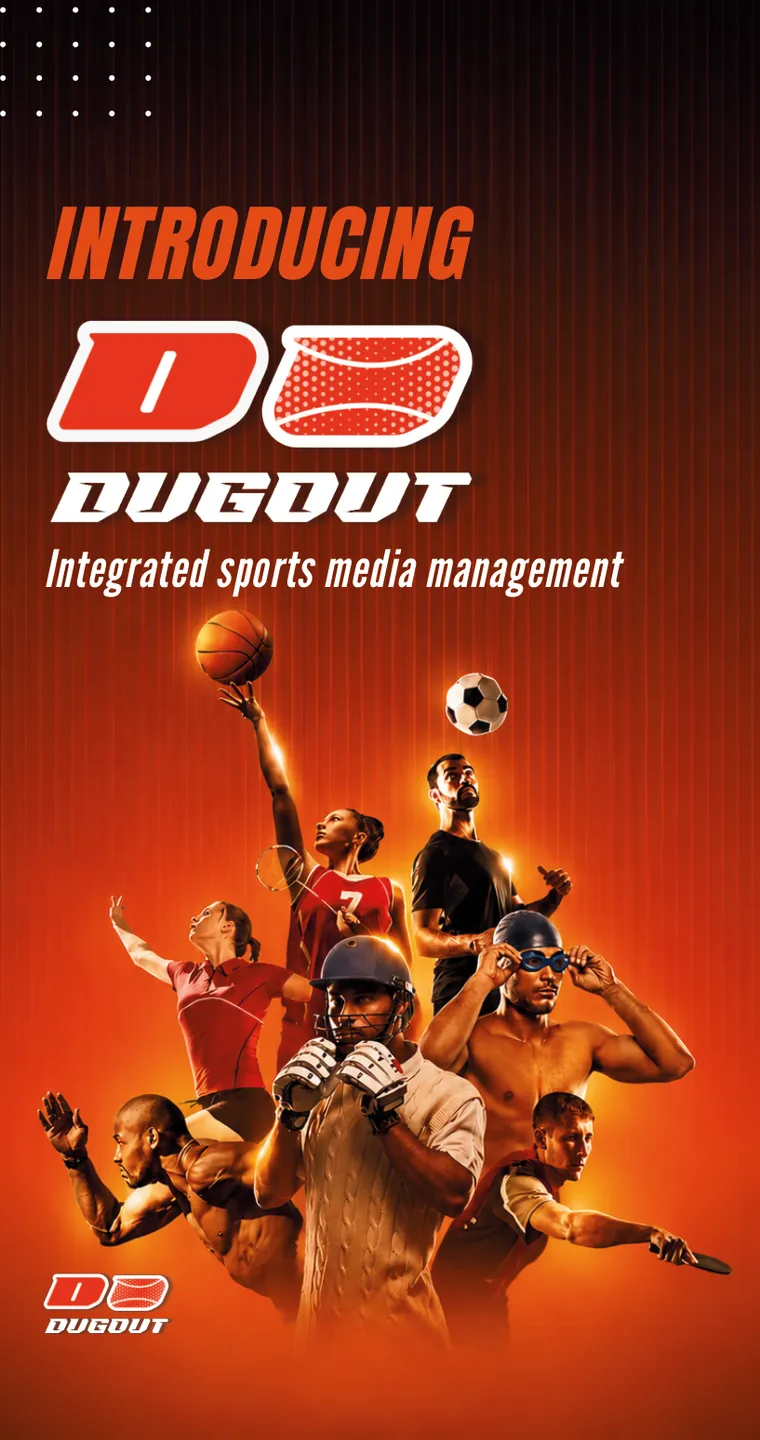
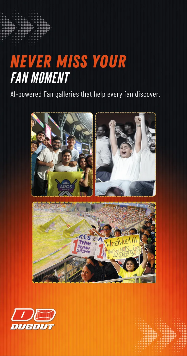
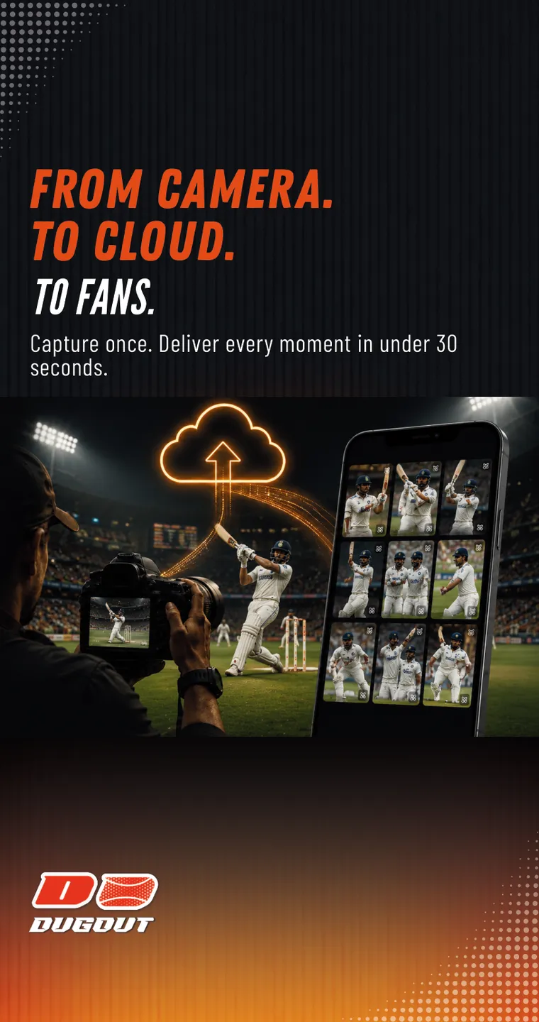
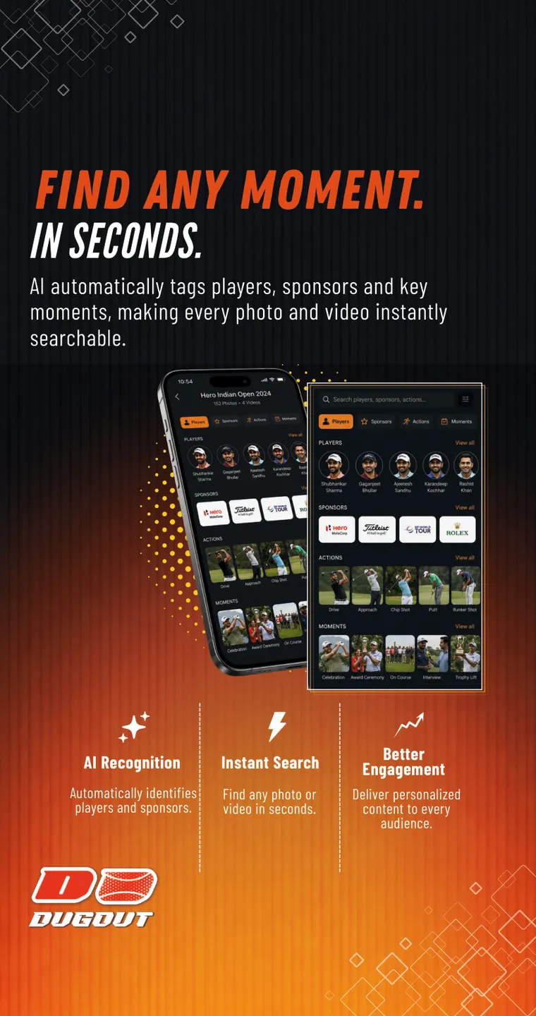
Rollups
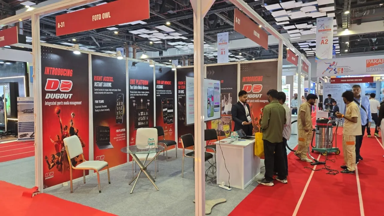
Each banner is one chapter of the pitch, readable from five metres. Stand in front of the stall and the story walks you from “Introducing Dugout” to “One platform”.
11 · Toolkit
Vectors when a shape has to be perfect, Figma when people will tap it, Canva when it has to ship today, and AI when I need many directions fast.
AI widens the search; I make the call. Every concept was chosen, corrected and finished by hand.
How a piece moves through my tools


How leagues post, what rivals say, before I draw.
Many key visuals and mockups, fast.
The logo, the screens and the web app, by hand.
Flyers, resizes and variations, on brand.
The launch teaser comes alive.
Why: a logo has to be perfect from a wristband to a six-foot rollup, so I draw it in vectors.
Here: the D + ball mark, the wordmark, and print-ready rollups, flyers and cards.
Why: one board the whole team can see and comment on, from logo rounds to screens.
Here: the logo exploration board, the eight store screens and the web app.
Why: launch week doesn’t wait. Brand templates let me ship variations without breaking the system.
Here: flyer layouts, quick resizes and social versions of the launch visuals.
Why: it turns a still idea into motion or a photo-real mockup in minutes, no shoot needed.
Here: the launch teaser, plus the cap, raglan, lanyard and wristband mockups.
Why: to try many directions quickly, then correct and finish the best one myself.
Here: key visuals, the billboard, business cards and the on-pitch brand photo.
12 · Outcome & impact
Red, fast and sporty, clearly Dugout, still “by FotoOwl”.
Store, web app, film, flyers, rollups, stationery and merch.
The rollups did the explaining at stall A-31, so the team could focus on conversations.
Eight features, eight screens, each one readable in a swipe.
Filters and collections built around how leagues actually work.
AI mockups and motion cut days from concept to launch.
The product this brand speaks for
Product figures from fotoowl.ai/dugout (IGPL, T20 Mumbai, World Padel League), October 2026.
13 · Reflection
A sub-brand earns attention by looking like its own audience.
The badges were liked. They just weren’t sport. Saying so early saved the brand.
The same story had to work on a rollup across the hall and on a phone in a hand.
Next project · 03 / 06
MediVerse