Complete Anatomy
Detailed 3D models, every device
Not truly immersive VR
Case study · VR in healthcare · UX/UI · Team project
Designing where human insight meets machine imagination, from Mumbai.
A VR learning platform where medical students explore 3D anatomy and rehearse emergencies in a risk-free virtual hospital.
All projects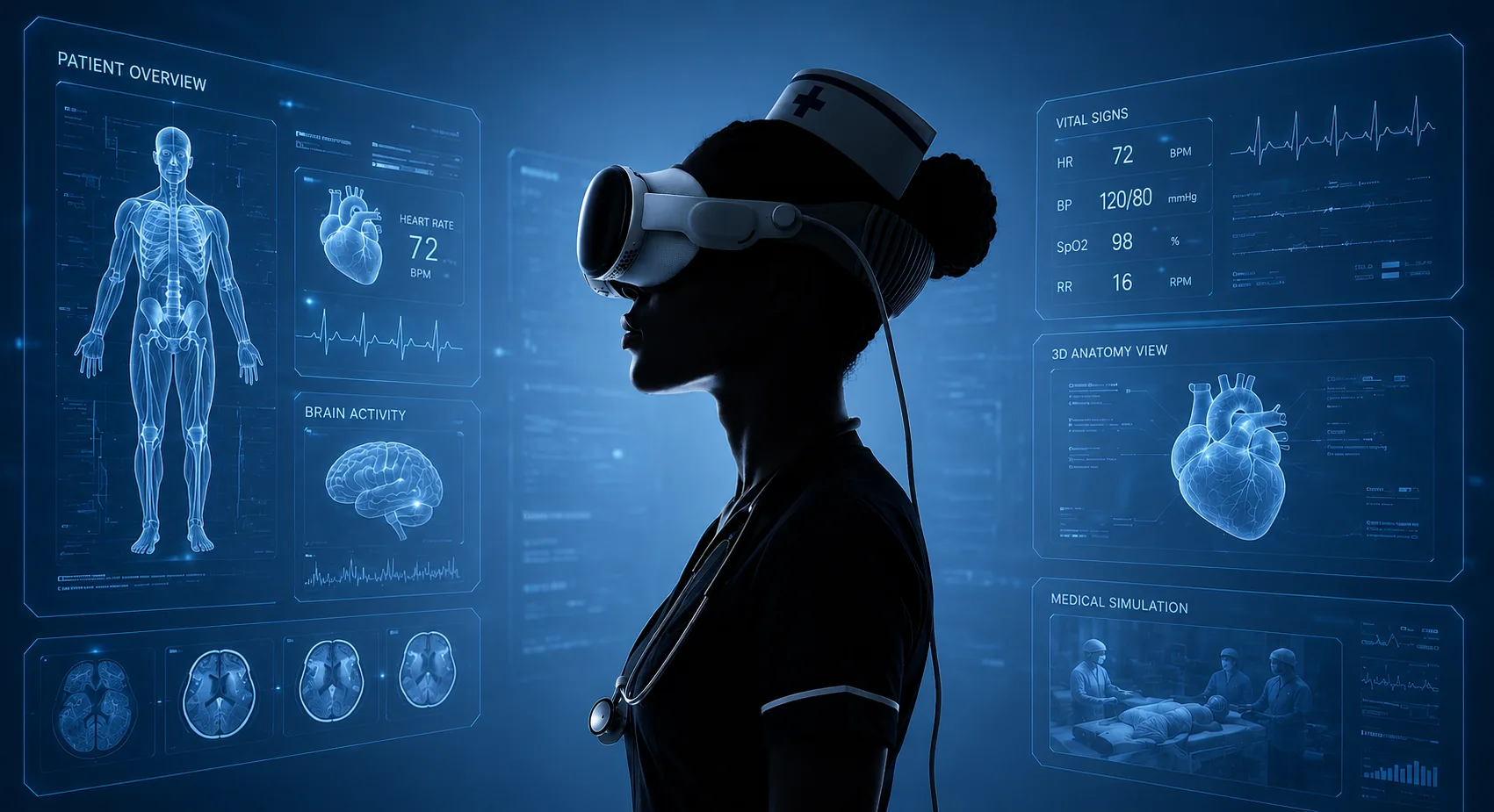
01 · Overview
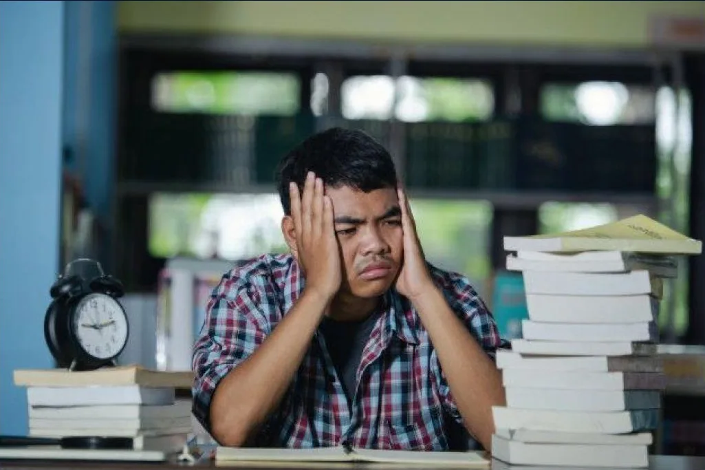
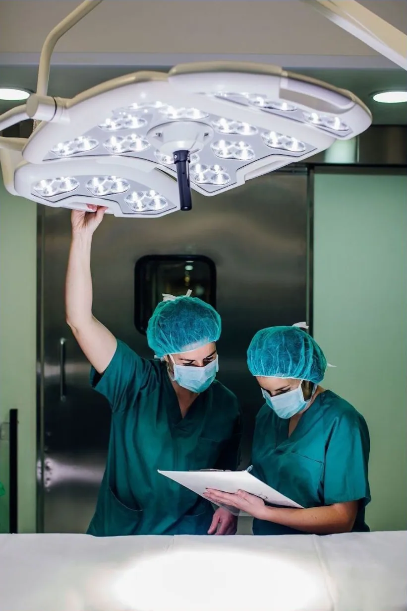
Medical students learn surgery from textbooks and videos, then meet their first real patient. MediVerse closes that gap: touch the anatomy in 3D, rehearse an emergency as often as you need, and walk into the ward already prepared.
What we designed
Medical+Universe=MediVerse
A boundless universe for medical training
How we worked
Expectations, pain points and preferences.
Compile the research; interview experts and learners.
A wide range of ideas, then interfaces, interactions and flows.
Usability issues in real VR training scenarios.
02 · The problem
of students had never used VR to learn.
learn mostly from textbooks and online lectures.
get to practise on simulations or in cadaver labs.
would use VR in their training, if they had it.
03 · Research
Medical, education, defence and enterprise training.
6 Indian VR firms, 6 medical training products.
14 questions to medical and physio students.
A VR founder and a physiotherapy student.
Face-to-face interviews with students in Pune.
Why medical
We mind-mapped every place VR is used for training. Medicine had the most at stake: patient interaction, anatomy, emergencies, surgery and new equipment, all of them expensive or risky to practise for real.
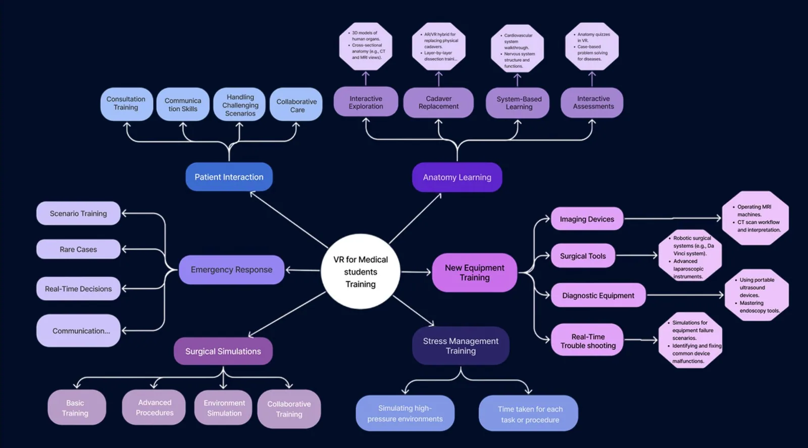
The field is growing fast
What students already use
Plenty of reading, very little doing. The literature says the opposite works: VR learning can double attention and lift test results by about 30%.
Competitive landscape
Detailed 3D models, every device
Not truly immersive VR
Holographic, instructor-led
Needs HoloLens-class hardware
Team-based patient simulations
Costly headsets, steep learning curve
Indian, CPR and surgical training
Narrow scope, few student modules
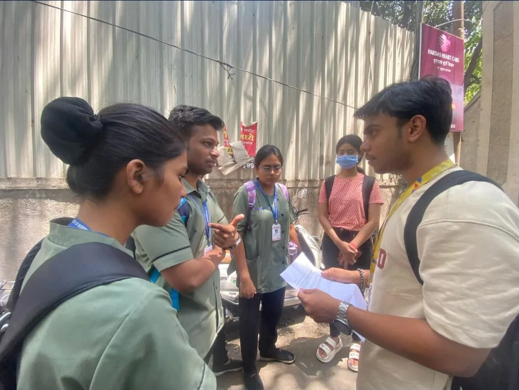
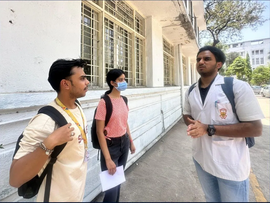
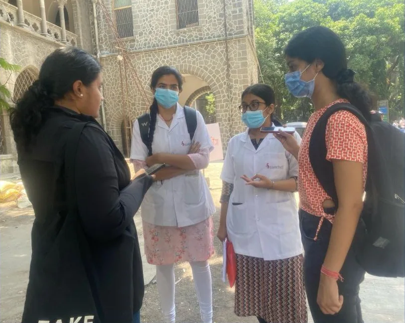
Campus interviews with MBBS, nursing and physiotherapy students
04 · Users
Books alone don’t help me picture a procedure.
We face difficulties from the very beginning.
There’s a wide gap between theory and practice.
05 · Synthesis
Affinity map · five clusters
The problem, redefined
Medical students struggle to retain and apply complex concepts because they lack practical exposure. They need an accessible, immersive tool that replays real medical scenarios, step by step.
How might we… → what we did
06 · Ideation
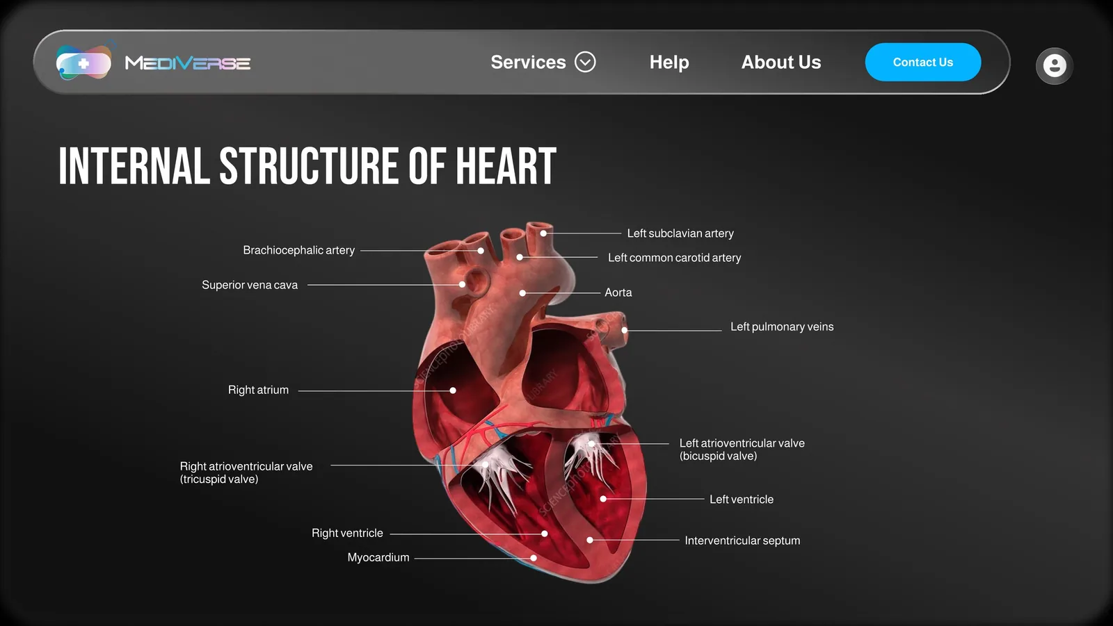
Turning a heart in 3D builds understanding; procedures practised in VR build muscle memory.
Words beside the picture, never in a legend: the heart screen names each chamber in place.
A procedure is split into steps with pause points, so nobody is overloaded.
07 · Information architecture
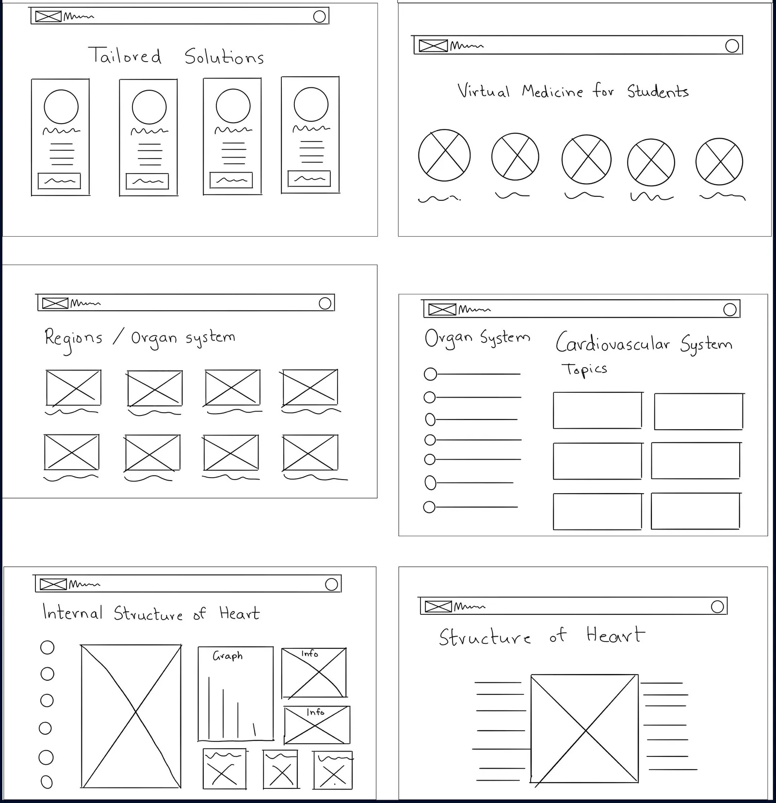
By year, by body system, or by topic type: three doors into the same modules.
 MediVerse home
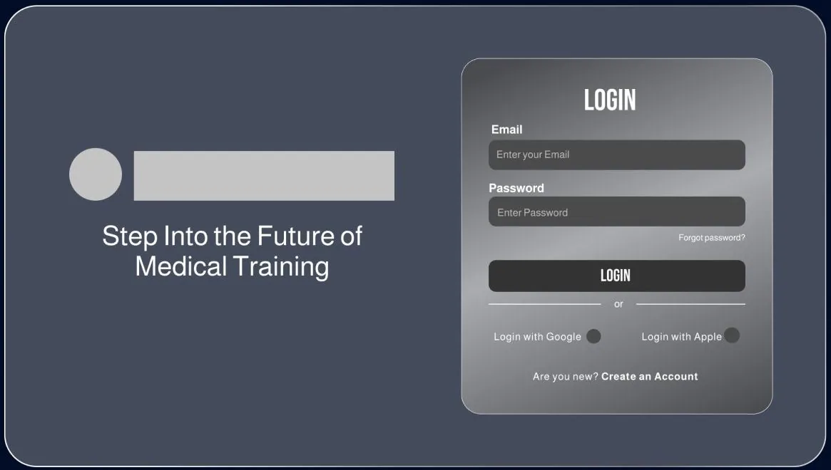
Onboarding flow
Student flow · from home to the heart, or to an emergency
08 · Designing for VR
Four gestures run the whole app, so a first-time user never has to hunt for a controller button.
Select an item
Rotate a 3D model
Look to trigger
Back to home
Comfort rules we kept
09 · Sketch → wireframe → final
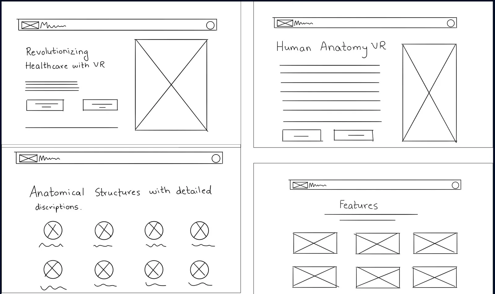
Pick a screen and watch it grow up. Paper sketches tested the navigation; grey glass wireframes tested the layout; then came the anatomy.
10 · Branding

Colour
Mood board



11 · Final UI
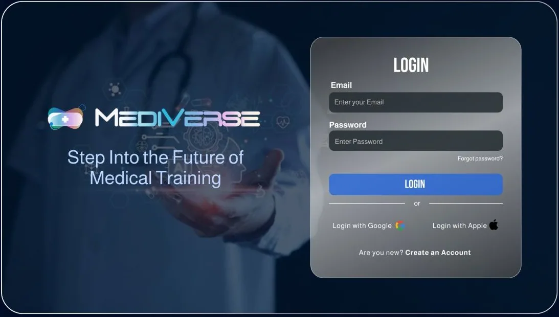
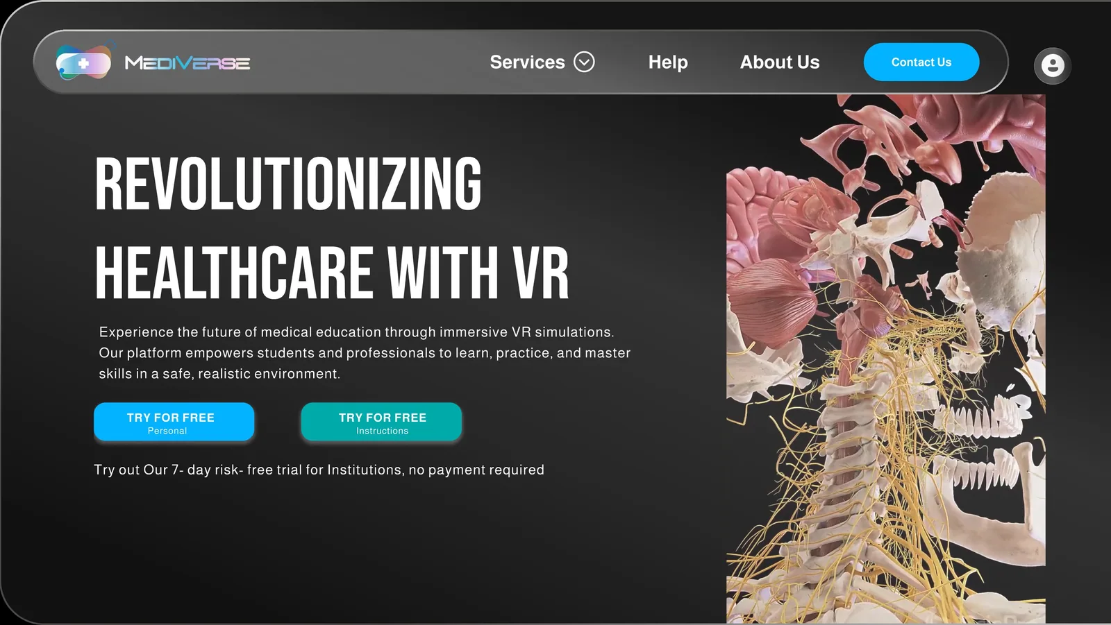
Keep scrolling: you are standing inside the app. Every screen below is from our Figma prototype, which you can open at the end of this page.
Look around · the VR app
01 / 10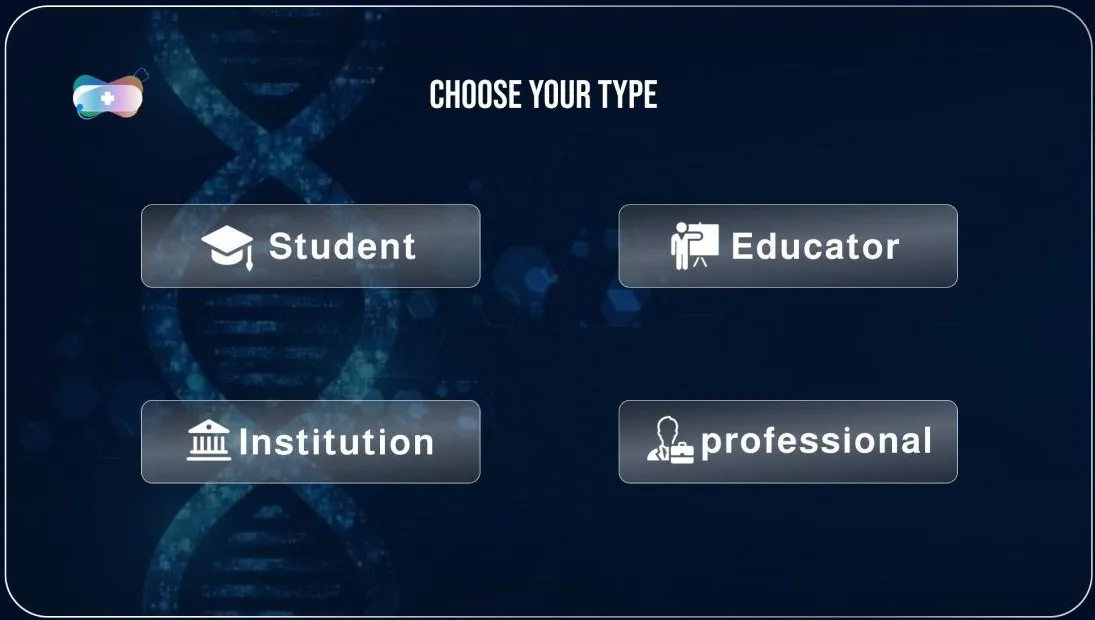
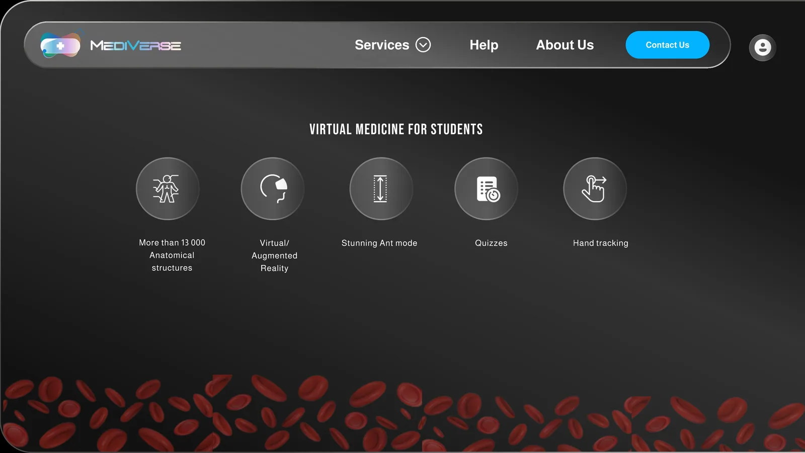
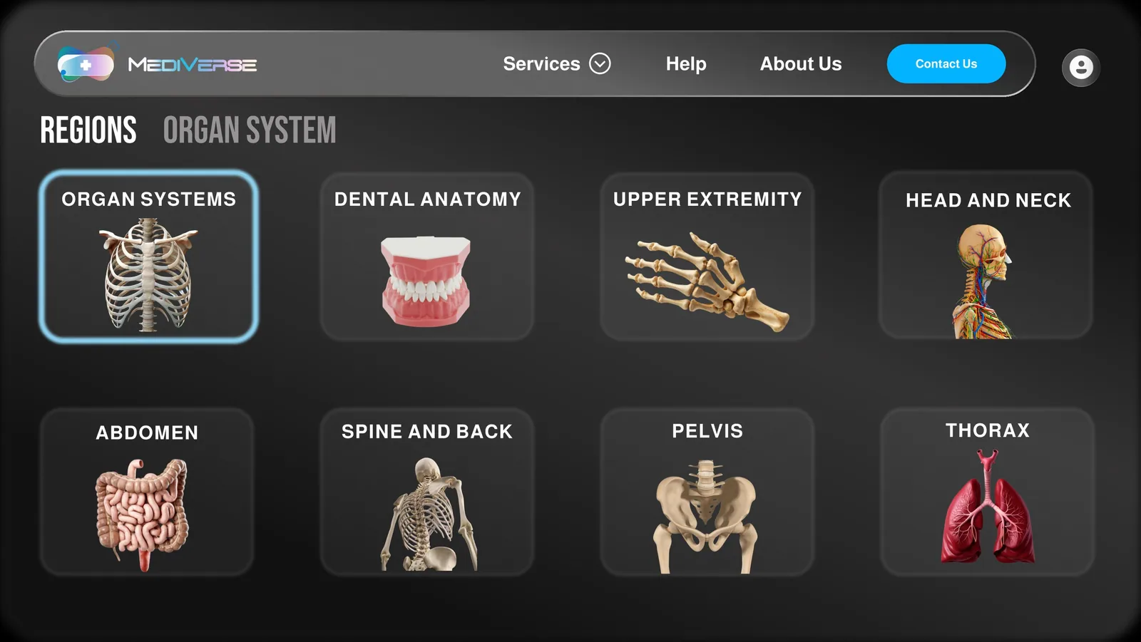
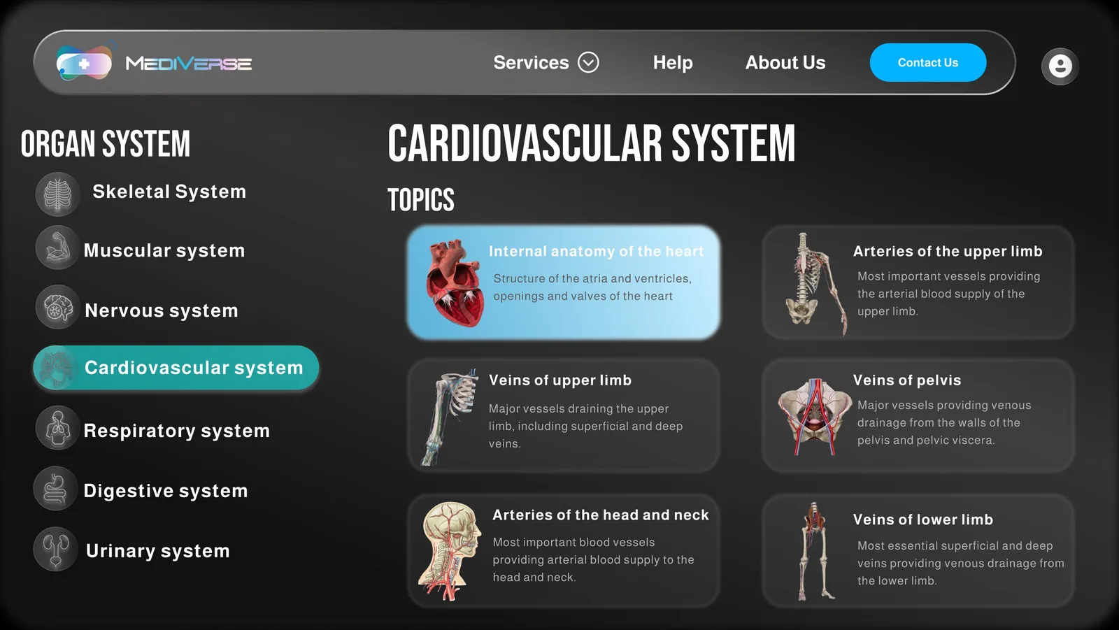
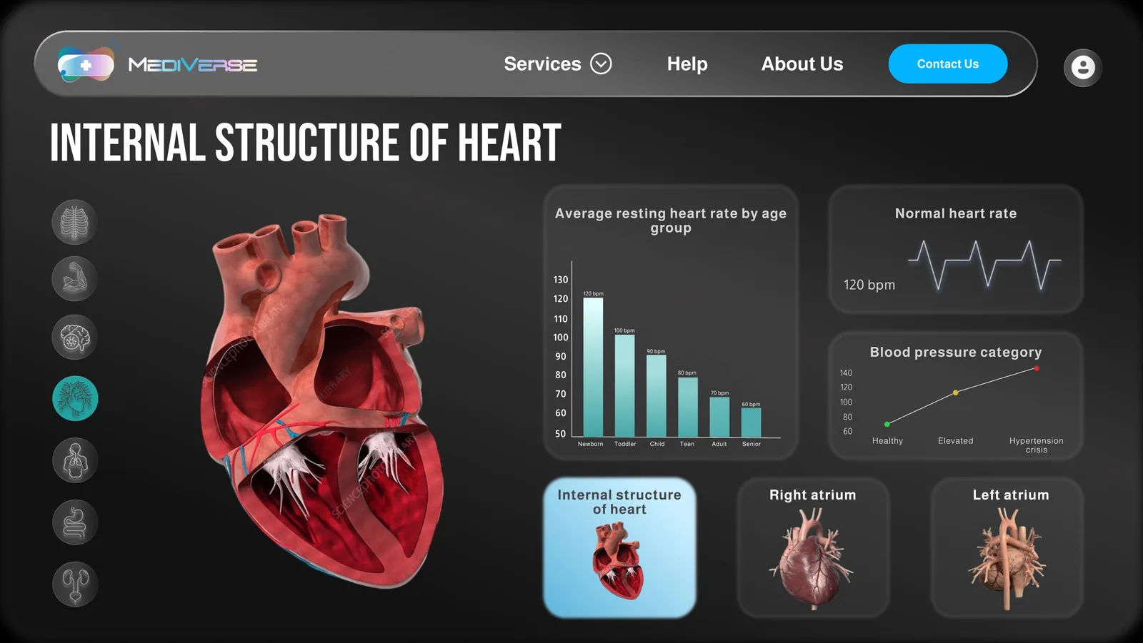
Choose your type
Beyond the headset
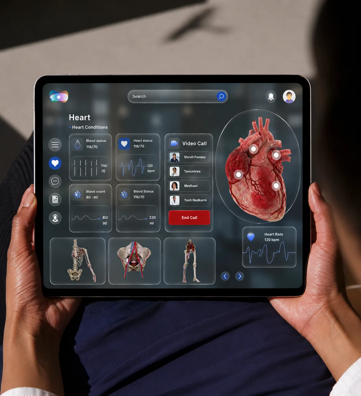
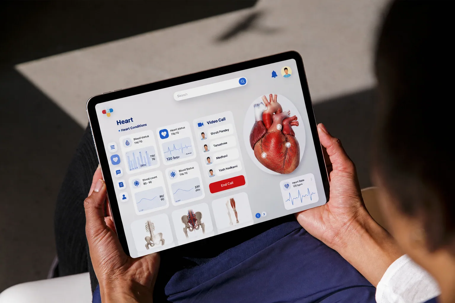
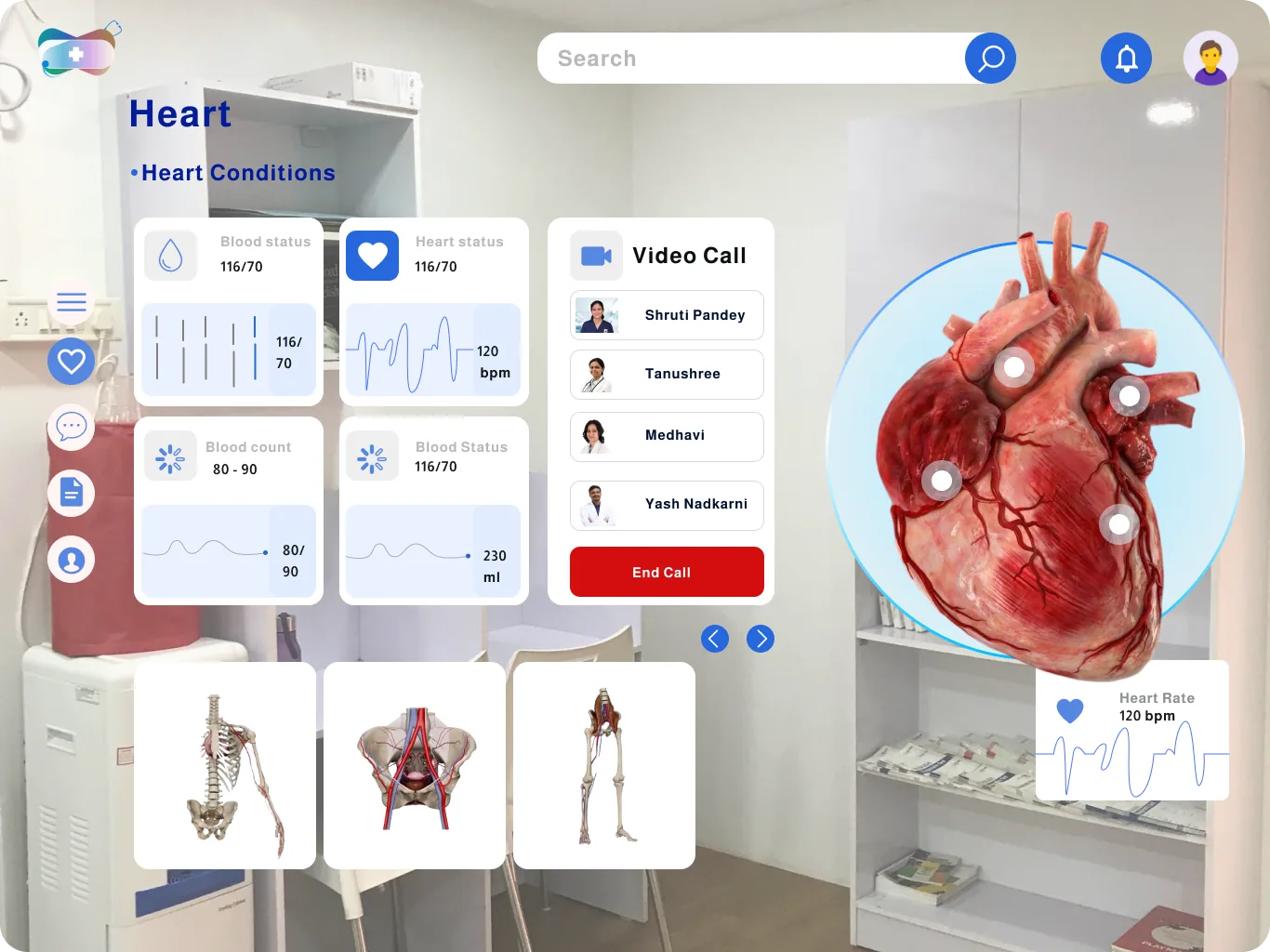
Not every college owns headsets, so the heart module also runs on a tablet, with a live video call to classmates beside it, and as AR over a real clinic.
12 · Gameplay
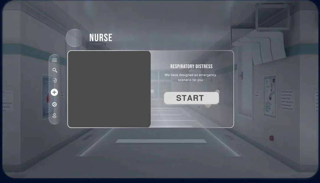
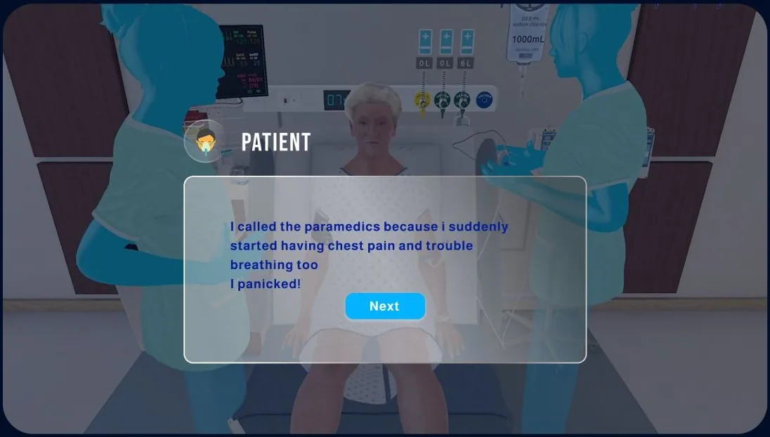
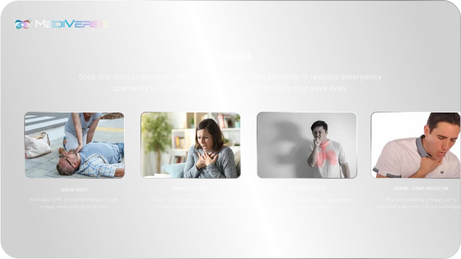
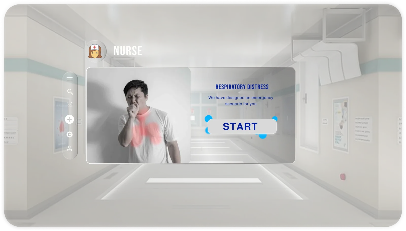
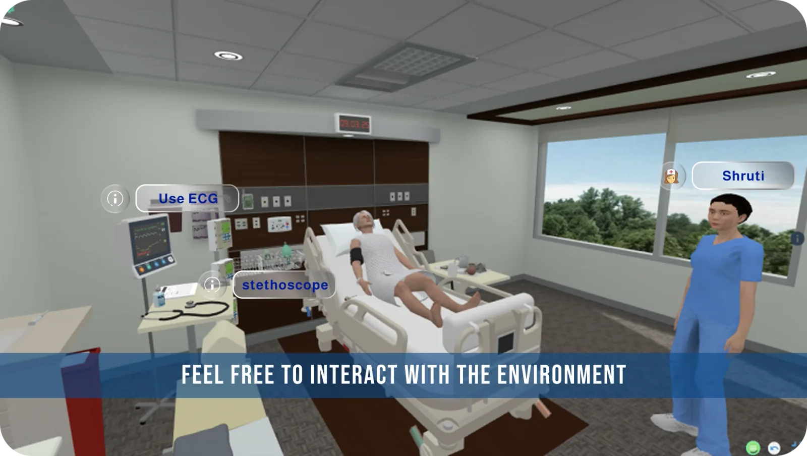
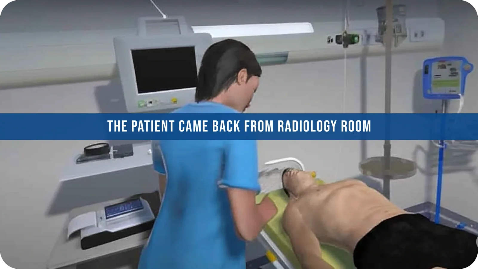
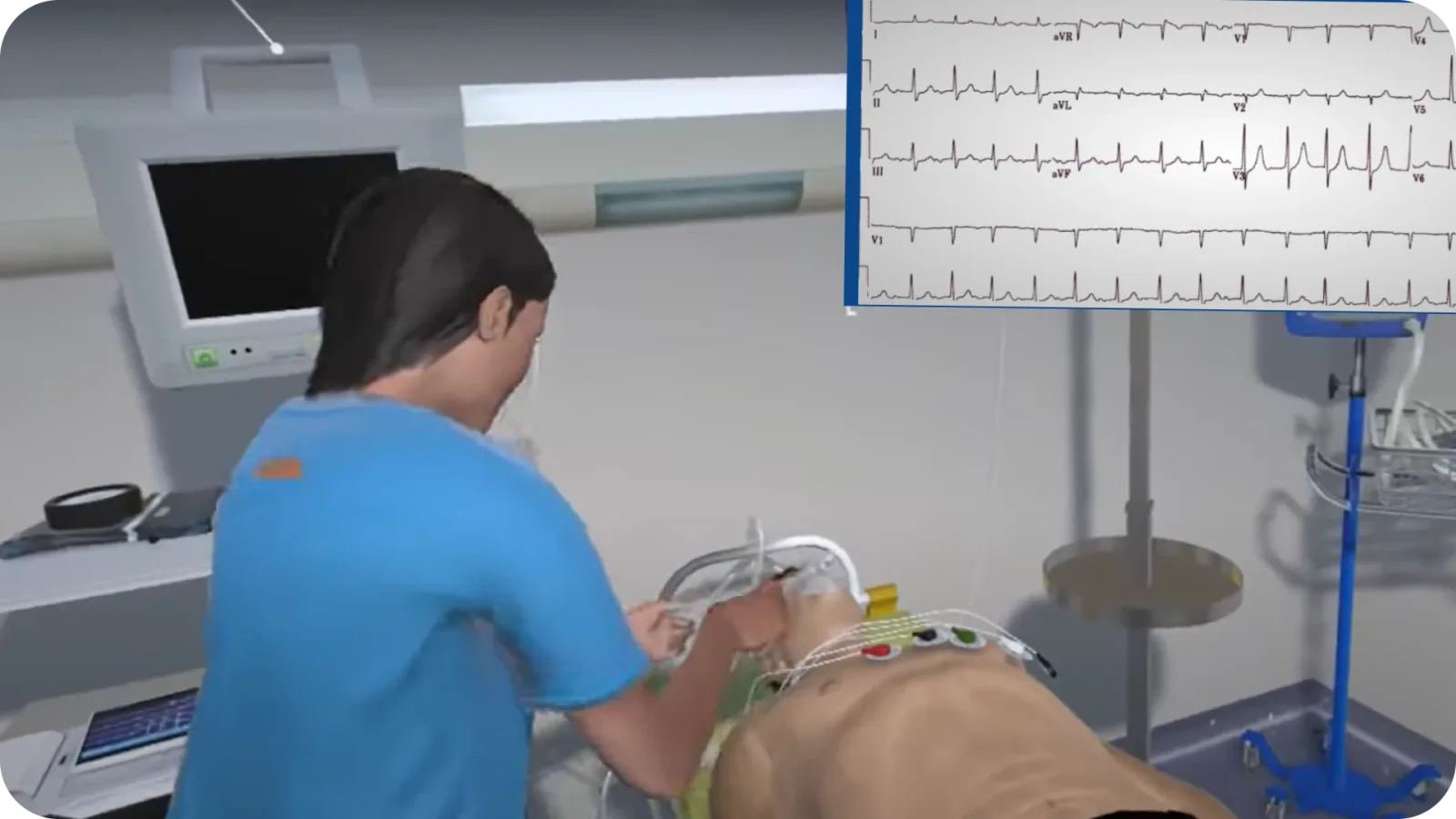
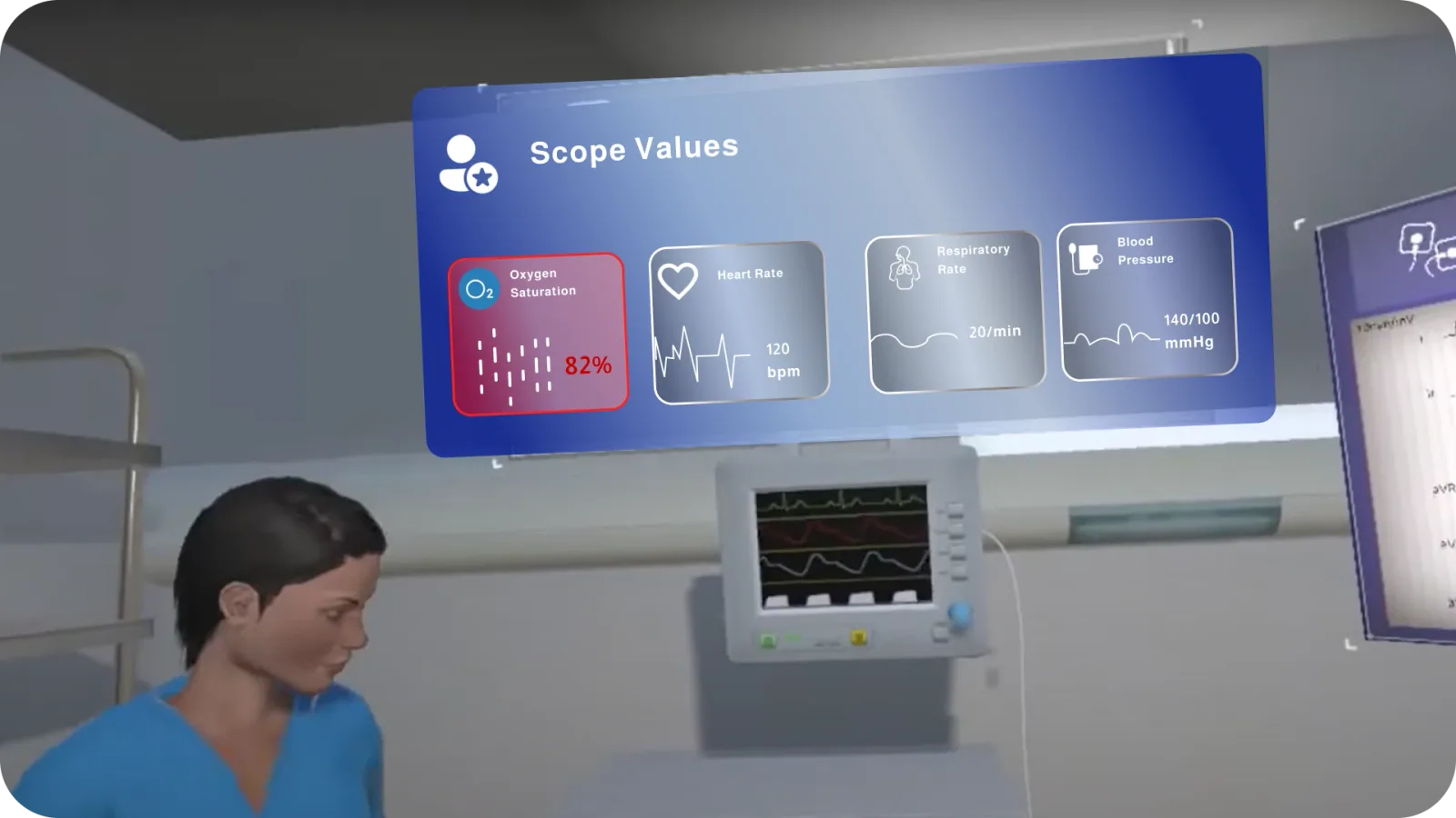
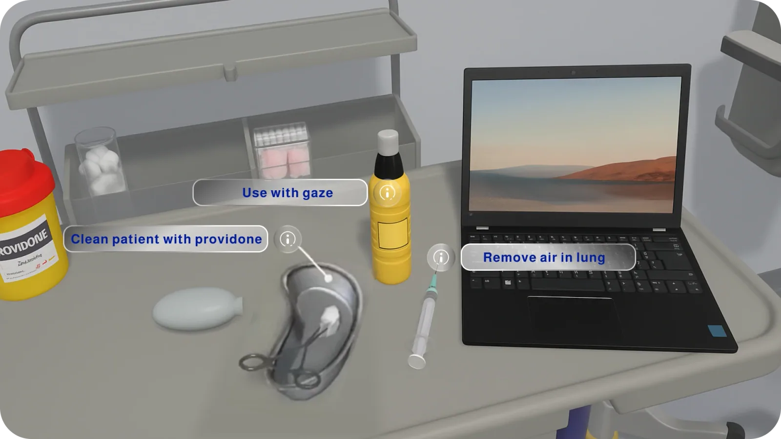
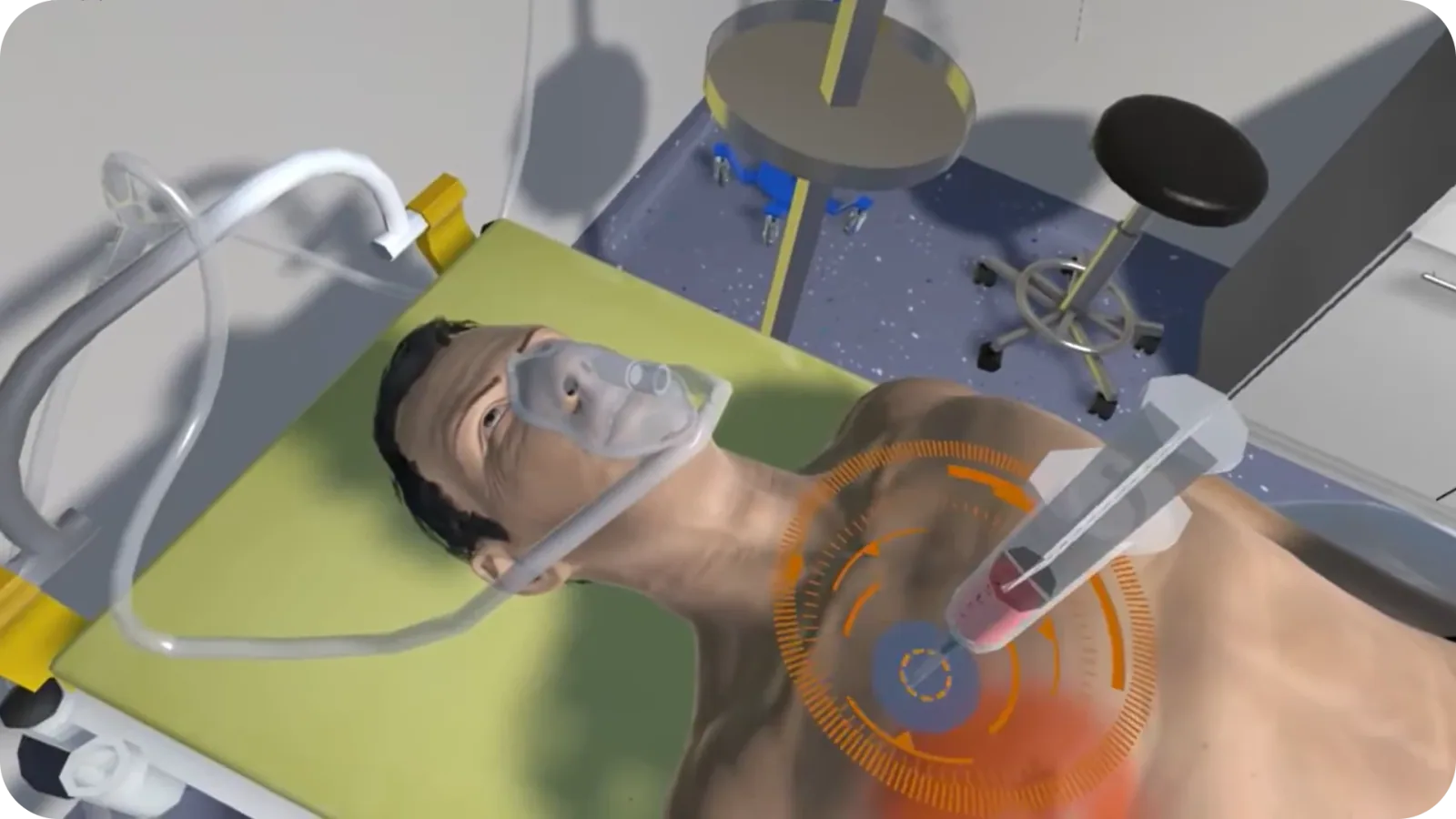
Every scenario is a mission: walk into the ward, read the patient, pick the right tool. Each step is one clear task with a hint, so students learn by doing. Here is respiratory distress, from first click to the fix.
13 · Usability testing
A 2nd-year MBBS student and a postgraduate ran the prototype and rated each task on the Single Ease Question (1 = very difficult, 7 = very easy).
14 · Toolkit

Why: one file for wireframes, glass components and the clickable VR prototype.
Here: mid-fi and hi-fi screens, flows, the research deck.

Why: the capsule and its swirls had to stay crisp from an app icon to a poster.
Here: the logo, the wordmark and the icons.
Why: fast, clean layouts for the parts people read rather than tap.
Here: persona sheets, survey charts and the presentation.

Why: to show the product in a real ward or room before it exists.
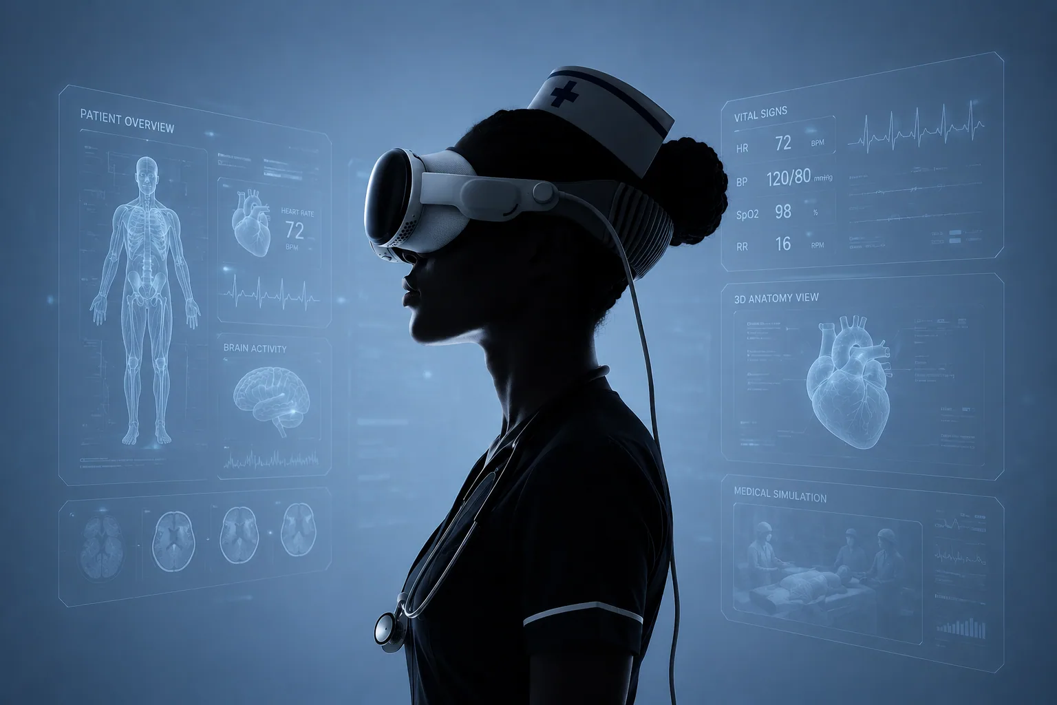
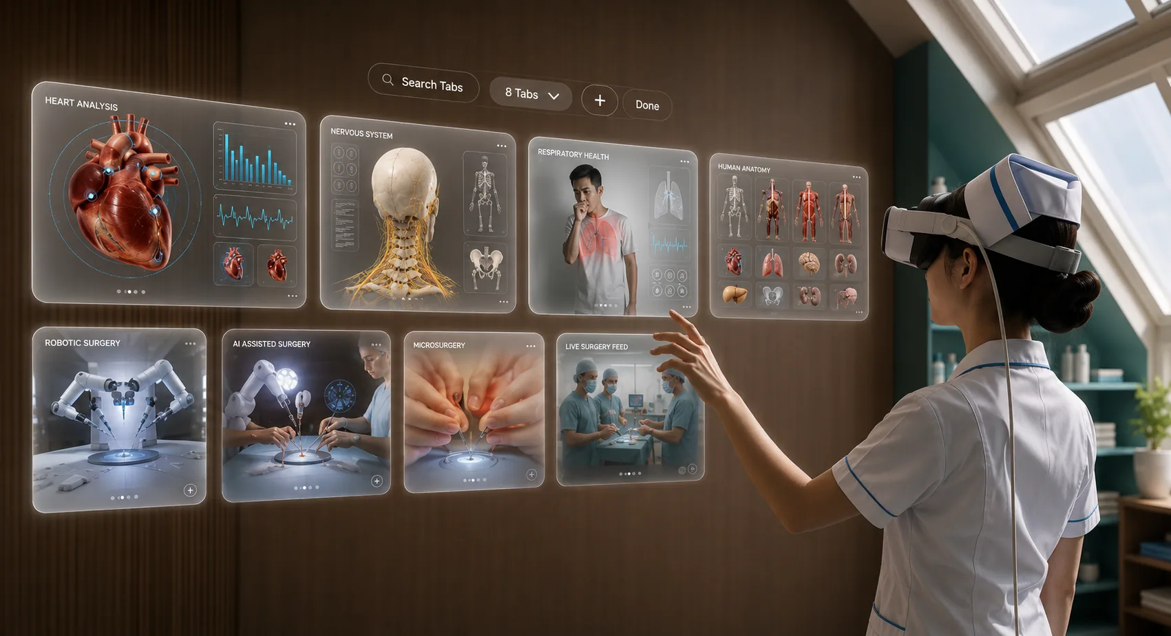
Here: the nurse in the headset, the spatial tabs and the tablet mockups.
15 · Outcome & impact
Students can fail, retry and master a procedure before a real patient.
Organs in 3D, labelled in place, by region or by system.
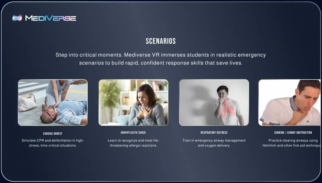
Cardiac arrest, anaphylaxis, respiratory distress, choking.
Year-wise modules; desktop and tablet when there’s no headset.
Quiz scores, streaks and completed modules in one tracker.
Students, educators, institutions and professionals.
16 · Reflection
Distance, motion and text size matter as much as the layout.
Four VR domains became one; one domain became one student.
We split the research, then agreed on one glass UI language.
See the full project
Next project · 04 / 06
First Step