Information is scattered
Plans, reviews, maps and tips live in different apps, and much of it is out of date.
Case study · Travel app · UX/UI · Android & iOS · 2025
Designing where human insight meets machine imagination, from Mumbai.
An all-in-one travel companion: plan the trip, book a trusted local guide, and get help in one tap if something goes wrong.
All projects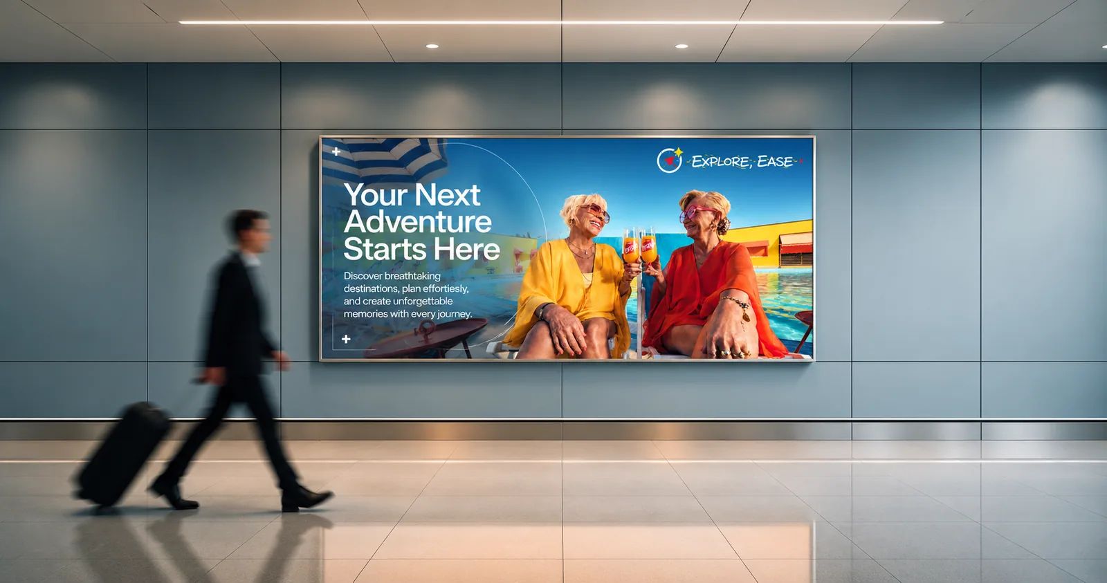
Screens50+
EE-2025 · TRAVEL MADE SIMPLE01 · Overview
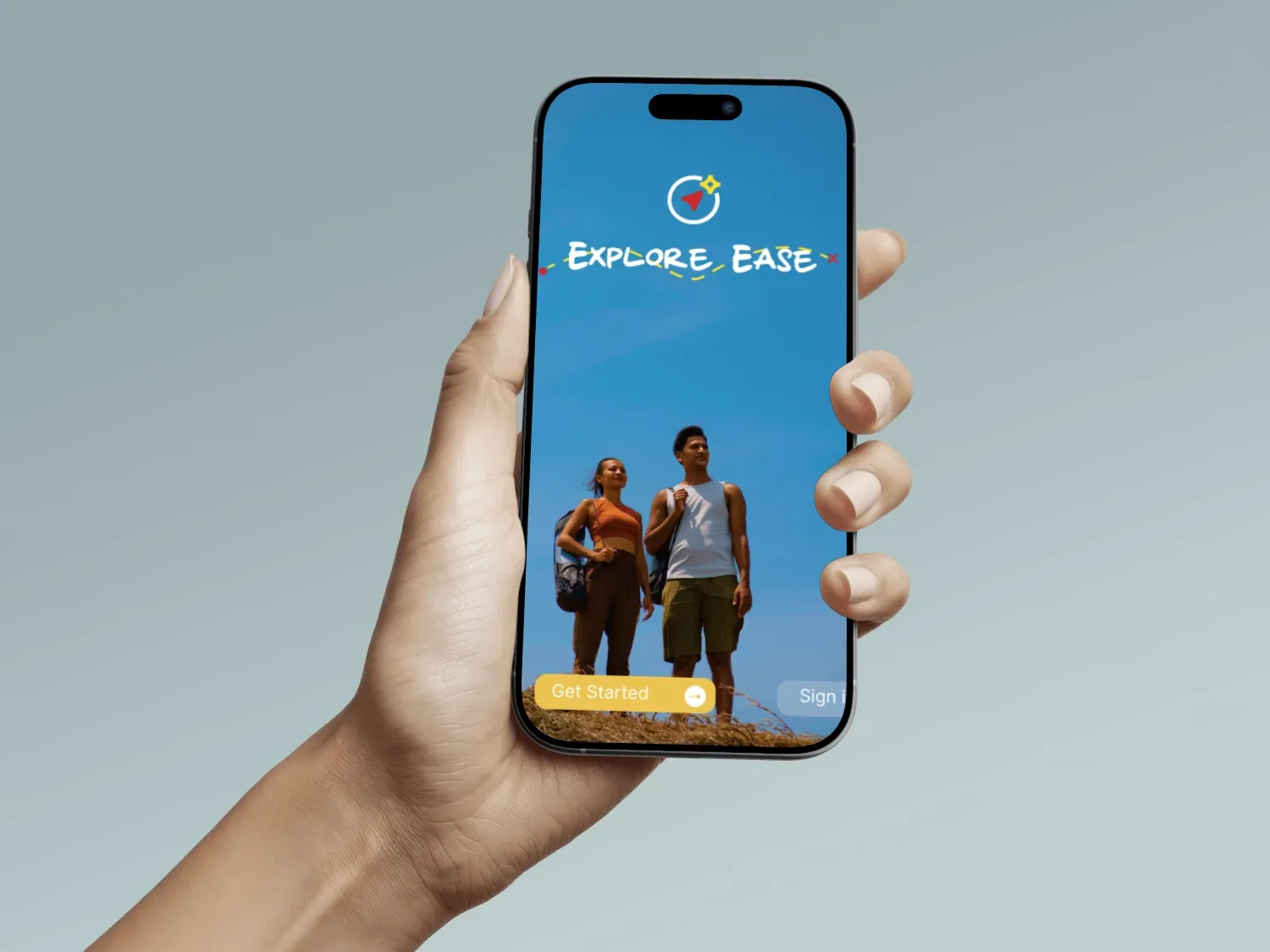
Travellers plan in one app, read reviews in another, search for a guide somewhere else and hope they never need help. Explore Ease puts discovery, trusted local guides and safety in one place, so people explore unfamiliar places with confidence.
What I did
How I worked
Interviews, research, competitors.
Personas, empathy and journey maps.
User flow, card sorting, IA.
Wireframes, brand, visual design.
Usability tests with real travellers.
02 · The problem
Plans, reviews, maps and tips live in different apps, and much of it is out of date.
Touts push tours at stations; hired guides can lack knowledge, language or professionalism.
In an unfamiliar city, few know the local emergency number, the nearest police station or the language.
Who it’s for
03 · Research
Qualitative interviews with solo travellers, families, couples and business travellers, plus tour and travel companies, on how they pick places, get around, eat and stay safe.
Solo, families, couples, business.
TripAdvisor, MakeMyTrip, Goibibo.
No single app covers it all.
What we heard
Competitive landscape
Huge database, reviews, community
Agents not cooperative, overpriced, dated UI
Every booking, good prices, friendly UI
Prices rise at checkout, high fees
Deals, hourly rooms, rewards
Booking first, little help on the ground
04 · Users
WantsHikes, hidden gems, local food, and safety tips for women travelling alone.
WorriesBudget, being alone in remote areas, transport and hygiene.
P<USAEMILY<<SOLO<<<<<<<<<<
WantsKid-friendly stays, culture and outdoor time the whole family enjoys.
WorriesDifferent ages to please, children’s safety, language barriers.
P<ESPMARIA<<FAMILY<<<<<<<<
WantsPremium stays, fine dining and private tours, all arranged smoothly.
WorriesSeamless bookings, extreme weather, cultural sensitivity.
P<GBRJAMES<<LUXURY<<<<<<<<
WantsLandmarks and heritage sites, comfortable stays, easy transport.
WorriesCultural differences, touts and scams, family needs.
P<INDPRIYA<<SIGHTS<<<<<<<<
05 · Journey map
06 · Ideation
Naming the worst version of the app showed us what to avoid as clearly as the best ideas showed what to build.
07 · Information architecture
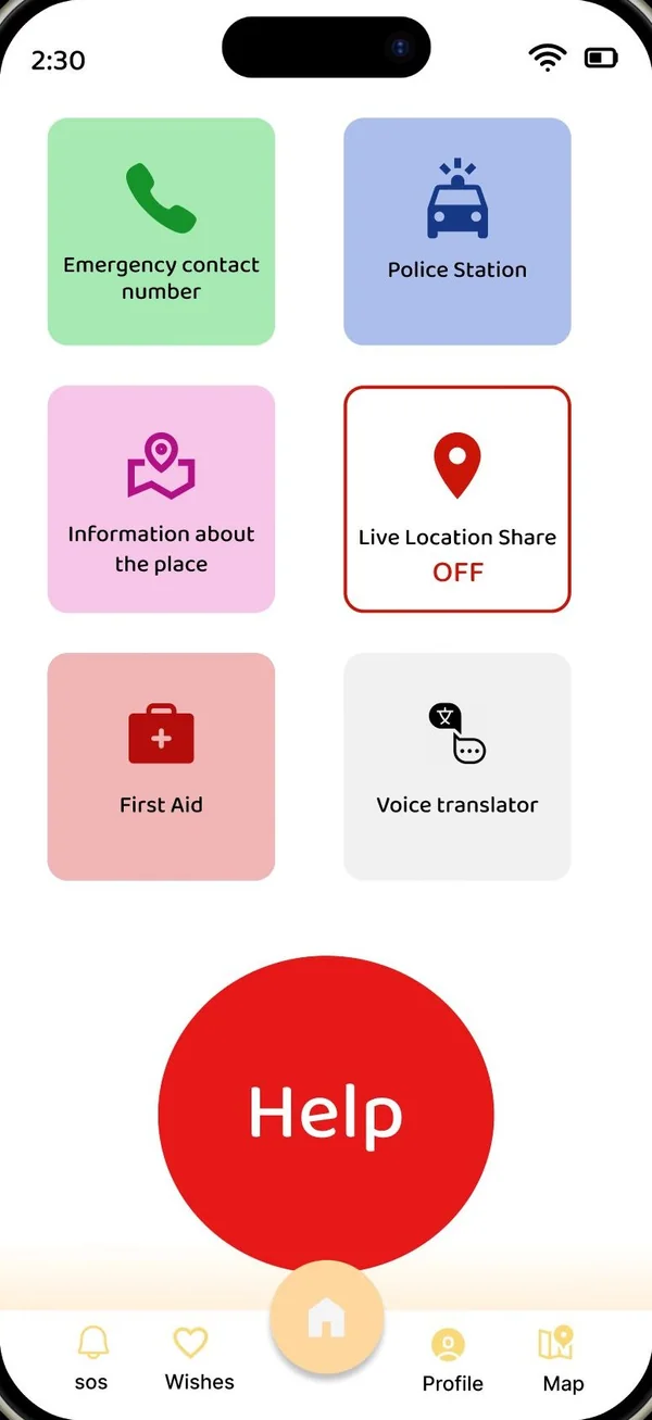
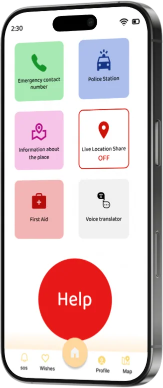
Card sorting grouped 60+ items into five tabs. SOS gets its own tab, so help is never more than one tap away.
User flow · from landing to sharing the adventure
08 · Wireframes
Mid fidelity · 16 screens
01 / 16
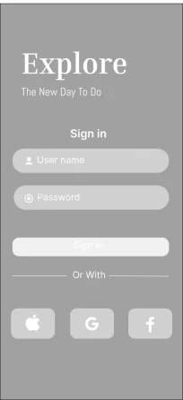

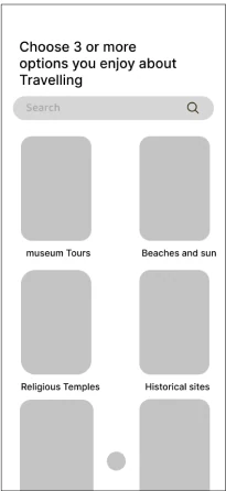
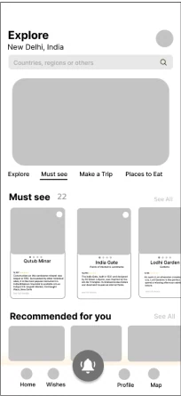
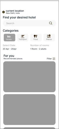
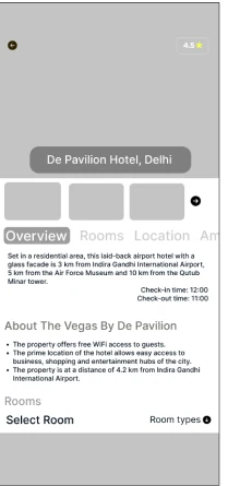
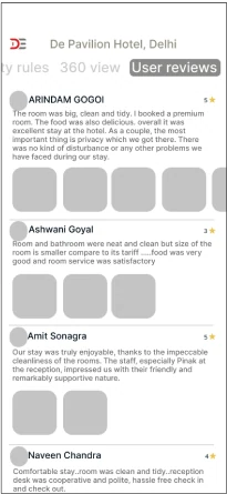
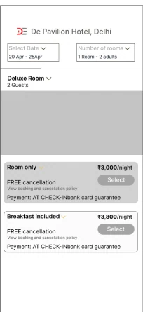
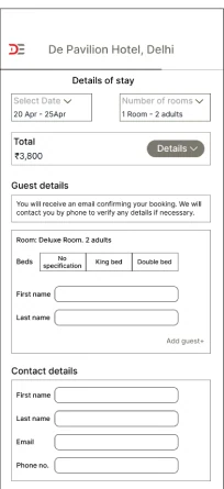
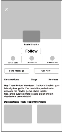
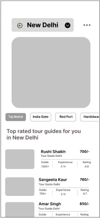
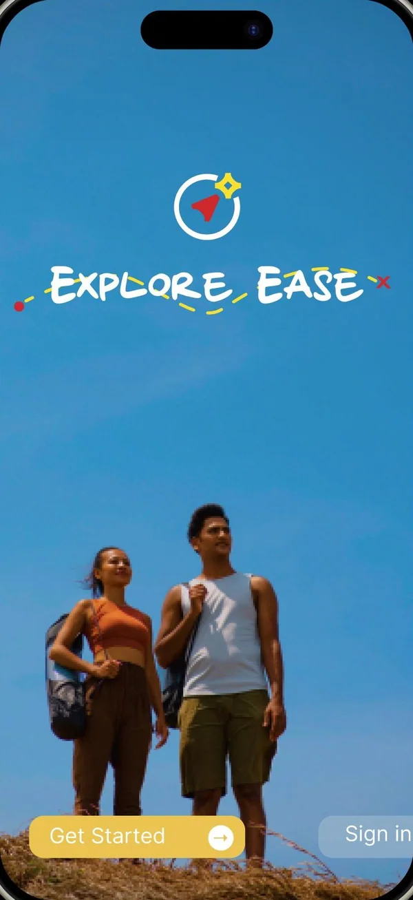 WireFinal
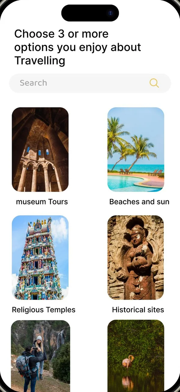 WireFinal
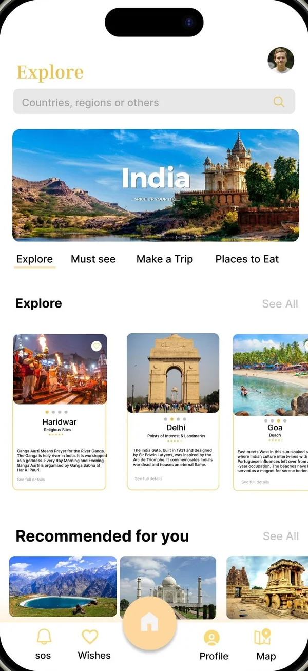 WireFinal
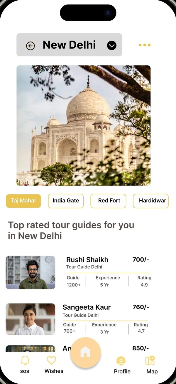 WireFinal
09 · Branding
The name
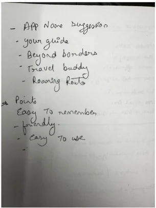
Short-listed in my sketchbook: easy to remember, friendly, easy to use.
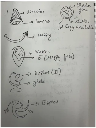
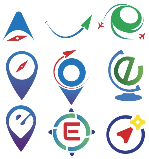

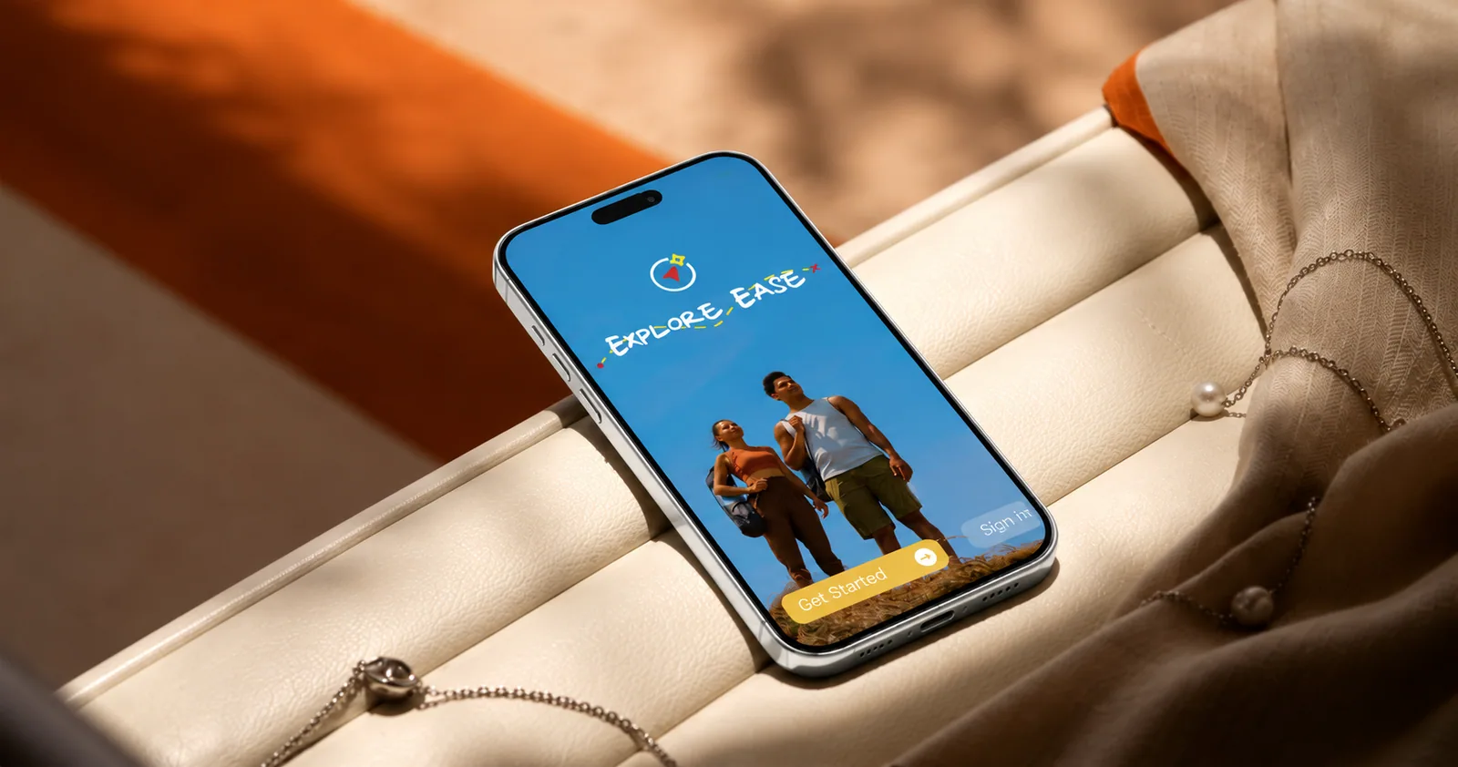
Travel made simple
UI colour
“Explore”, “Hi, Adam”: a warm, bookish voice.
Bold · RegularEvery label, list and button.
Light · Regular · Medium · SemiboldTaglines and campaign headlines.
RegularMood board






10 · Final UI
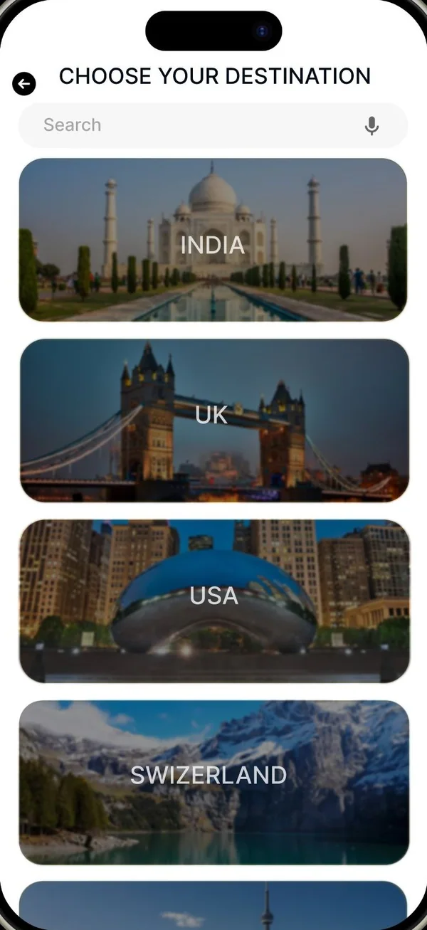
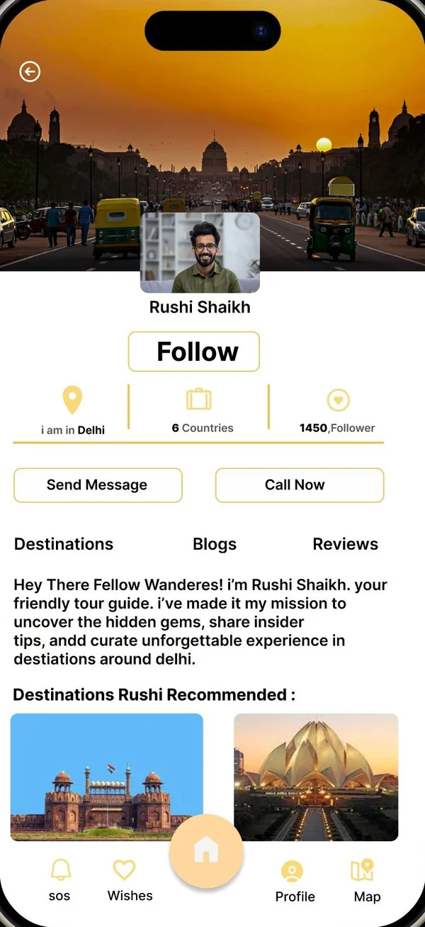
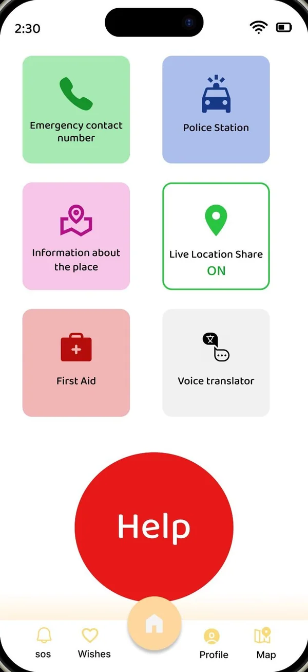
Keep scrolling to walk the main flow of the prototype, screen by screen.
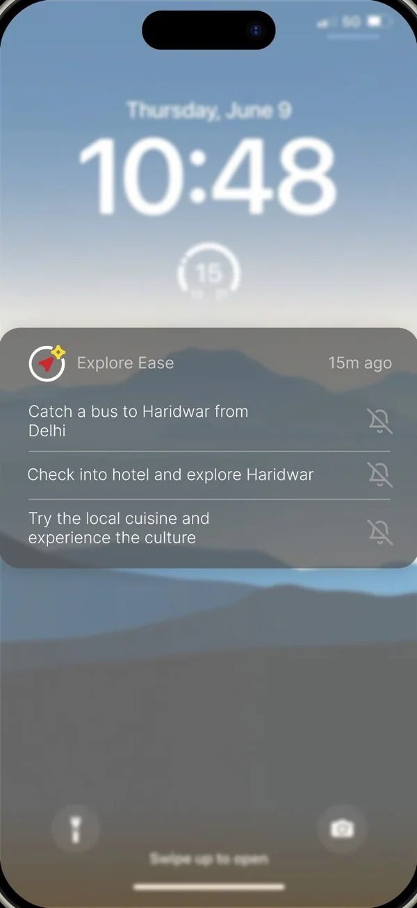
11 · Features
Hi-fi screens · tap one to enlarge
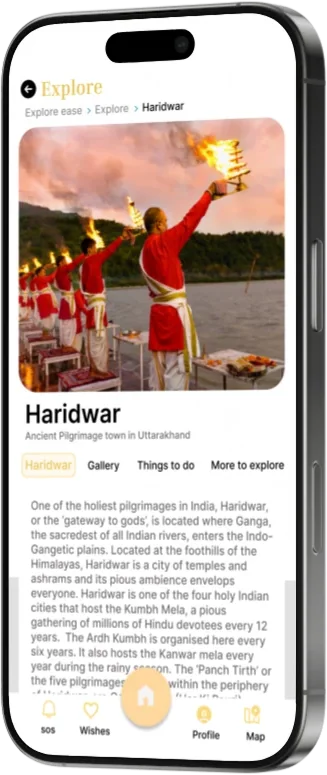
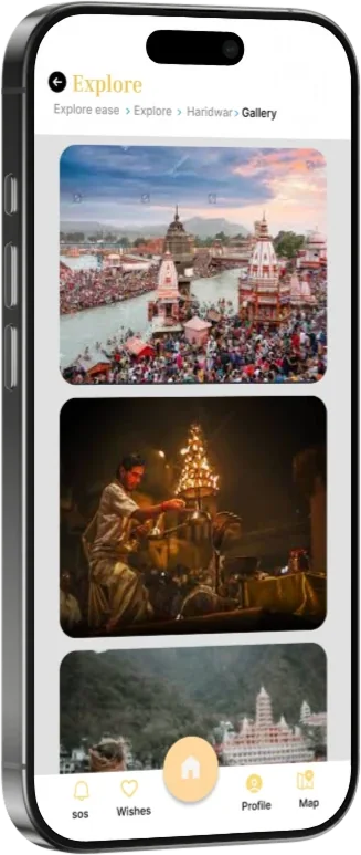
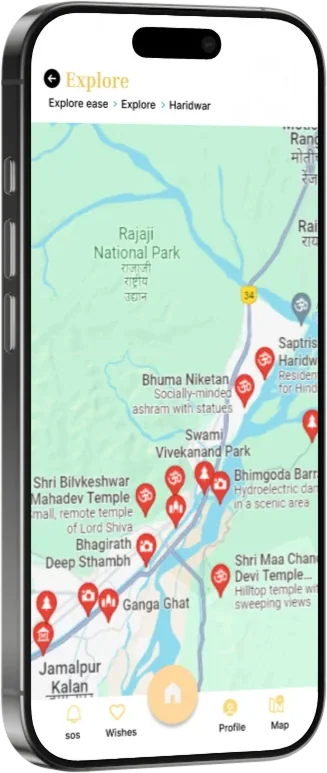
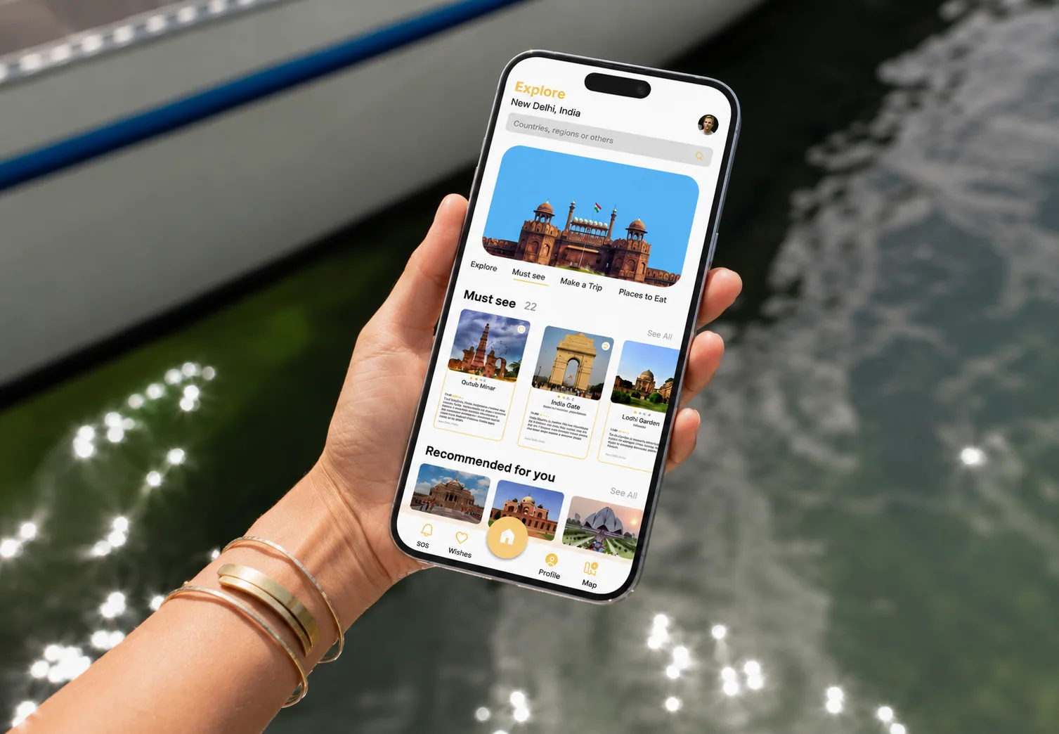
01 / 20History, the best time to visit, things to do and a map of temples and ghats.
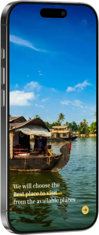
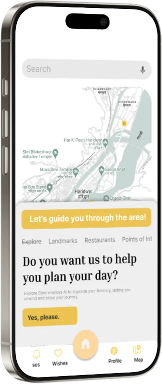
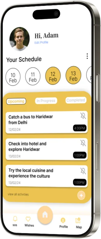
AI builds an itinerary; your schedule tracks what’s next.
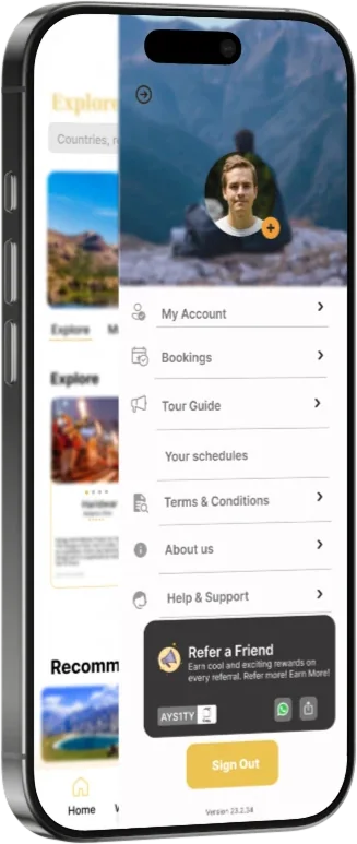
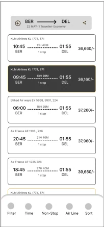
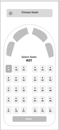
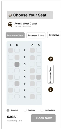
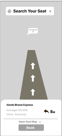
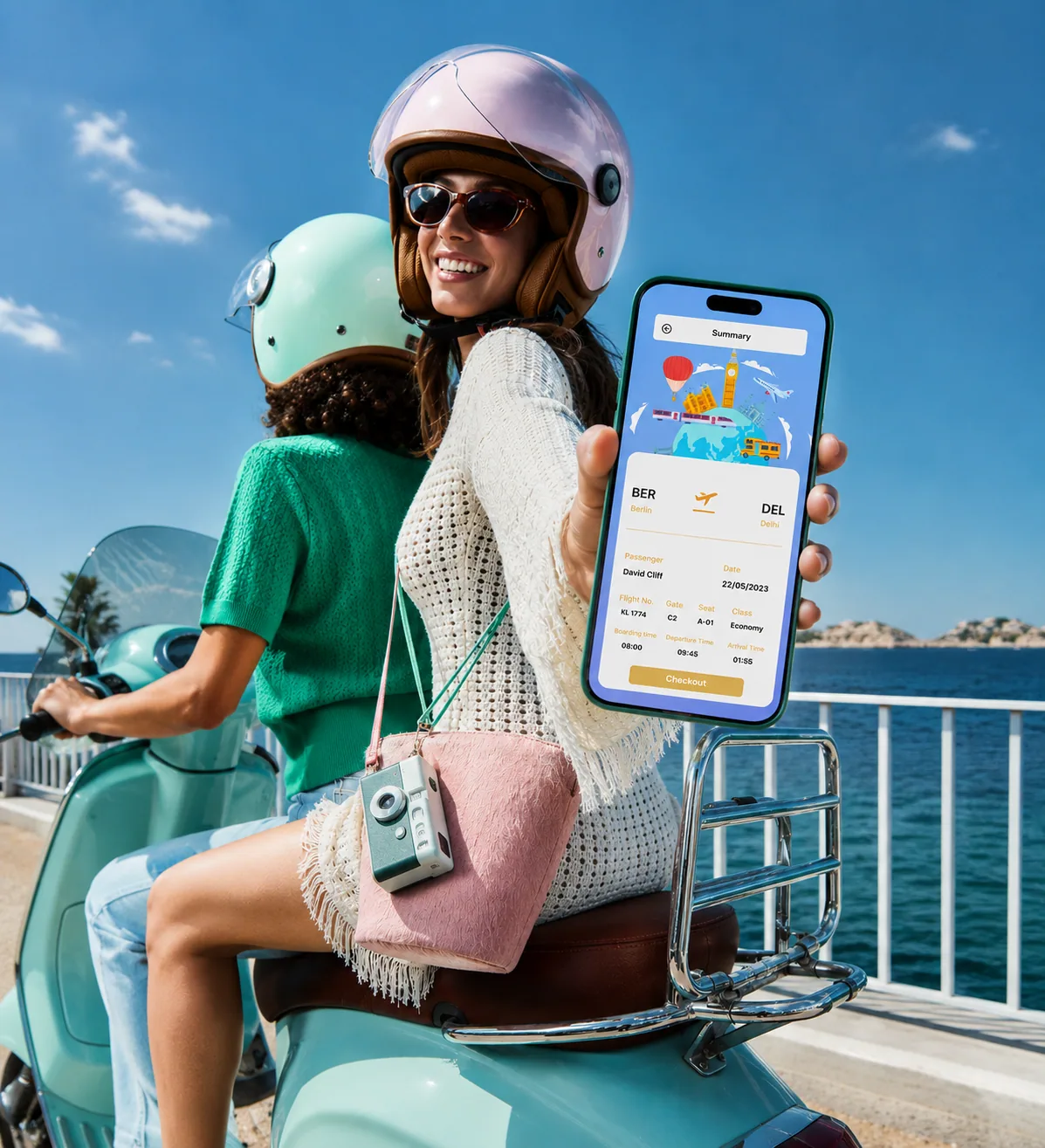
Hotels, flights and trains, with seat maps and one clear summary.
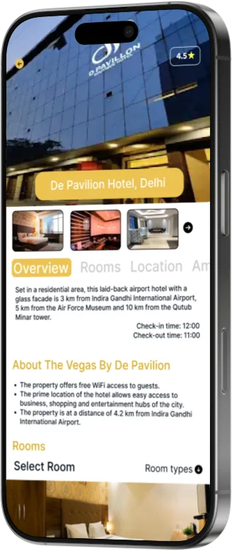
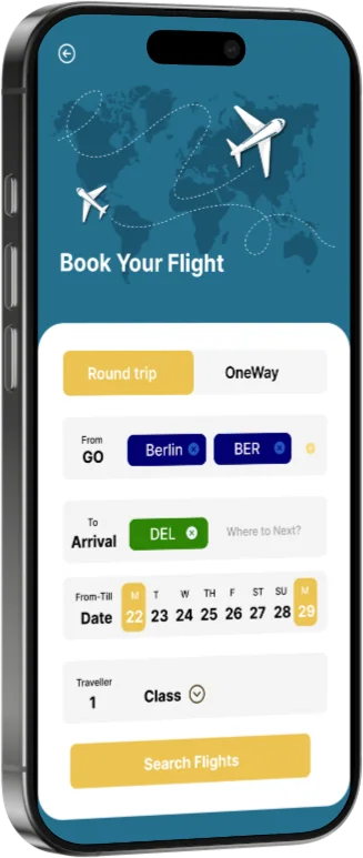
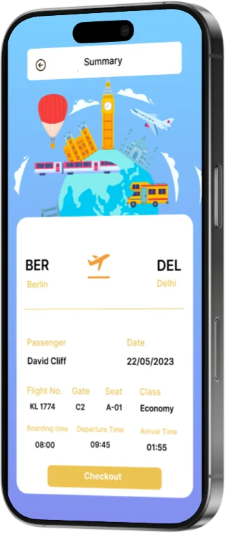
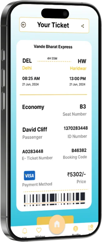
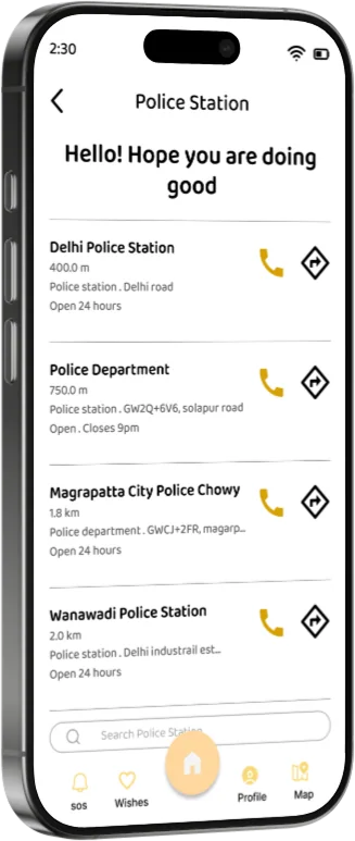
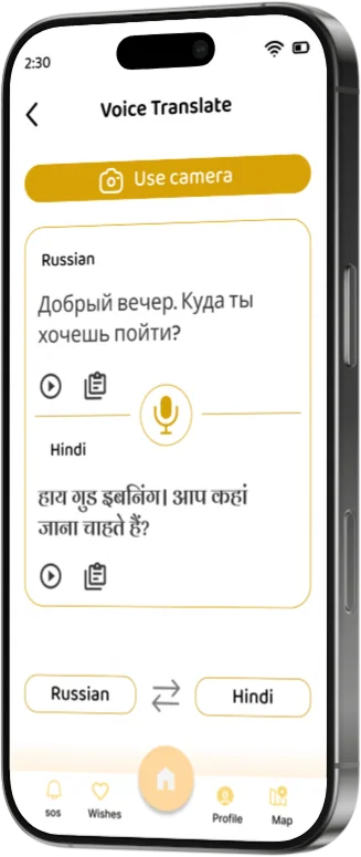
Police nearby with call and directions, and a two-way voice translator.
12 · Safety
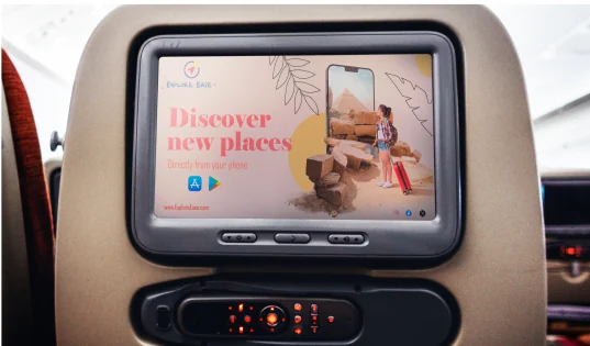
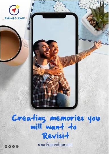
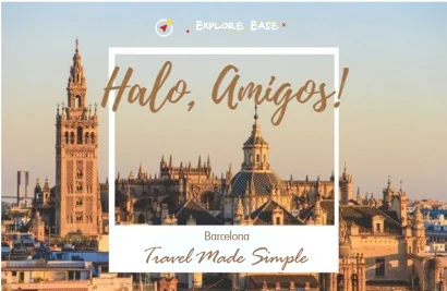
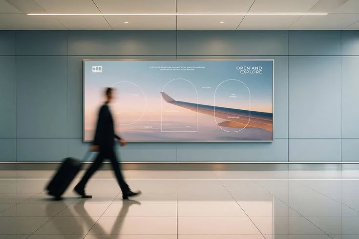
13 · Launch campaign
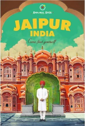
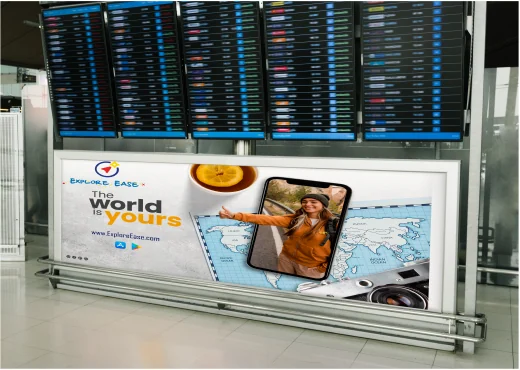
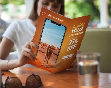
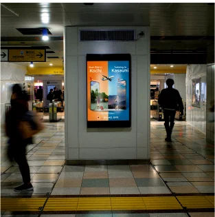
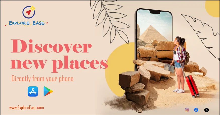
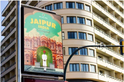
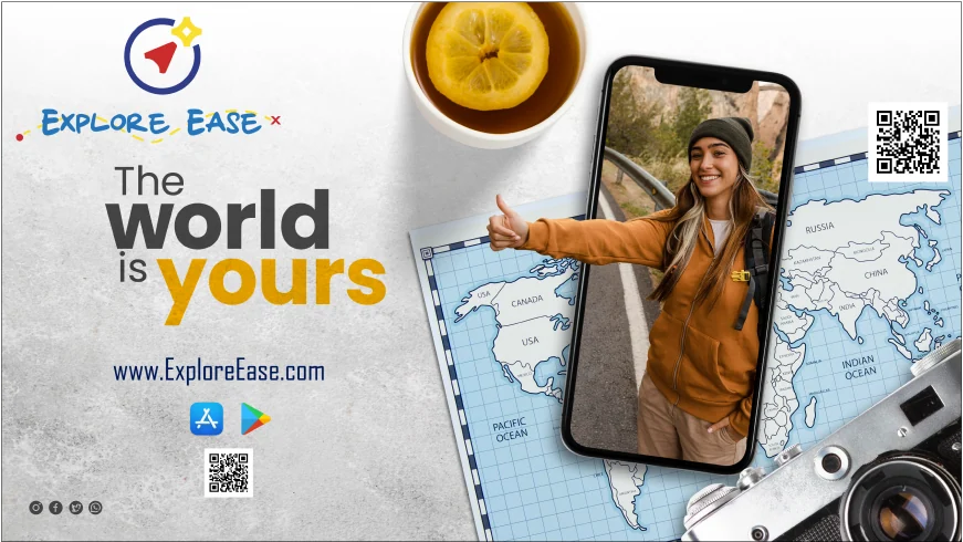
Where travellers already wait: airports, metro stations, seat-back screens, city billboards and their feeds.

14 · User testing
We sent the prototype to travellers and asked what worked and what didn’t.
The “help me plan my day” feature is quite unique and handy.
Good, but the tab bar icons change position when you switch sections.
It has everything a traveller needs; the functionality could improve.
All the information about a place before travelling. That’s great.
15 · Outcome & impact
Discover, plan, book, guide and SOS in one connected experience.
Verified guides with reviews, live location and help one tap away.
Testers liked having everything in one place and showed us exactly what to refine.
16 · Reflection
It earned its own tab, not a link buried in settings.
One moving tab bar icon was enough to confuse testers.
Listing the worst app made the right one obvious.
See the full project
Next project · 01 / 06
FotoOwl