Many features, no single story
Beam, ReelIt, Selection, Selling: each one strong, but nothing tied them together into one clear promise.
Case study · SaaS · AI photos · 2026
Designing where human insight meets machine imagination, from Mumbai.
How I shaped FotoOwl’s visual world, from the first moodboard to a mascot, a website, an app, a brand-new CRM, campaigns and a stand on the expo floor.
All projects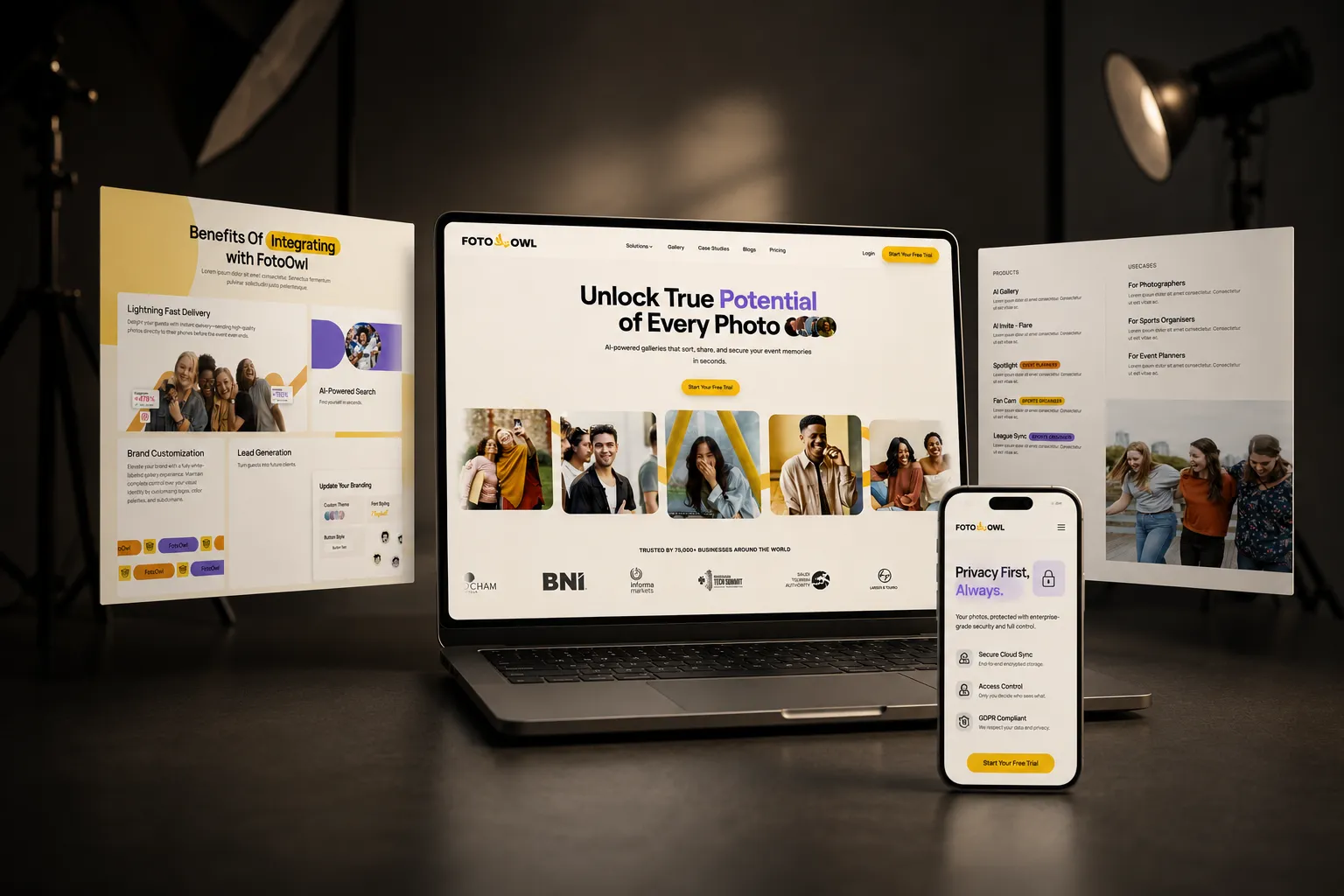
01 · Overview
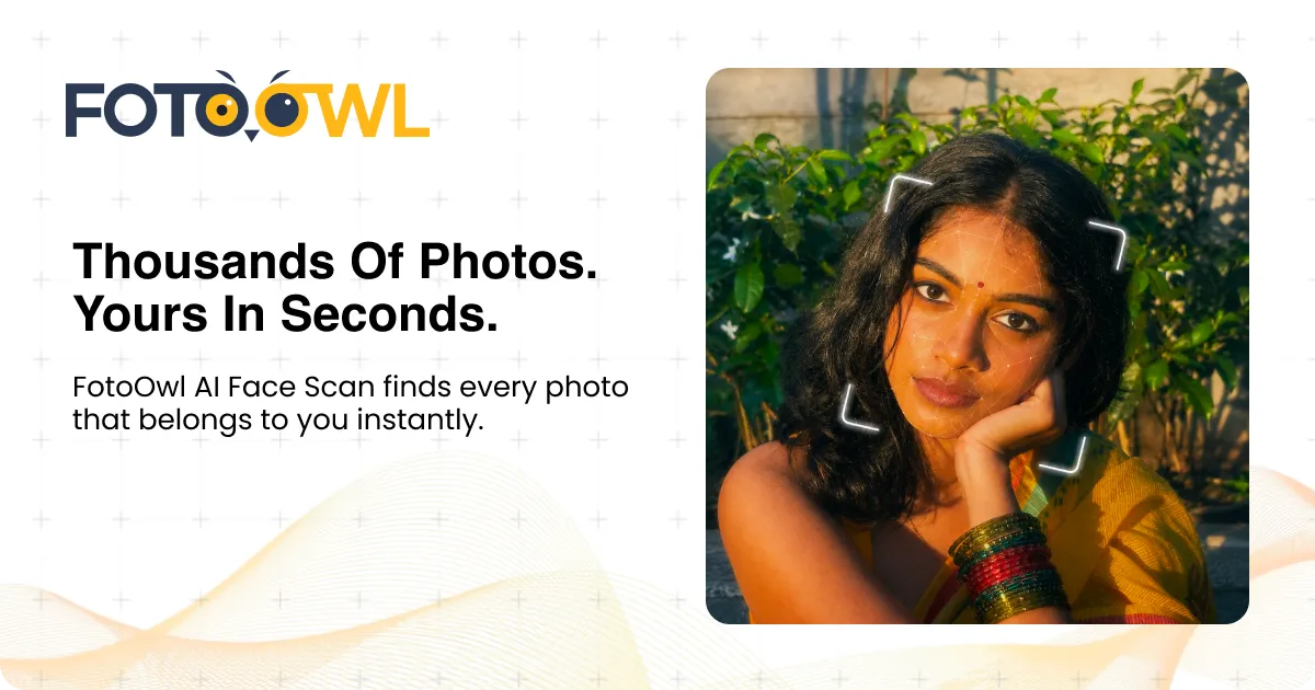
FotoOwl is an AI photo gallery for event photographers. A guest takes one selfie, and face recognition pulls out every photo they appear in, from thousands, at weddings, concerts, sports leagues and corporate events.
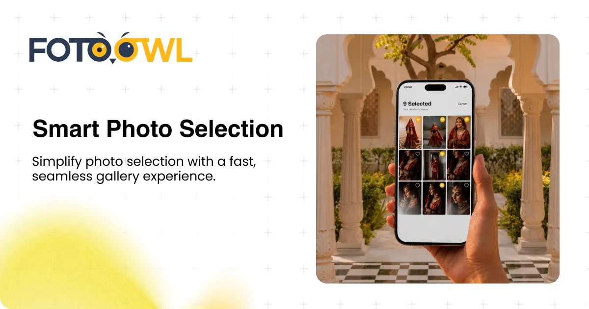
The product was already strong: Beam sends photos from the camera to the cloud in seconds, ReelIt turns every guest’s photos into a personal reel, and photographers can let clients pick favourites or sell prints right inside the gallery.
I joined as the Graphic and UI/UX Designer to make all of that feel like one brand: clear enough for a busy photographer, and warm enough for the guests who open the gallery.
Why it mattered: people don’t fall for features, they trust faces. FotoOwl needed a look that felt as happy as the moment a guest finds their own photo.
What I did
02 · The challenge
Each feature spoke a slightly different visual language. Posts, website sections and sales material had been made at different times, and it showed. A photographer seeing FotoOwl for the first time, in a feed or walking past a stand, couldn’t tell in one glance what it did or why it was different.
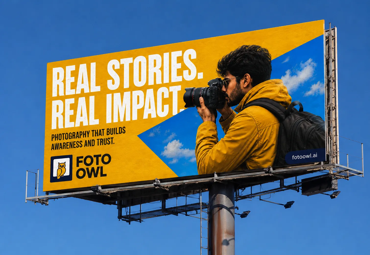
My goal: one warm, confident visual system that explains the product fast, works from a phone screen to a billboard, and stays in memory long after someone scrolls past.
Beam, ReelIt, Selection, Selling: each one strong, but nothing tied them together into one clear promise.
Photography is emotional. The visuals felt like software, not like the joy of seeing yourself in a great photo.
No character, no signature moment. Easy to like in the moment, easy to forget after the expo.
03 · Research
I started with the people who use FotoOwl. I went through the product as a photographer and as a guest, worked closely with the marketing and product teams, and studied how photographers talk about delivery on Instagram and at expos.
I also looked at how other gallery and delivery tools present themselves. Most leaned on cool blues and generic dashboards, which left room for FotoOwl to feel warmer, brighter and more human.
Who I designed for
Shoots thousands of photos in a day. Wants to deliver fast, look professional and earn more from every event.
Doesn’t want to scroll a folder of 5,000 pictures. Just wants their own photos, on their phone, right now.
From weddings to cricket leagues: needs fans engaged, sponsors seen and memories shared before the crowd goes home.
What I learned
“From camera to guests within minutes” had to be felt in every visual: quick to read, bold, nothing in the way.
Real people with real cameras worked far better than abstract tech graphics. So the camera stays in the picture.
Instead of replacing it, I made it brighter and gave it a calm partner in deep navy.
04 · Inspiration
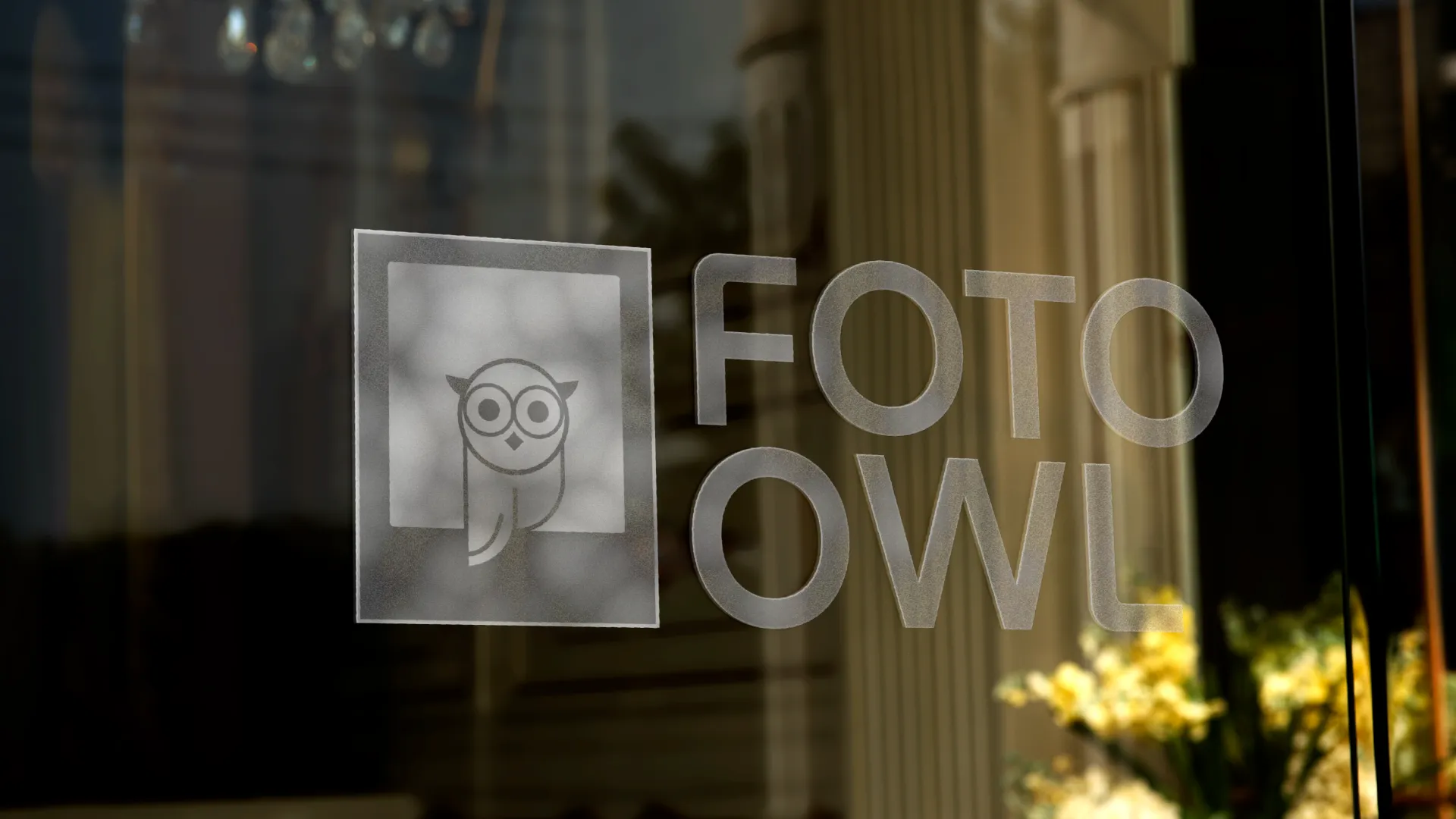
The idea came from photography itself: the warm light of golden hour, the pop of a flash, the white frame of a Polaroid.
And the owl, an animal that sees in the dark and spots everything, became the perfect symbol for face recognition that never misses a single guest.
05 · Branding
Step 1 · Sketch
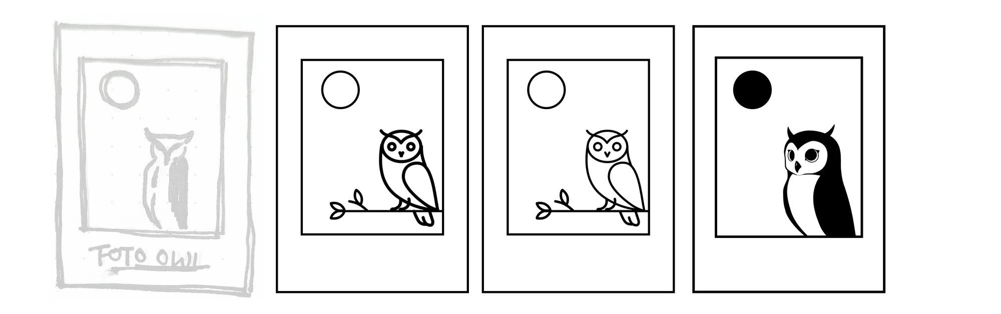
Photography and AI in one simple shape. Every round took detail away until only the essentials stayed.
Step 2 · Construct
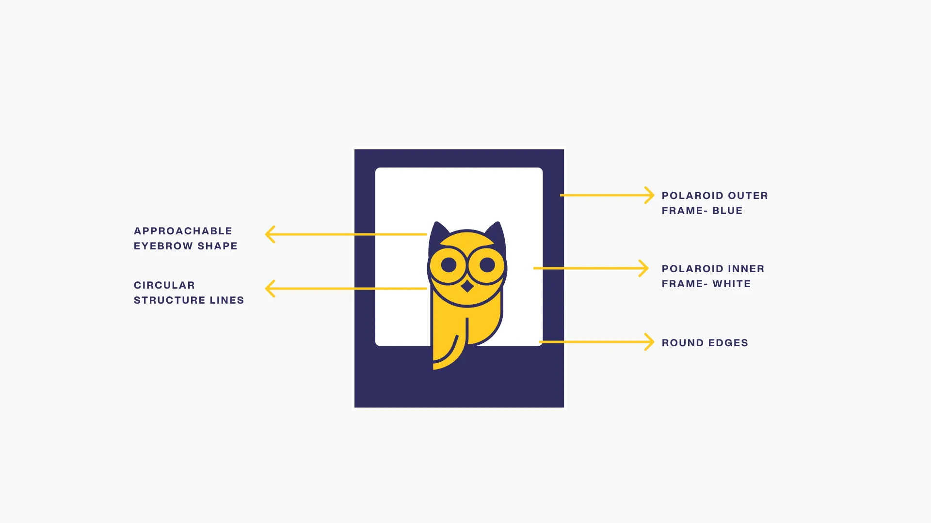
Rounded edges, a circular structure and a soft eyebrow keep the owl approachable at any size.
Step 3 · System
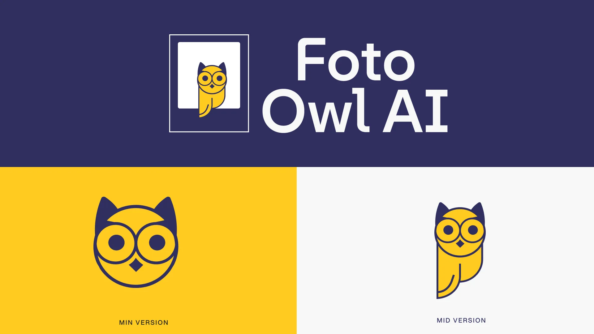
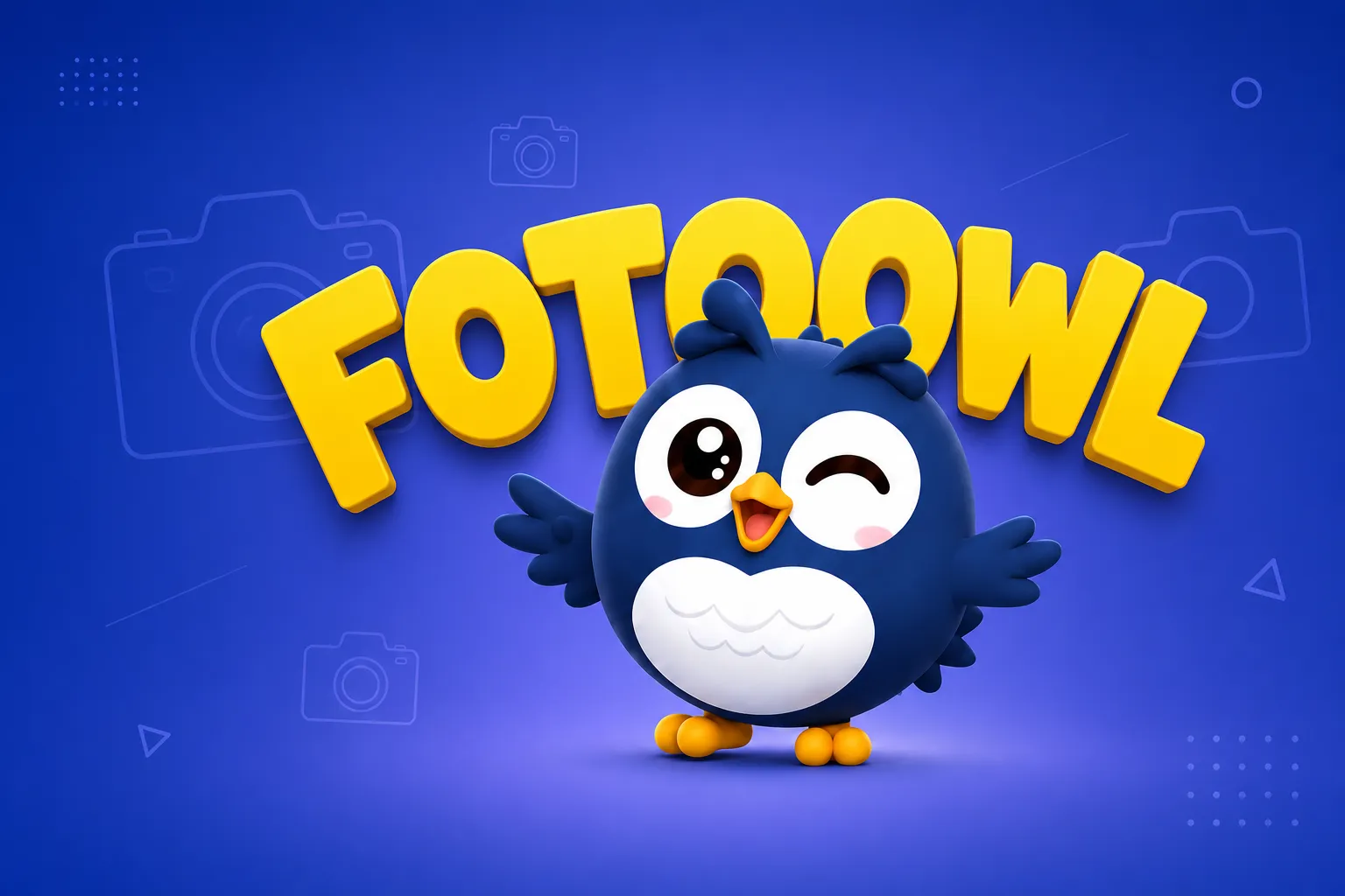
A full lockup, an app icon and a standalone owl, in yellow, navy and white.
Step 4 · Type
Plus Jakarta Sans for the brand, Bebas Neue for big campaign headlines, Poppins and Inter for everything people read.
Colour
Typography
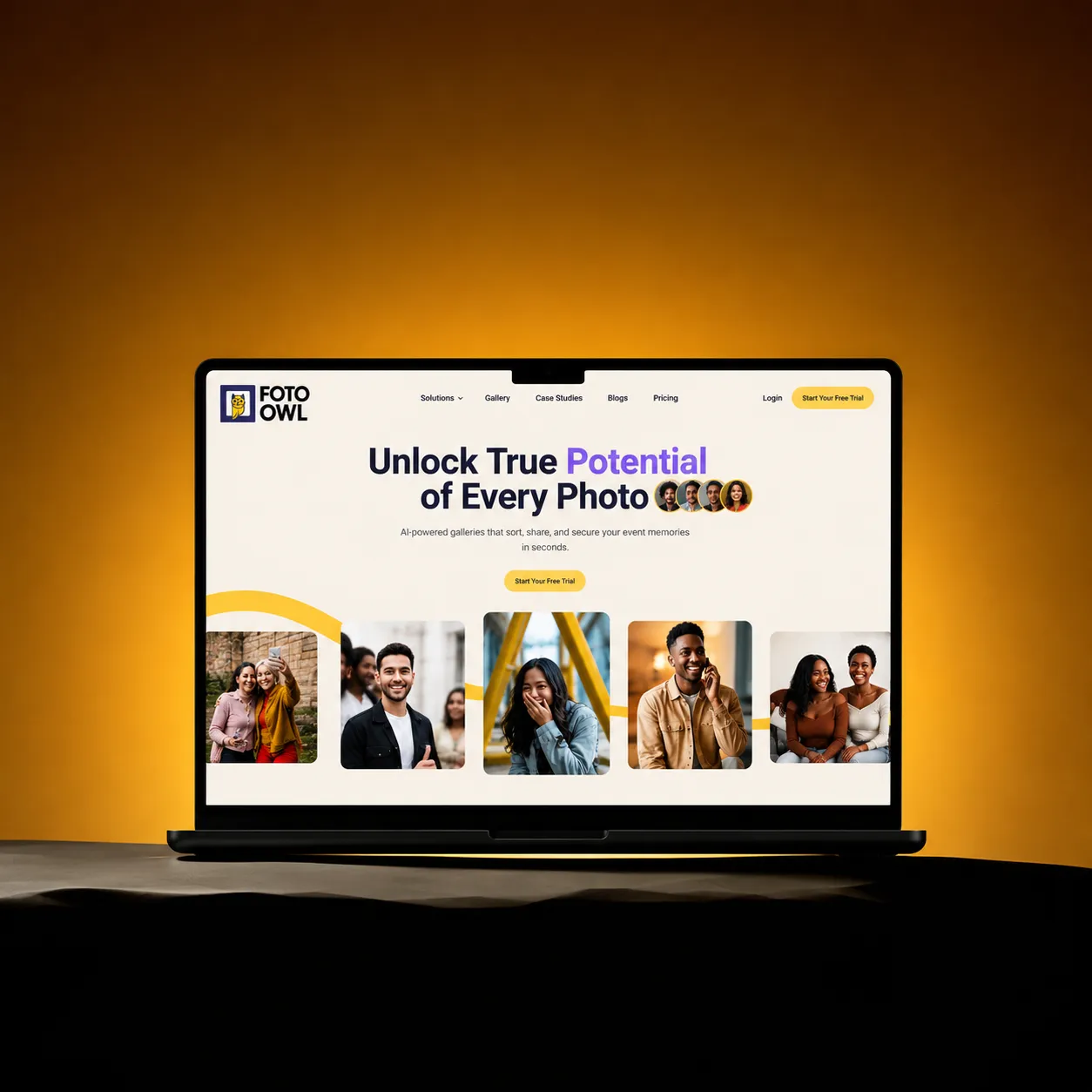
Unlock true potential of every photo.
ExtraBold 800 · Regular 400 · fotoowl.aiAI FINDS YOU.
Owl yellow + thin dark outline · Play Store, postsUpload a selfie and discover every photo you’re in
Light 300 · SemiBold 600 for the words that matter₹18.4L booked · 68.5% collected
Regular 400 · SemiBold 600 · Studio CRMEach typeface has one job. The website speaks in Plus Jakarta Sans: round and friendly, still sharp at small sizes. For the store and campaigns I switched to Bebas Neue, tall and condensed, so three words can fill a phone screen, with a thin dark outline that keeps yellow readable on white. Poppins carries the one supporting line, and inside the product Inter keeps numbers and tables calm.
06 · Mascot
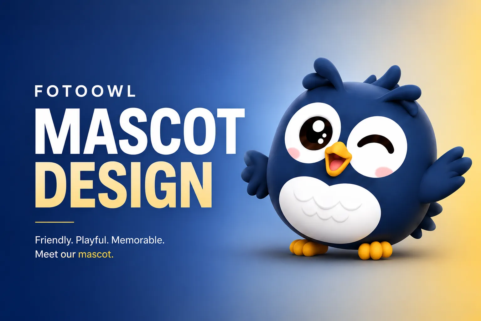
A logo explains. A mascot connects. I designed an owl character that could show up wherever FotoOwl talks to people: onboarding, error screens, social posts and the expo floor.
Personality
1 · Sketch
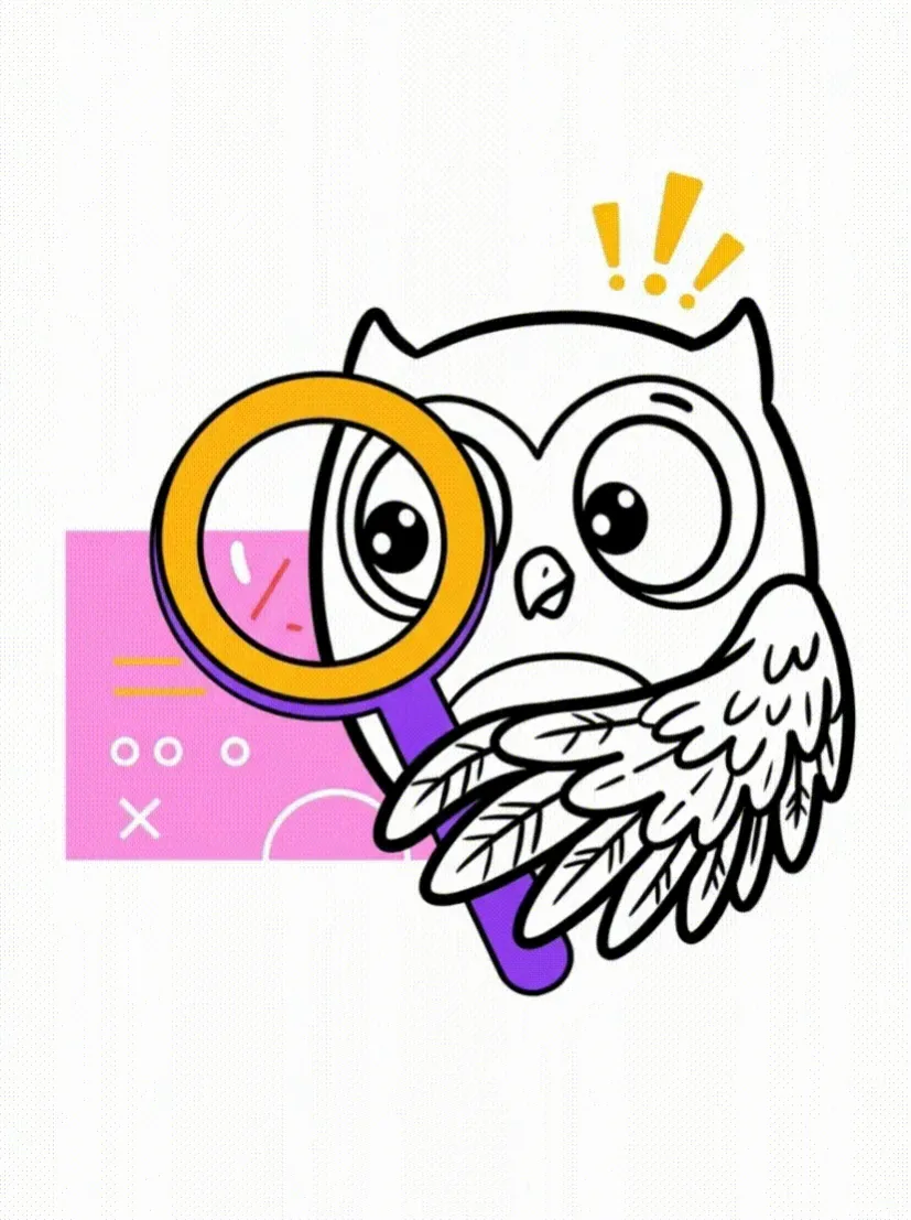
Loose line art first: big curious eyes and a magnifying glass, because finding faces is its job.
2 · Explore
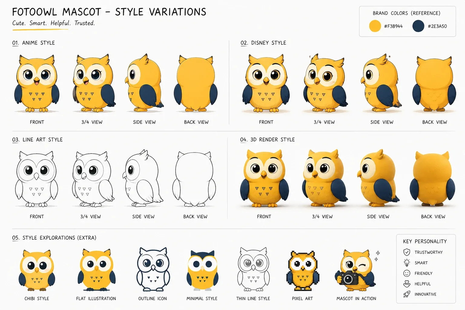
Anime, Disney-like, line, 3D, pixel and flat, each in front, ¾, side and back views, so it stays the same owl everywhere.
3 · Give it form
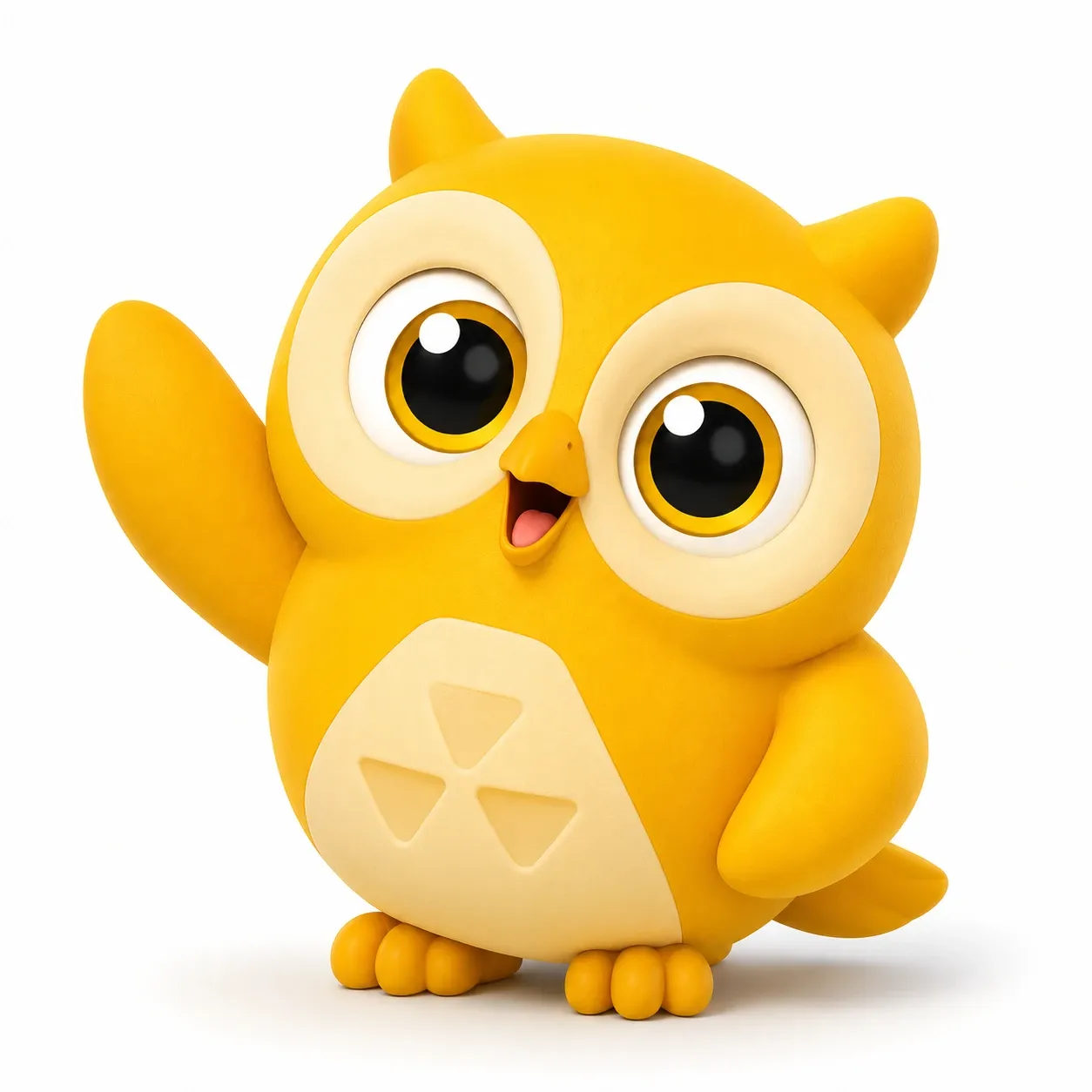
A 3D version gave it weight and warmth for campaigns, in a yellow and a navy edition.
4 · Bring it to life
Waving hello, blinking, turning its head: small motions that make a brand feel alive.
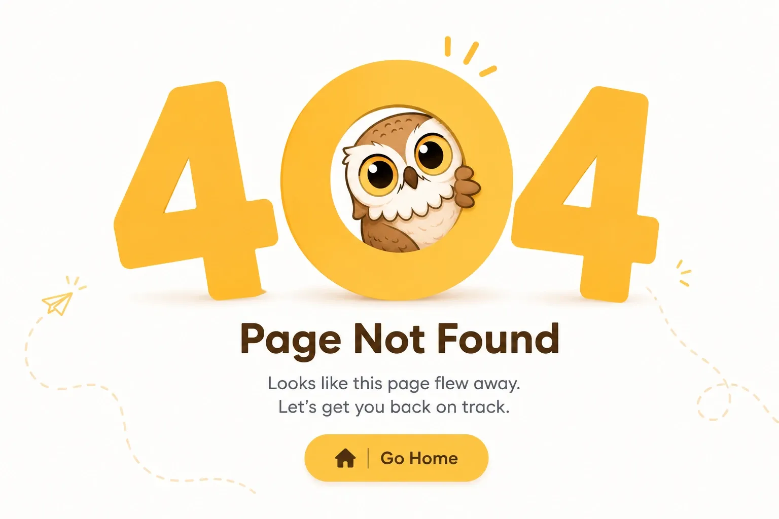
Moments that usually frustrate people became small, friendly scenes: the page that “flew away”, the owl staring at a dead Wi-Fi signal, the owl buried under a box of loose prints.
07 · Website
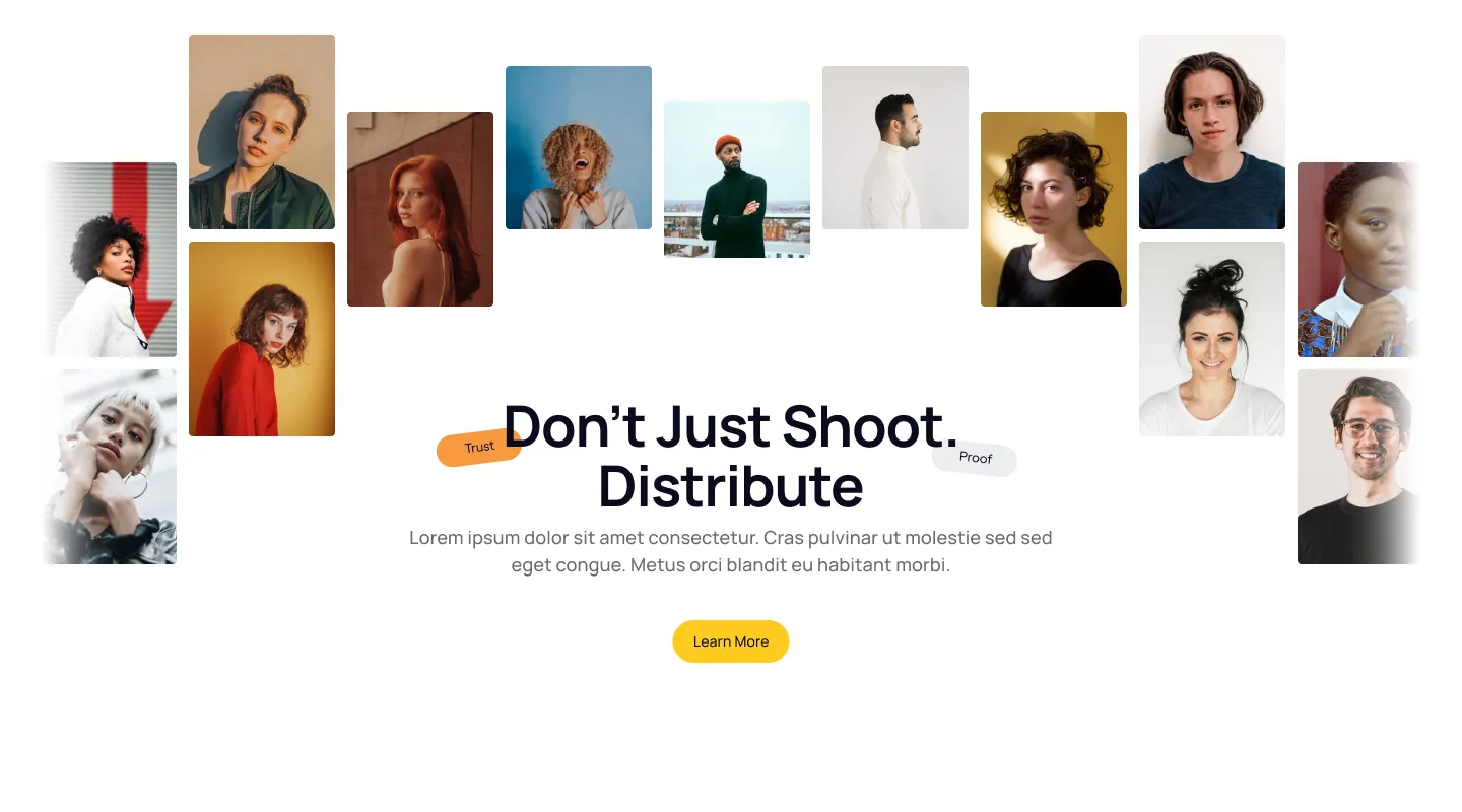
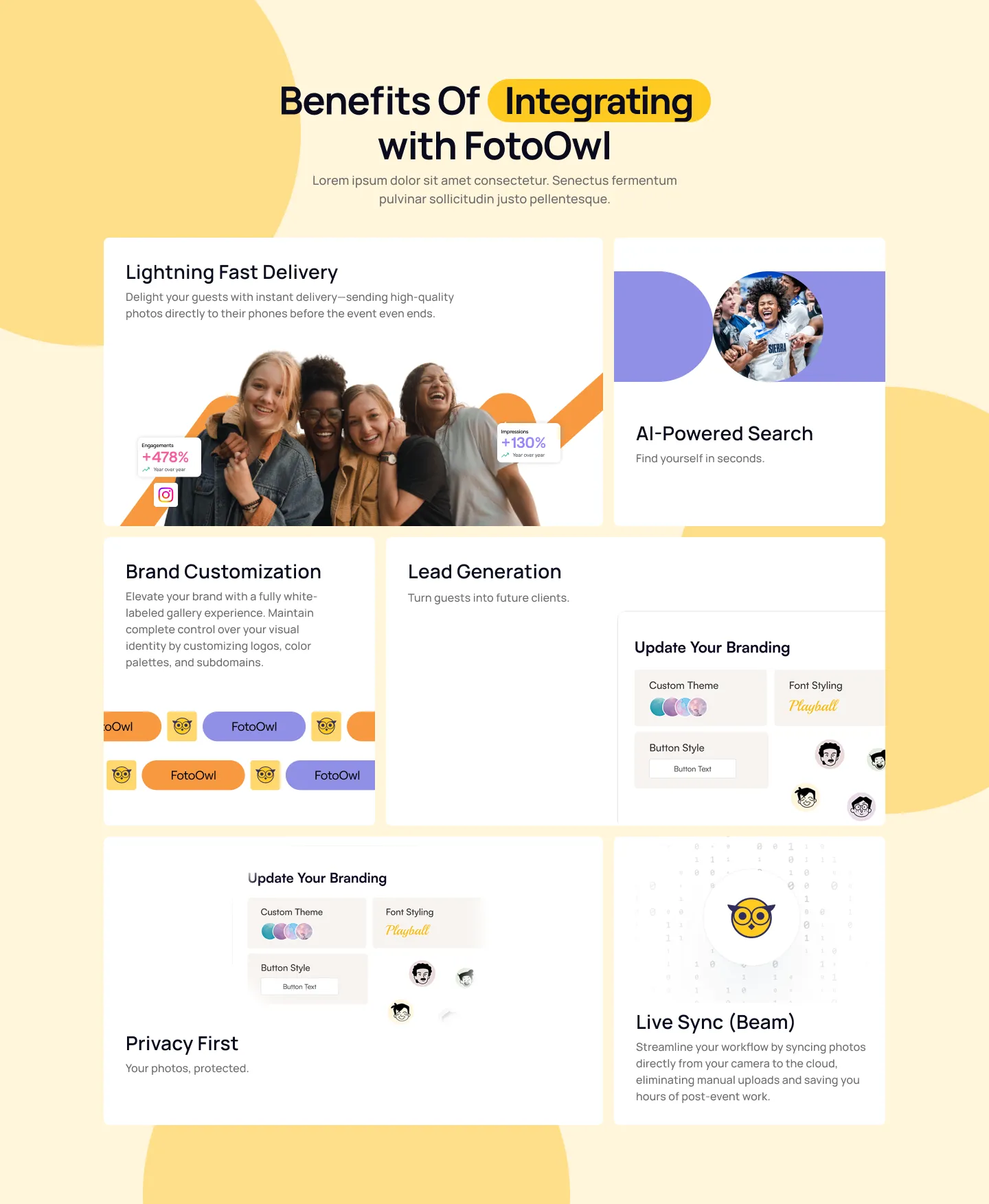
On the website, my job was to make a complex product easy to read. The hero leads with the outcome, real faces show it’s about people, and every feature gets its own short, scannable block.
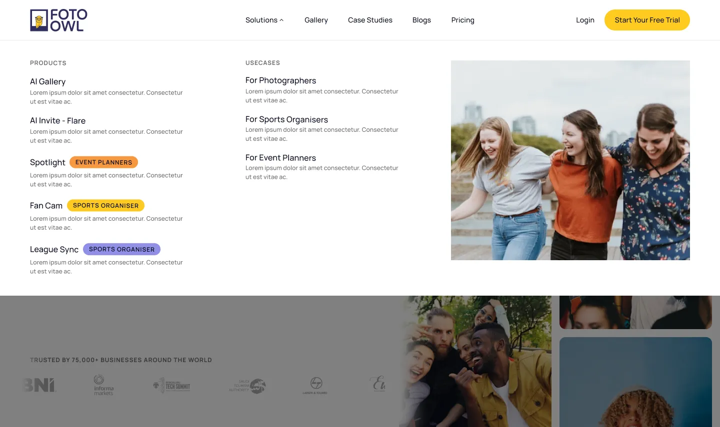
The menu sorts solutions by who you are (photographer, sports organiser or event planner) so nobody has to decode product names to find what they need.
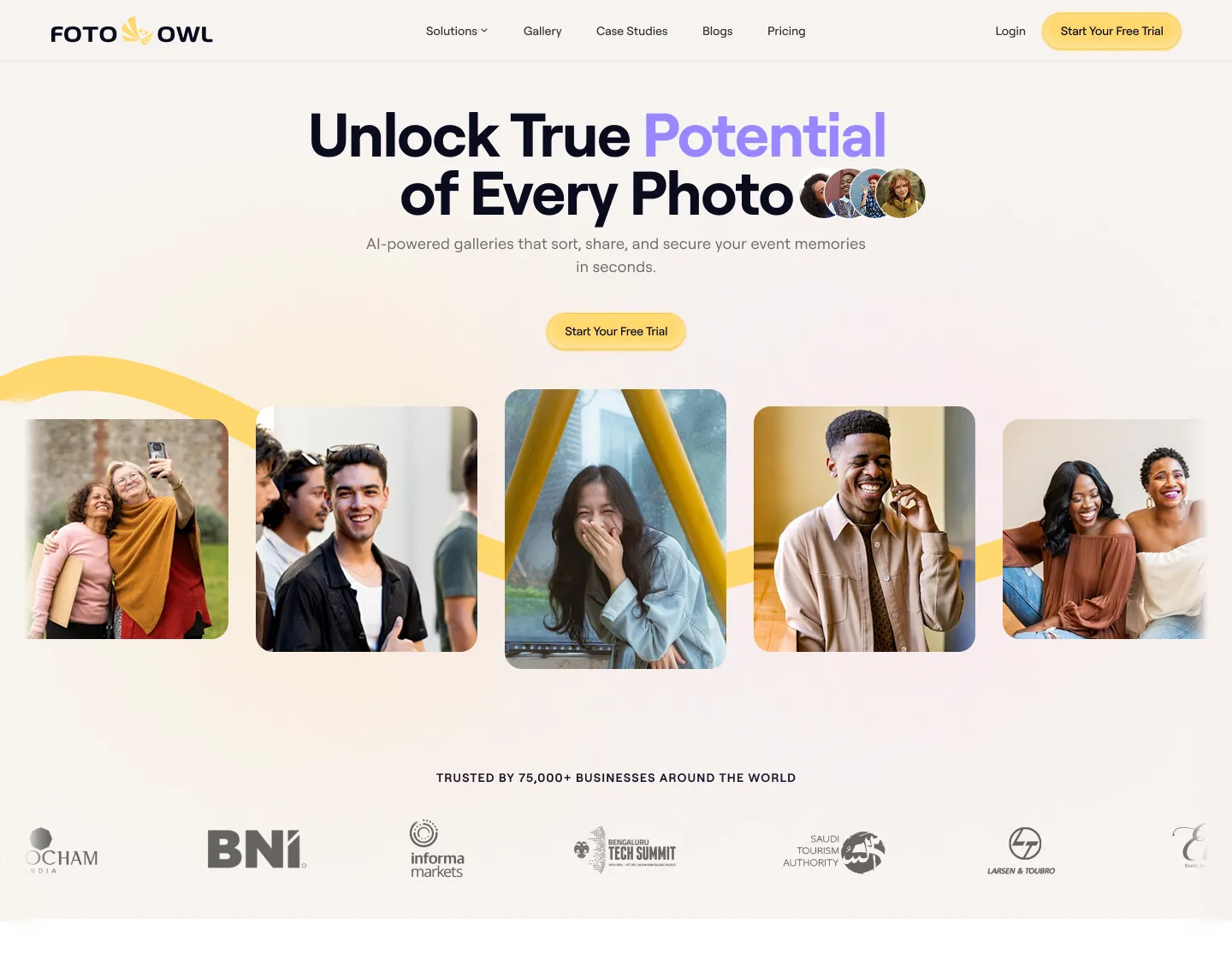
The full page
Keep scrolling: the page runs inside the frame, from the hero through features, use cases, pricing and the footer.

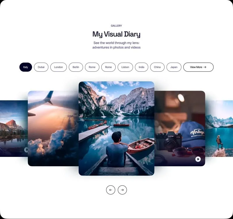
Sample galleries
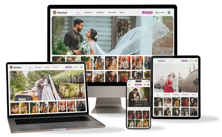
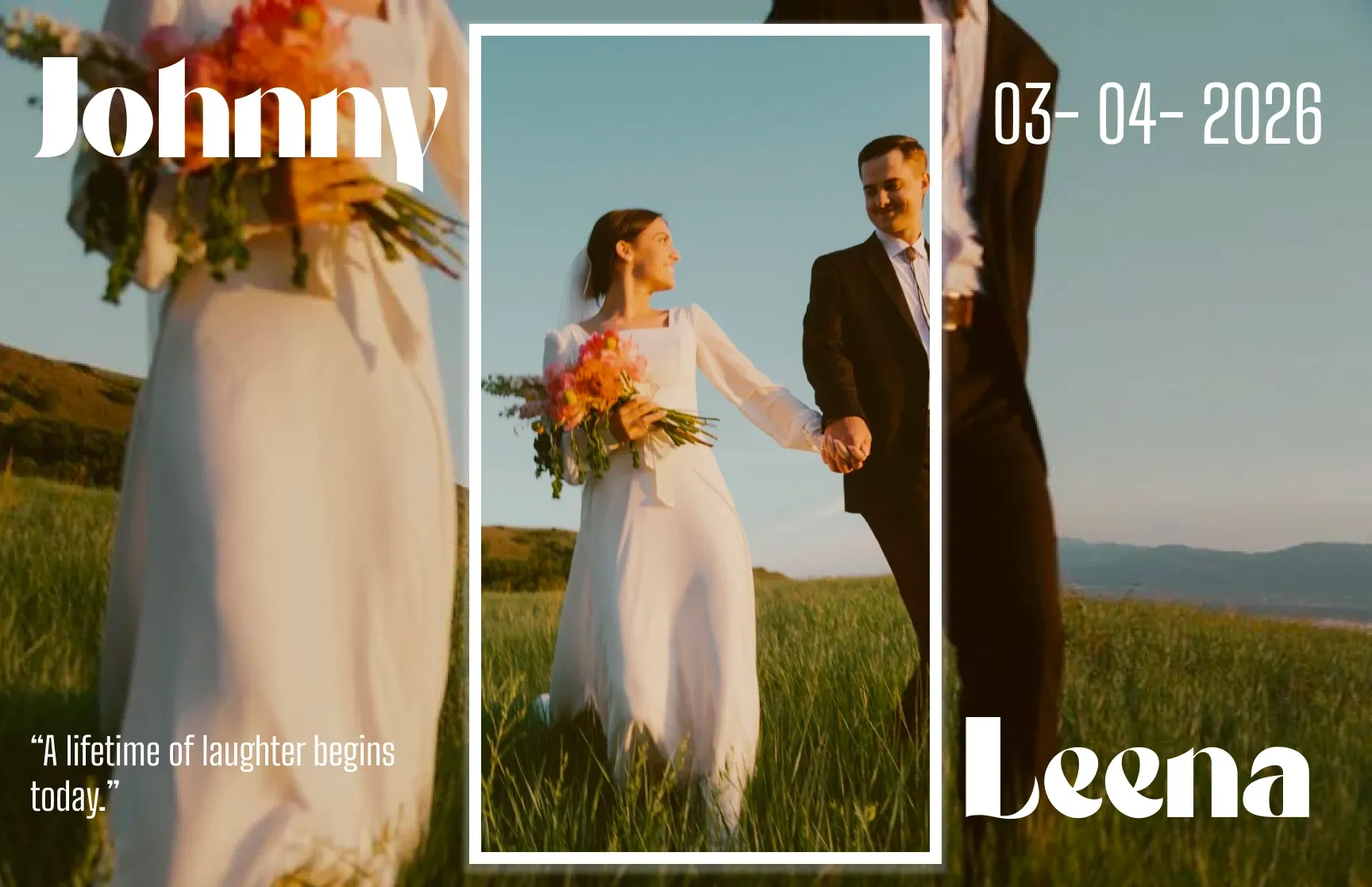
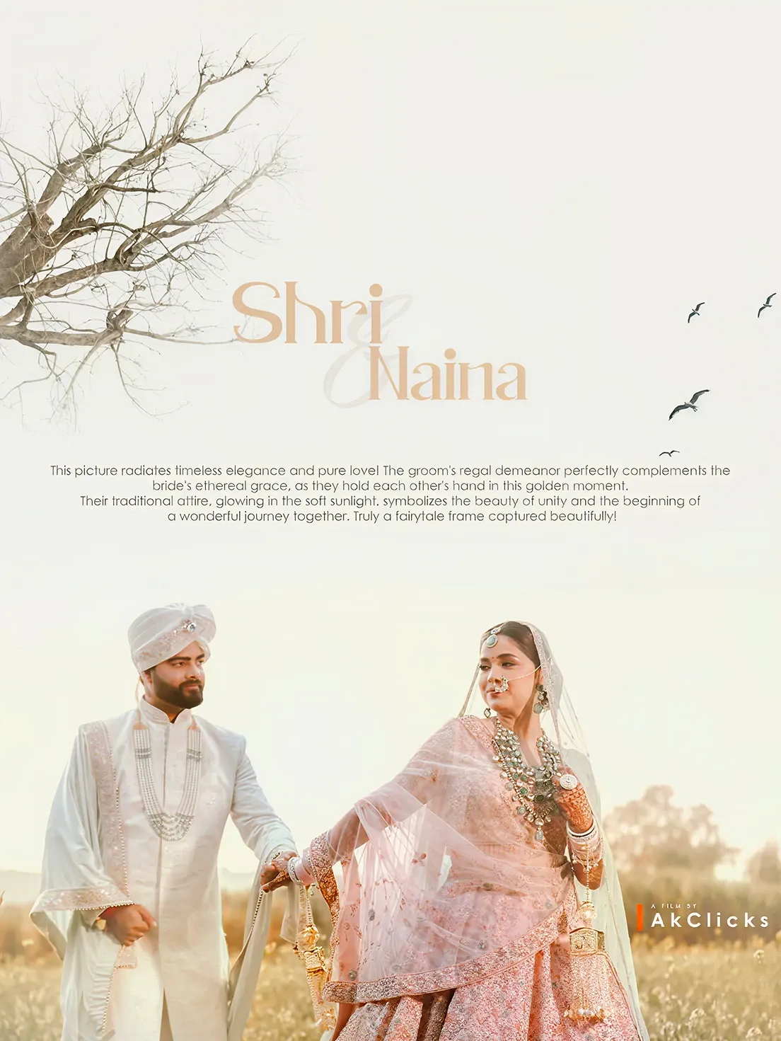
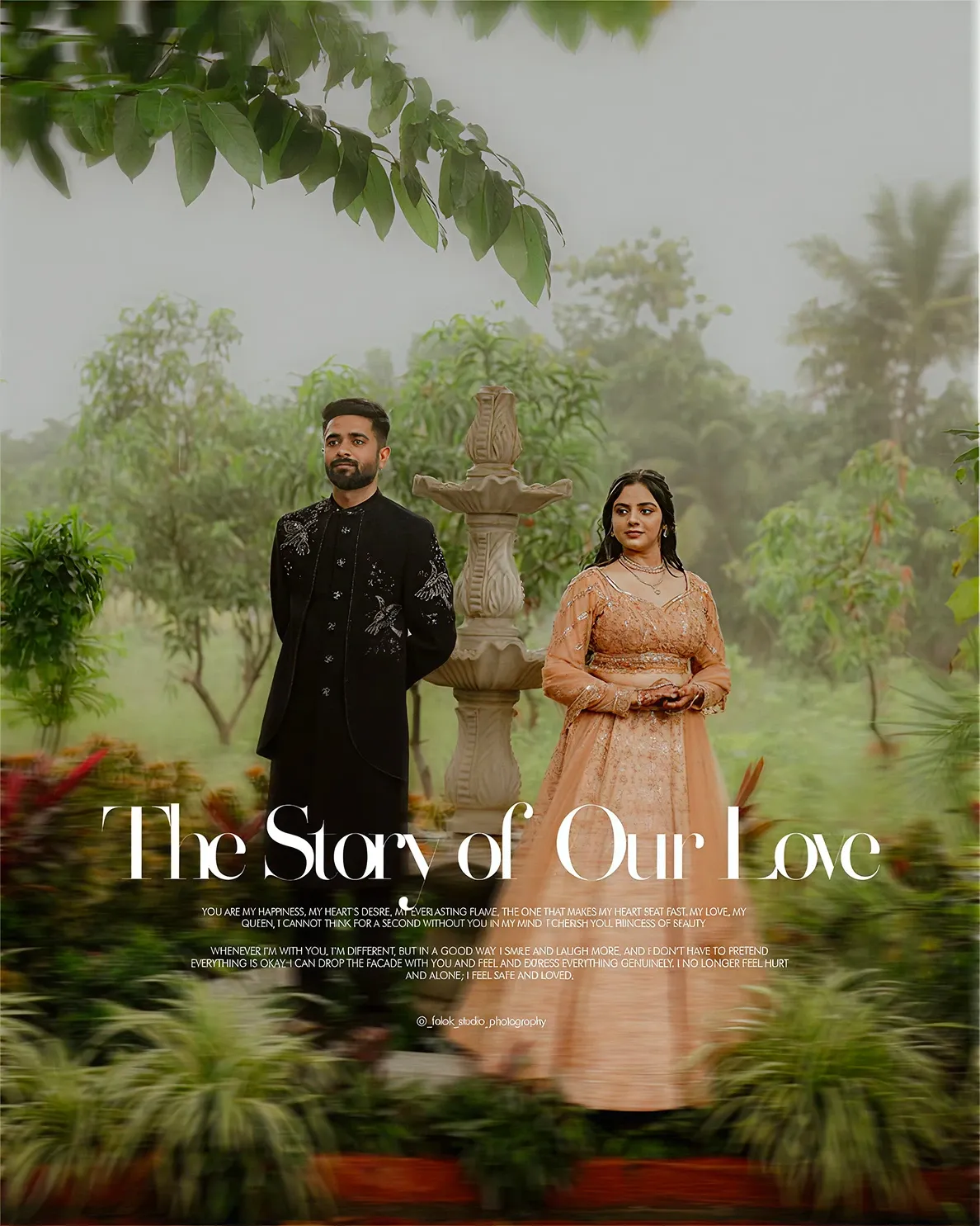
Photographers judge a gallery tool by how their own work will look inside it. So for the website’s sample galleries I designed editorial wedding covers: the couple’s names set big, one short line of story, soft natural light. Each cover shows a different mood a studio could choose.
Link previews
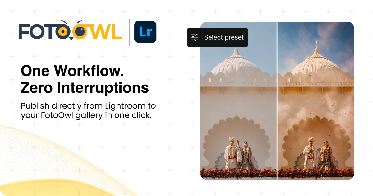
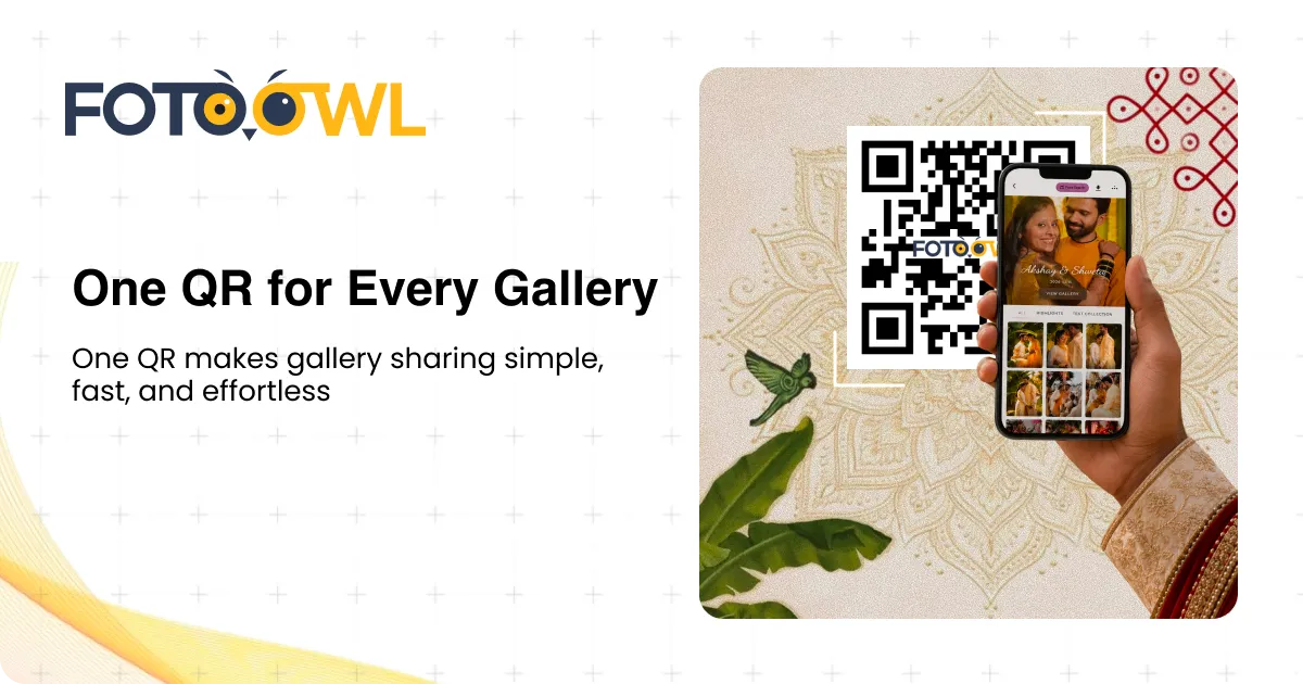
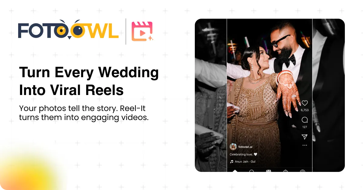
Photographers share FotoOwl links all day, on WhatsApp, LinkedIn and email, and every link opens into a preview card. I designed one for each product, all on one grid: logo top left, a promise in a few words, one supporting line, and a picture of the feature at work (a face scan, a Lightroom before and after, a QR code in hand).
Studio Aarav · Photography
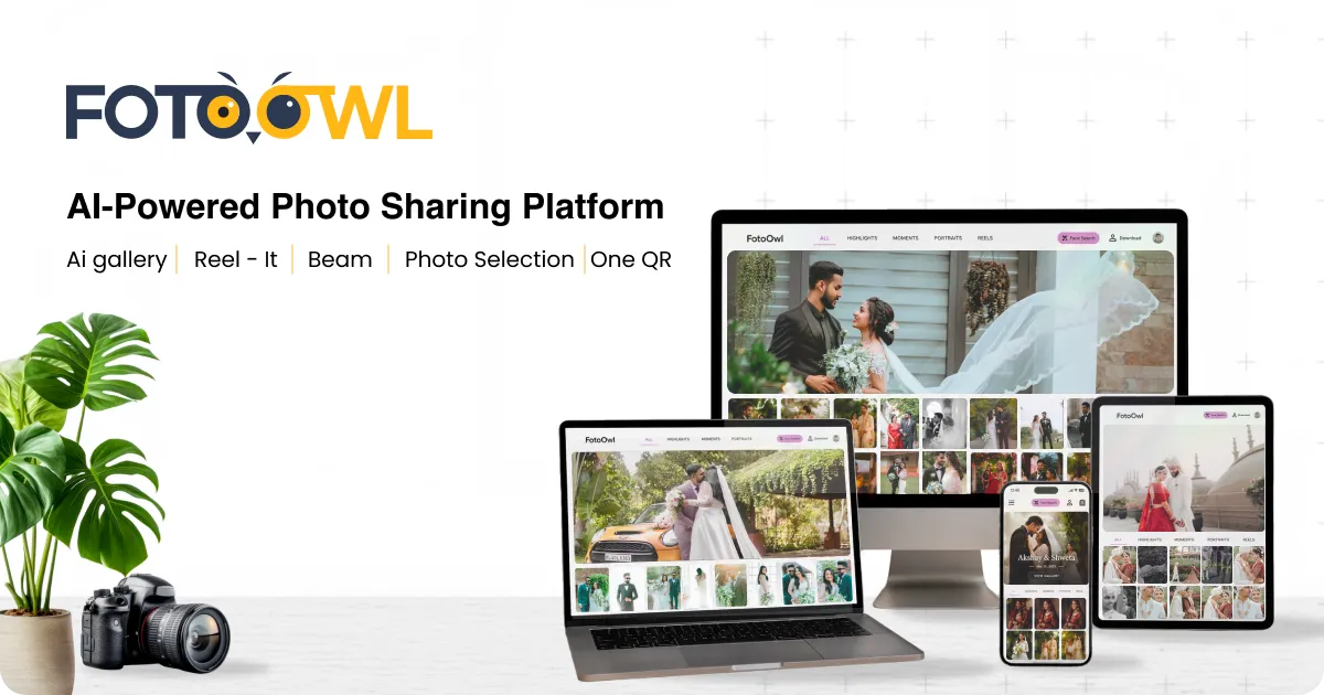
FotoOwl · AI-Powered Photo Sharing Platform
fotoowl.ai
Your wedding gallery is live. Scan your face and find all your photos.
9:41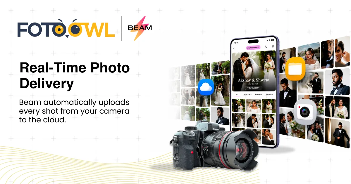
08 · Mobile app
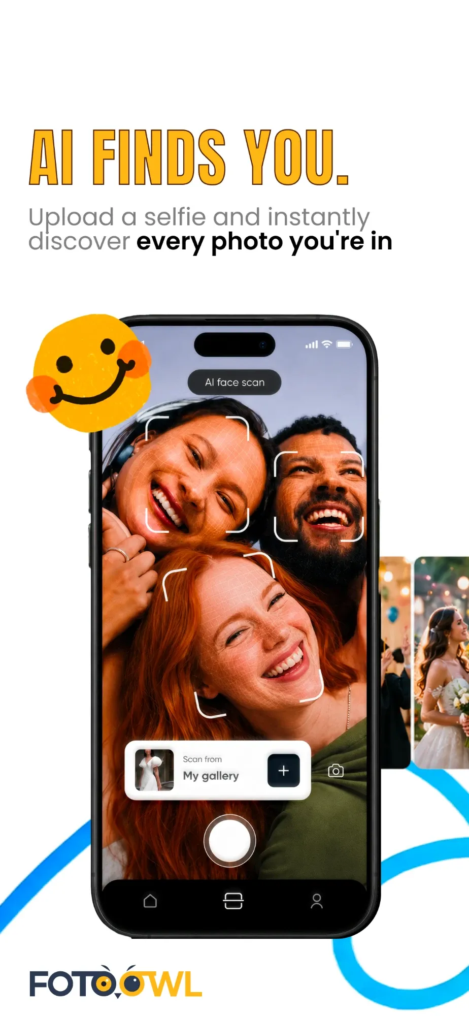
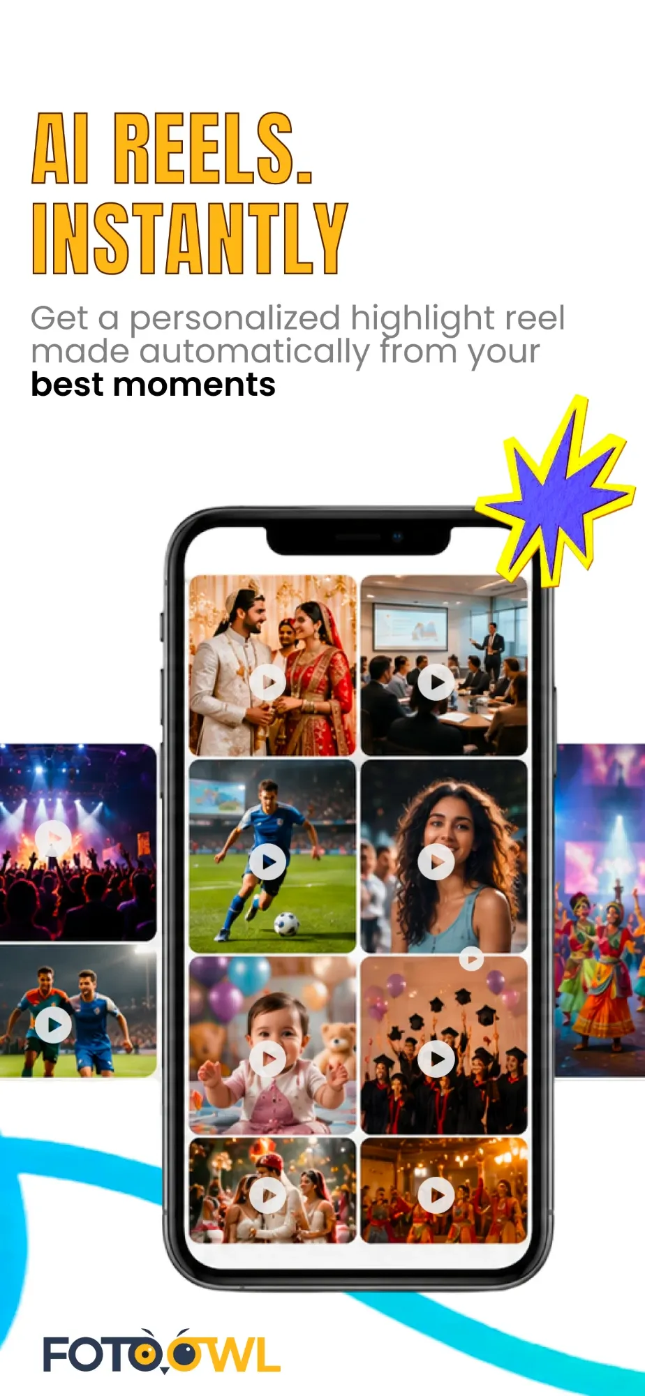
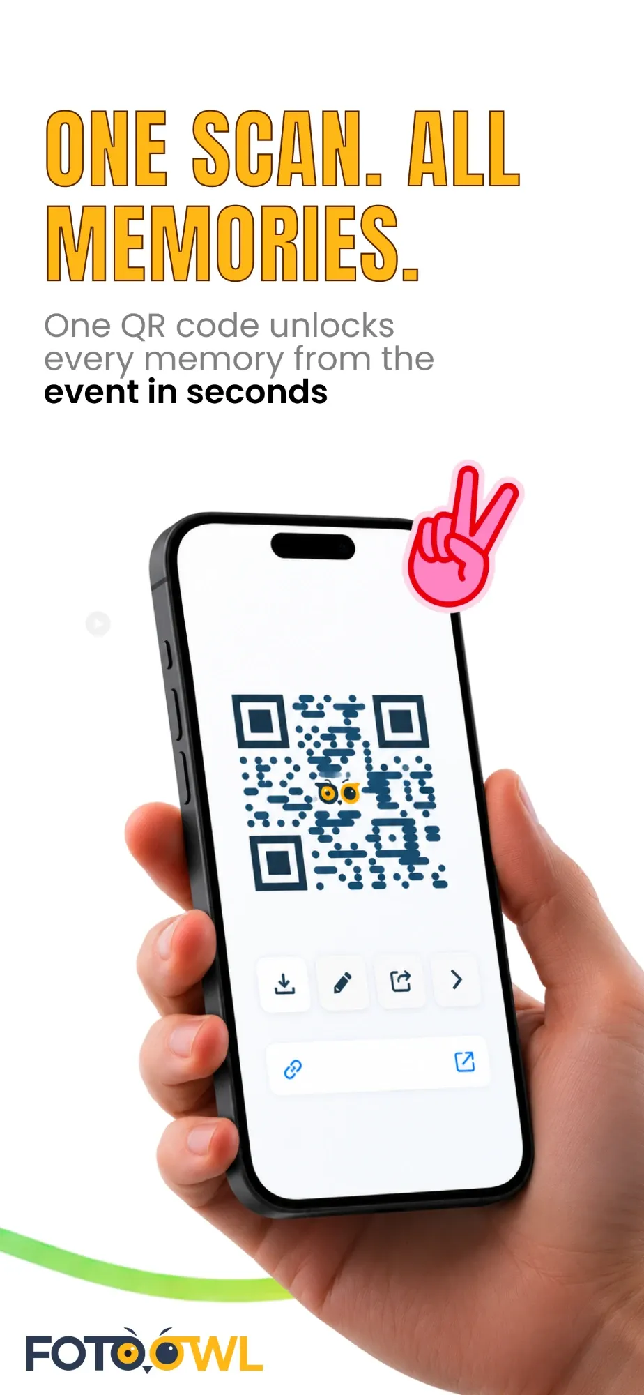
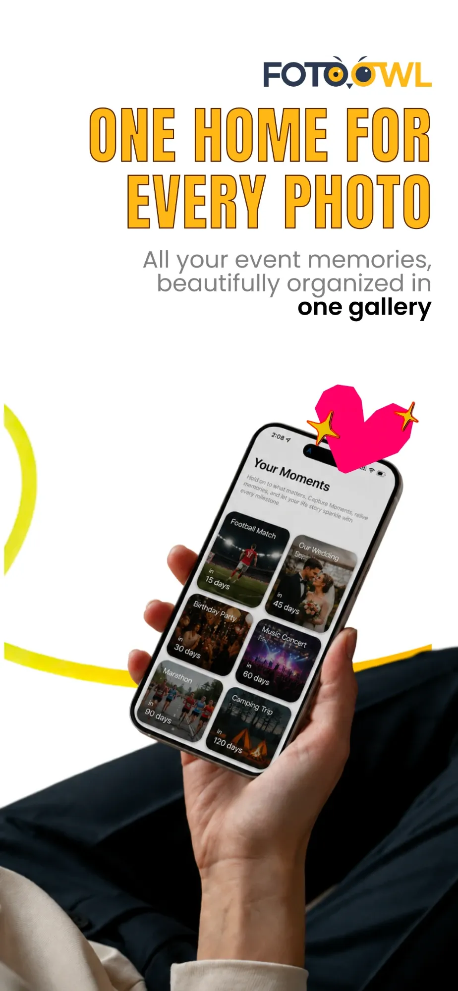
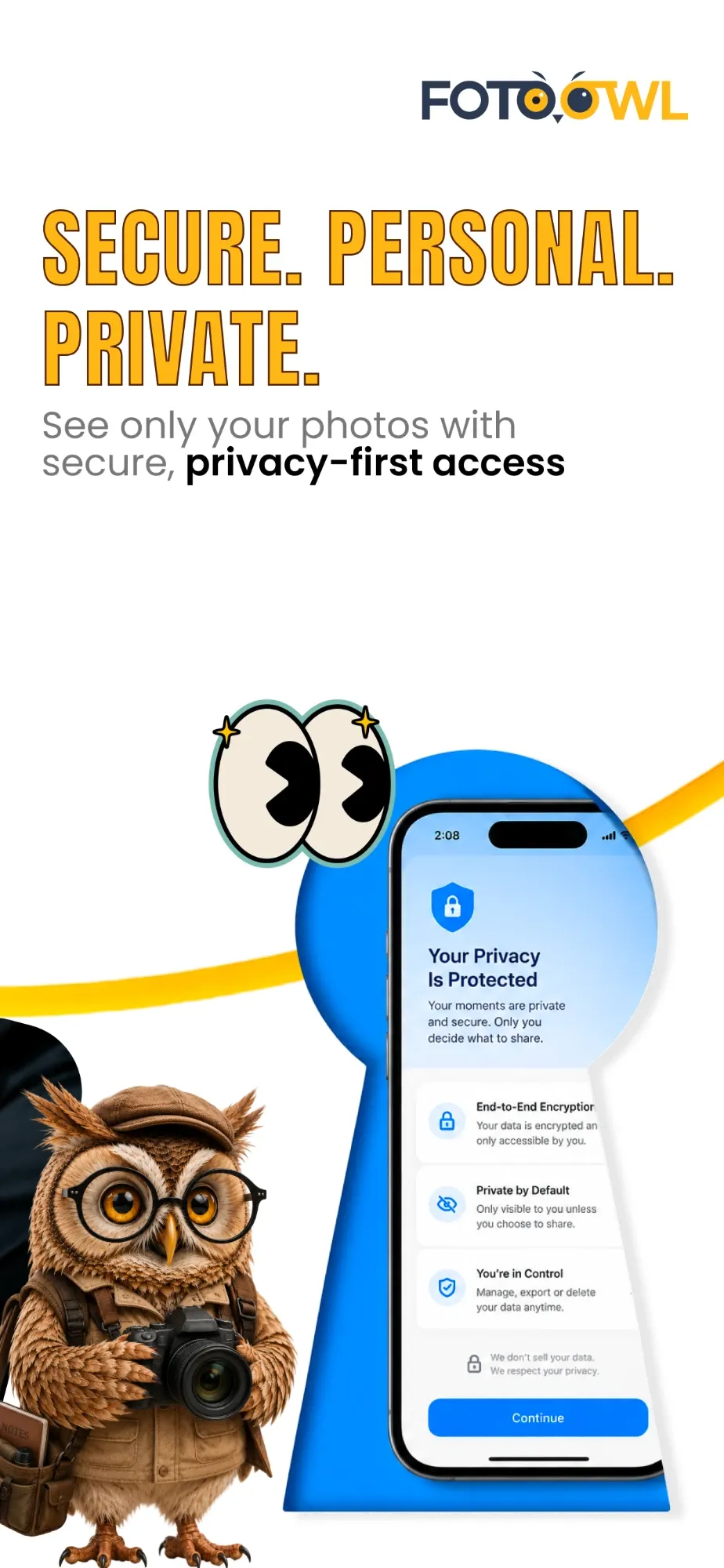
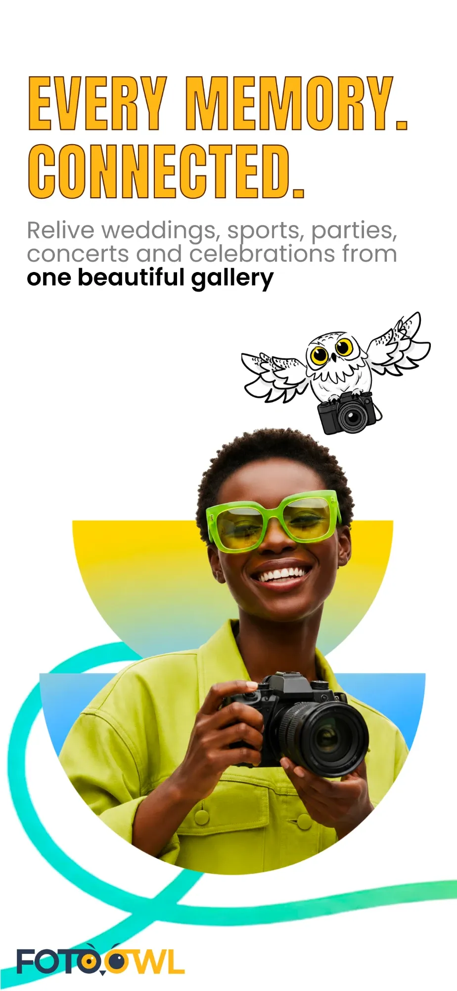
The FotoOwl Gallery app is judged on its Play Store page, in a few swipes. So every screen sells one benefit in three or four words, with the real app on a real phone.
How I built them: Bebas Neue headlines in owl yellow with a thin outline, one Poppins line with the key words in bold, a coloured ribbon that flows from screen to screen, and a hand-drawn sticker on each (a star, a peace sign, a heart, googly eyes), so the page feels like a celebration, not a manual.
Scroll · the store listing
01 / 07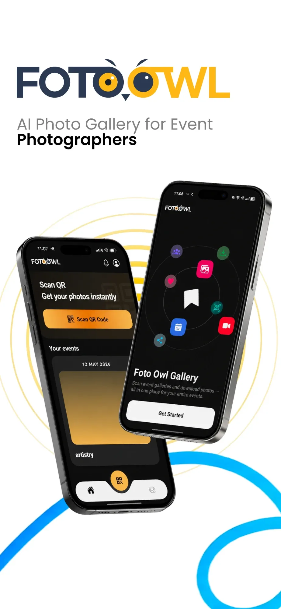
09 · Studio CRM
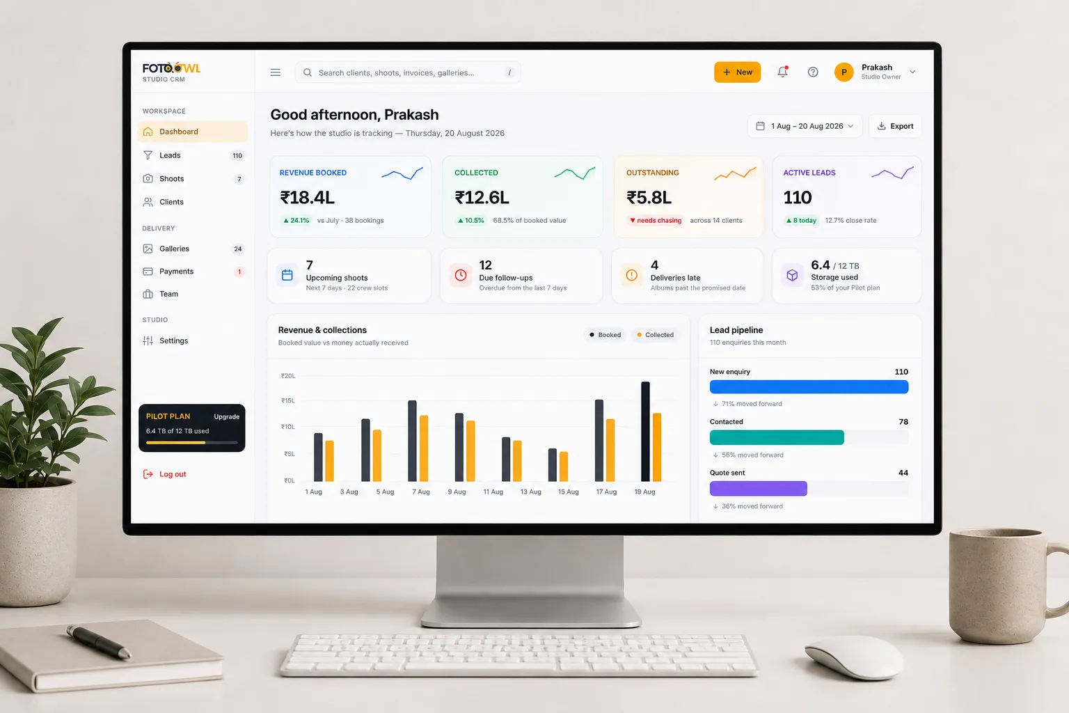
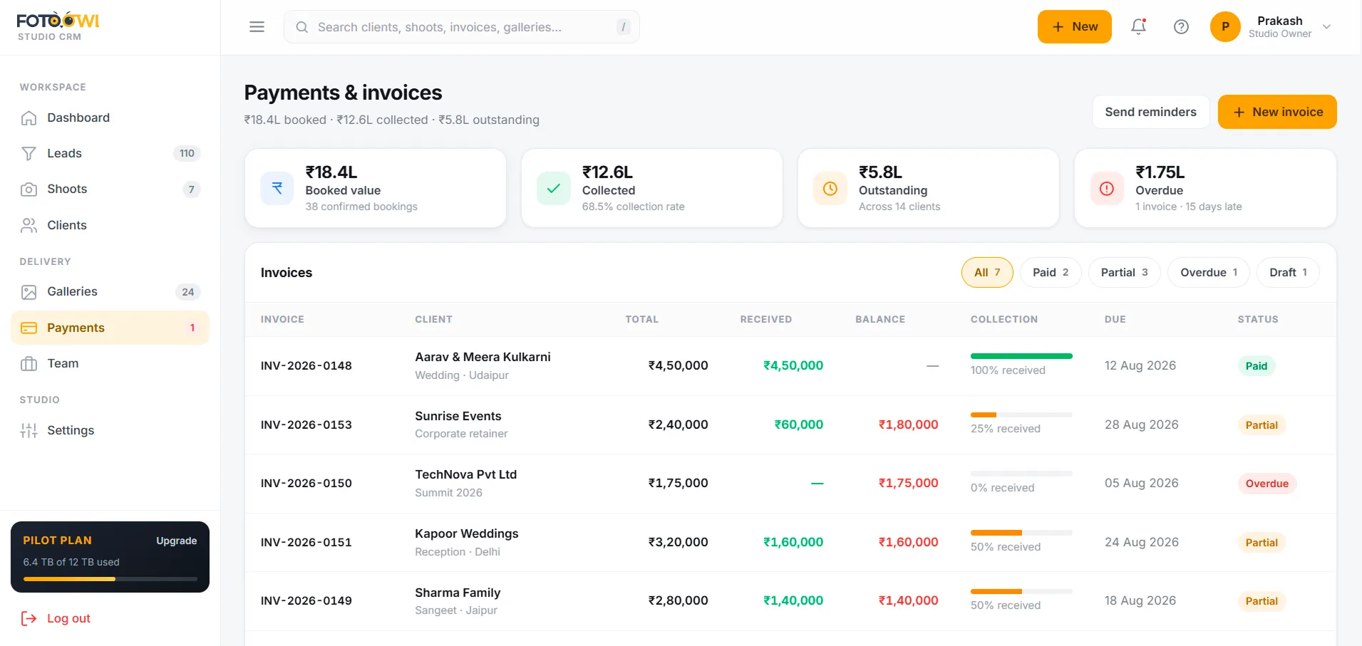
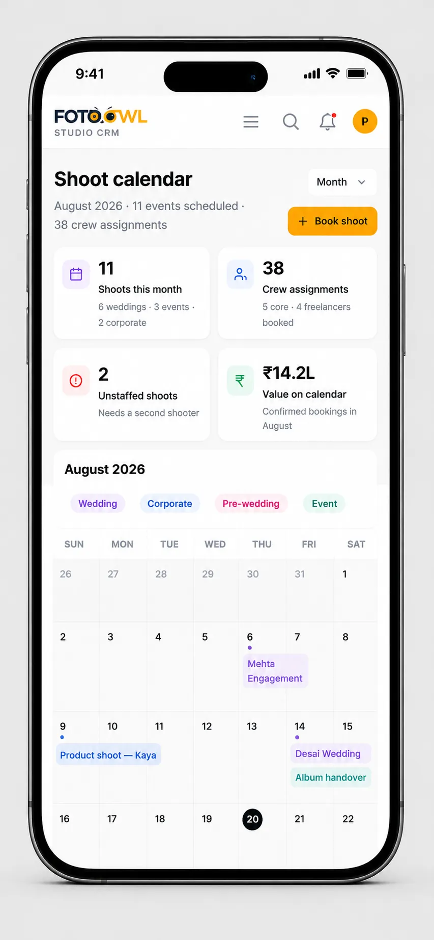
Most studios run on a pile of tools: leads in WhatsApp chats, bookings in Excel, invoices on paper and reminders on sticky notes. FotoOwl set out to replace all of it with one Studio CRM, and I designed it end to end, from the desktop dashboard down to the phone.
Then I made the launch film: the mess of chats and sheets first, then everything falling into place.
Design decisions
10 · Campaigns
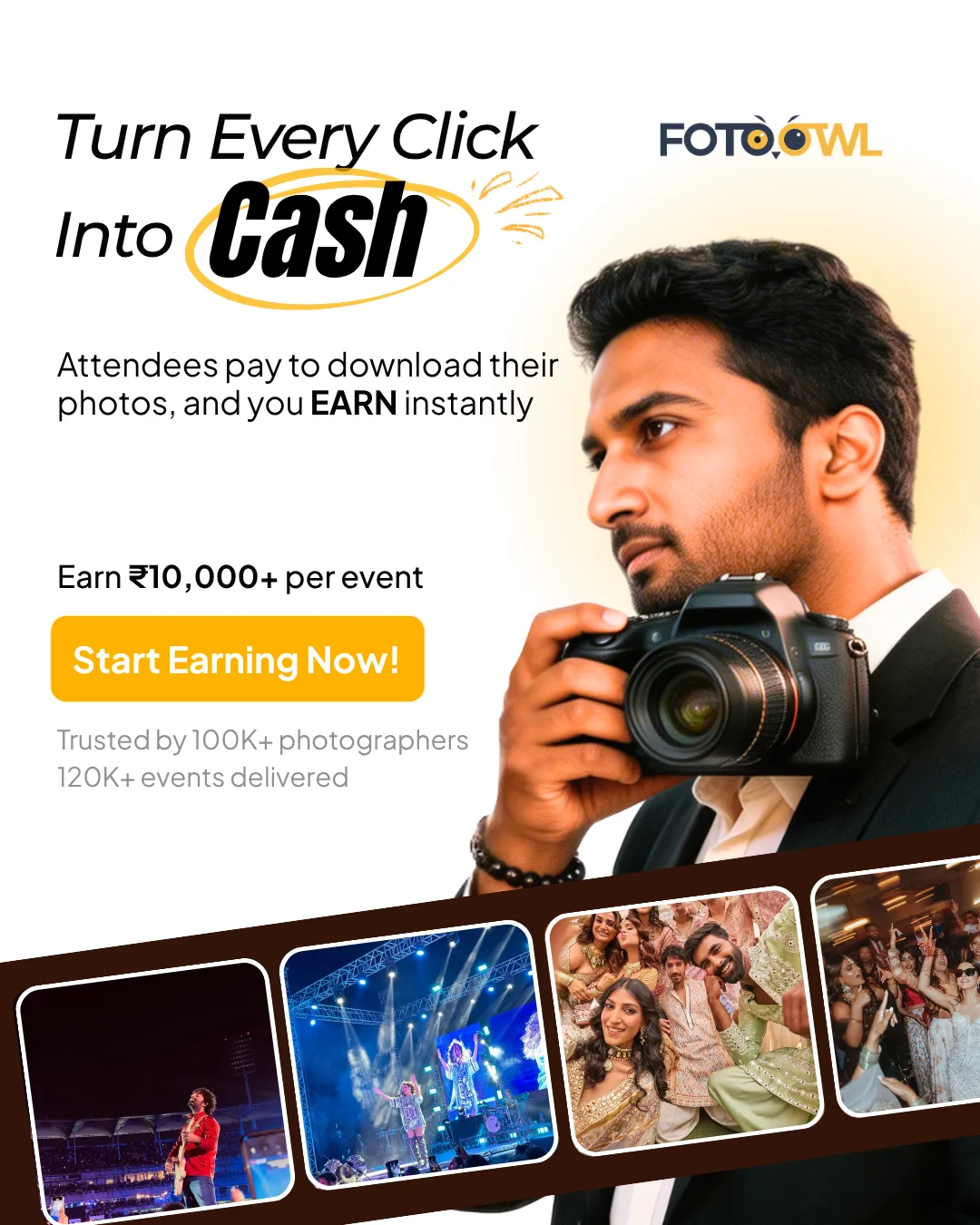
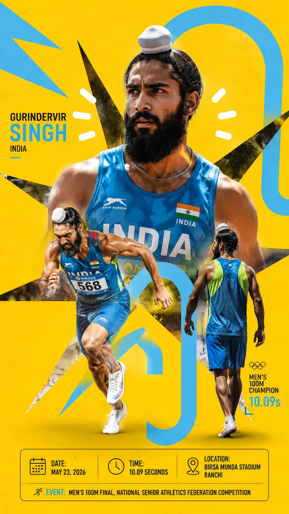
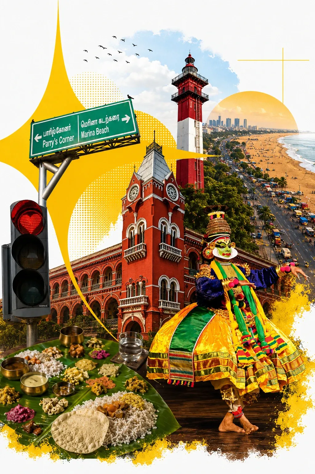
Each product got its own story. Beam became “deliver your photos instantly”. Photo Selling became “turn every click into cash”. A month-end sale turned into a loud, comic-style reel built to stop the scroll.
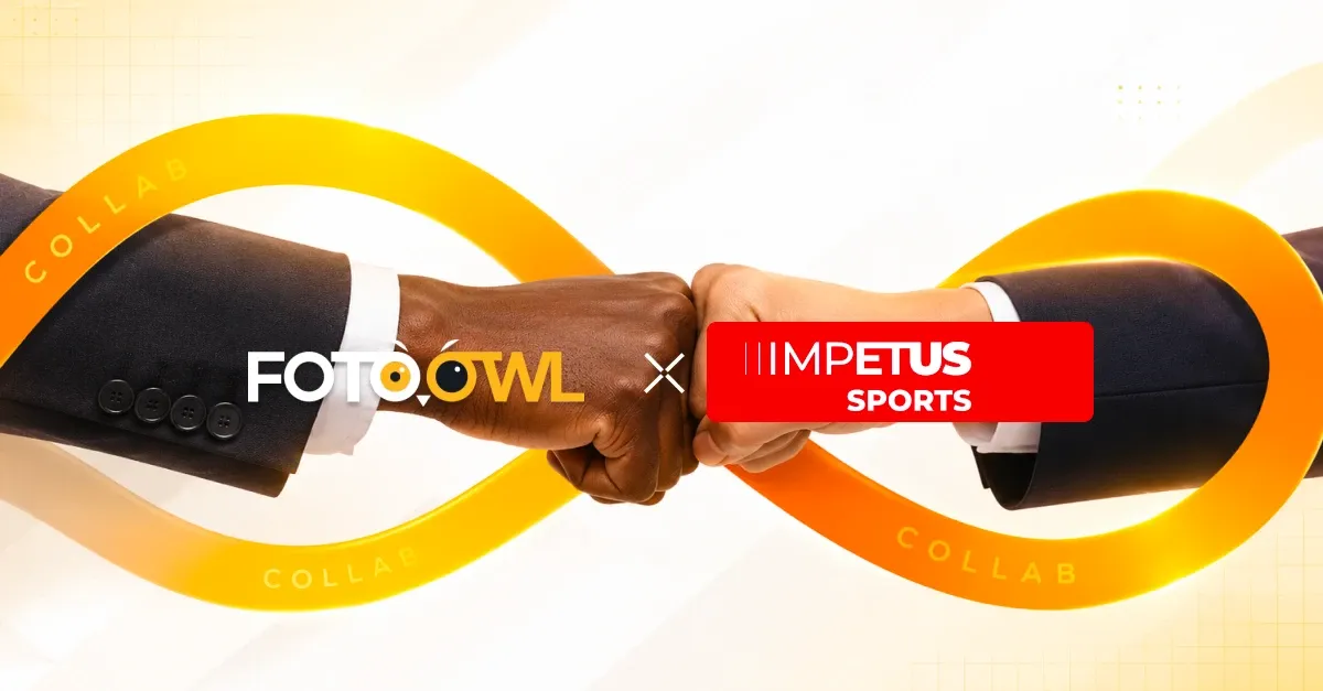
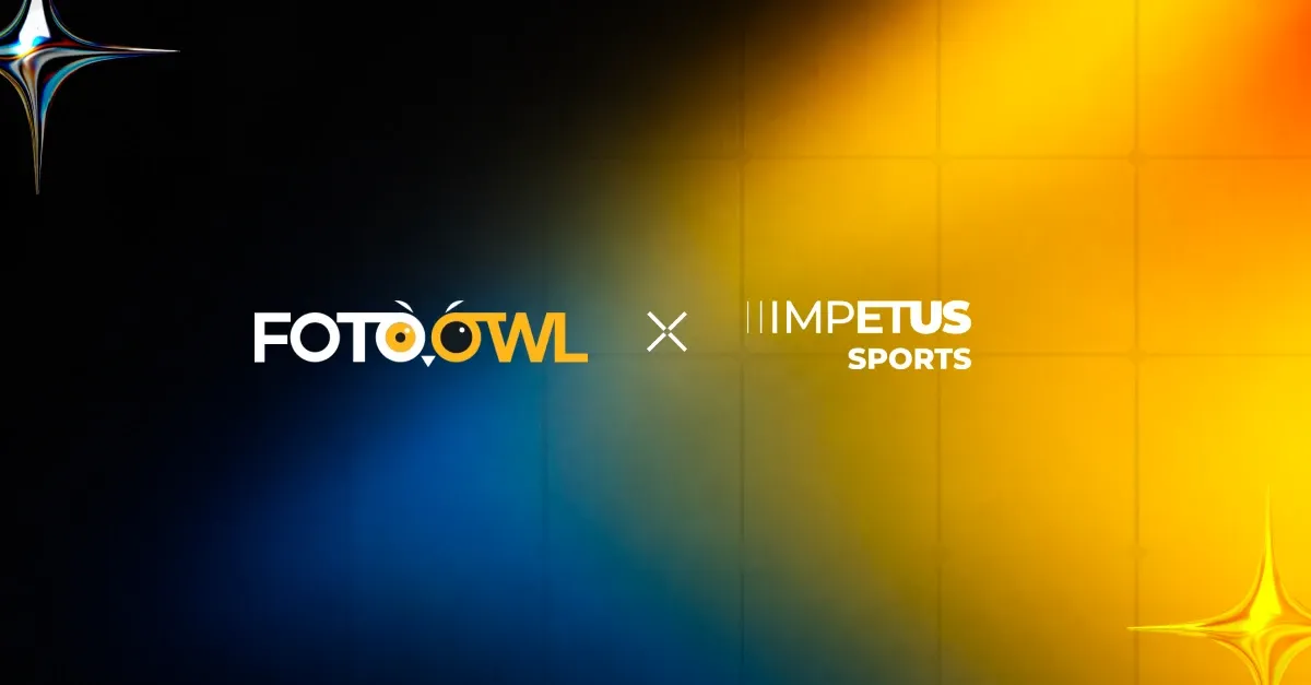
On LinkedIn the tone grew up a little: partnership banners that show FotoOwl working with real leagues and brands, like the collaboration with Impetus Sports.
Scroll · the campaign wall
01 / 09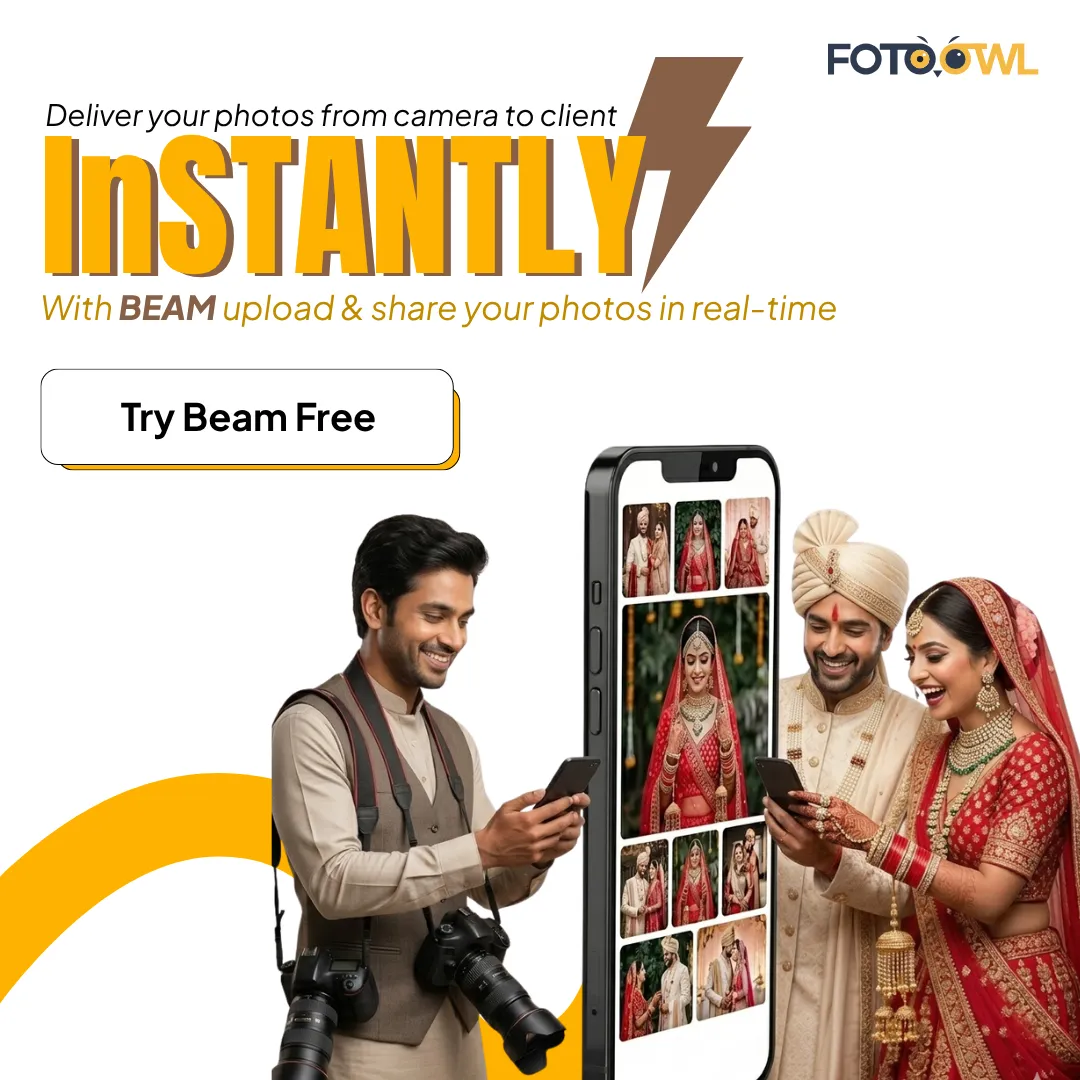
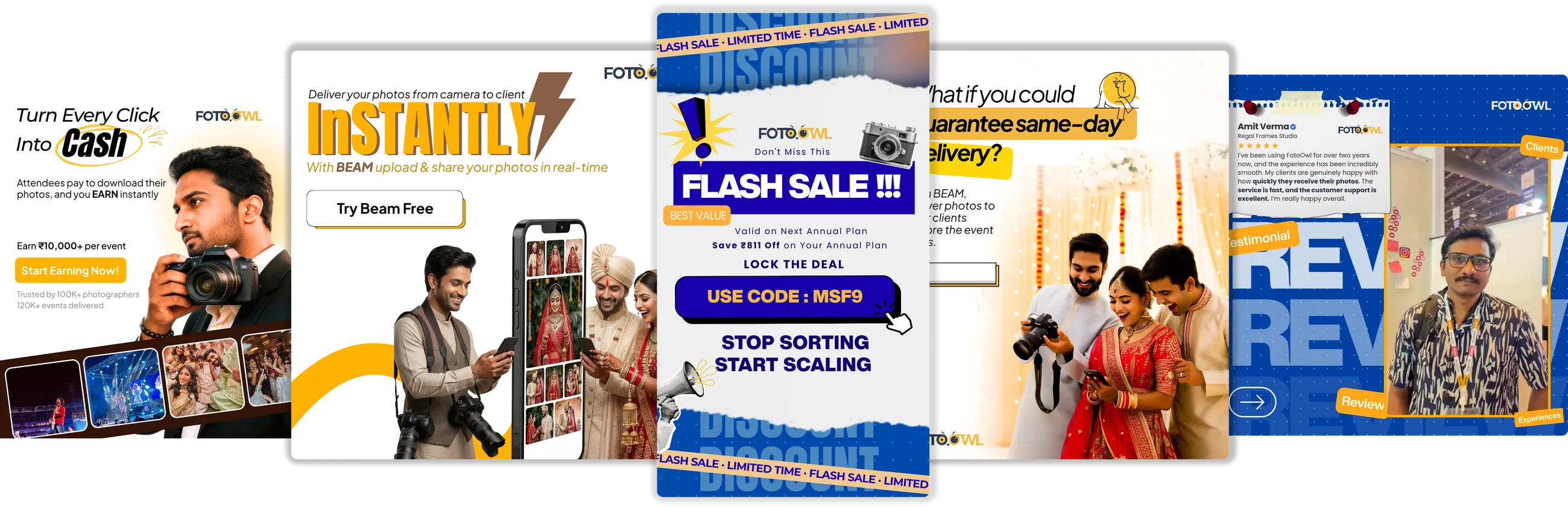
11 · Expo & merch
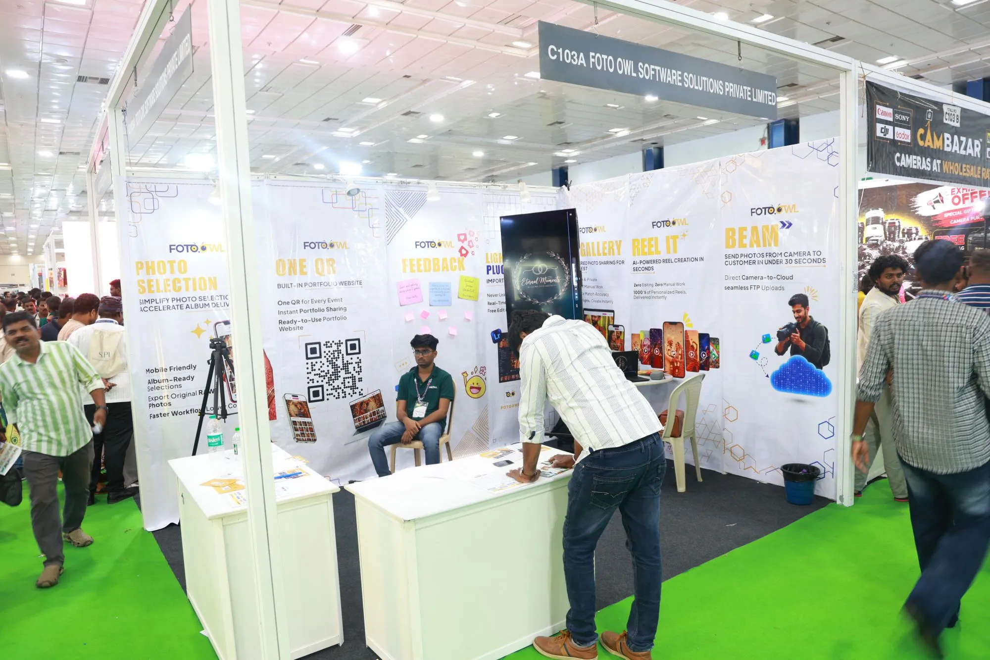
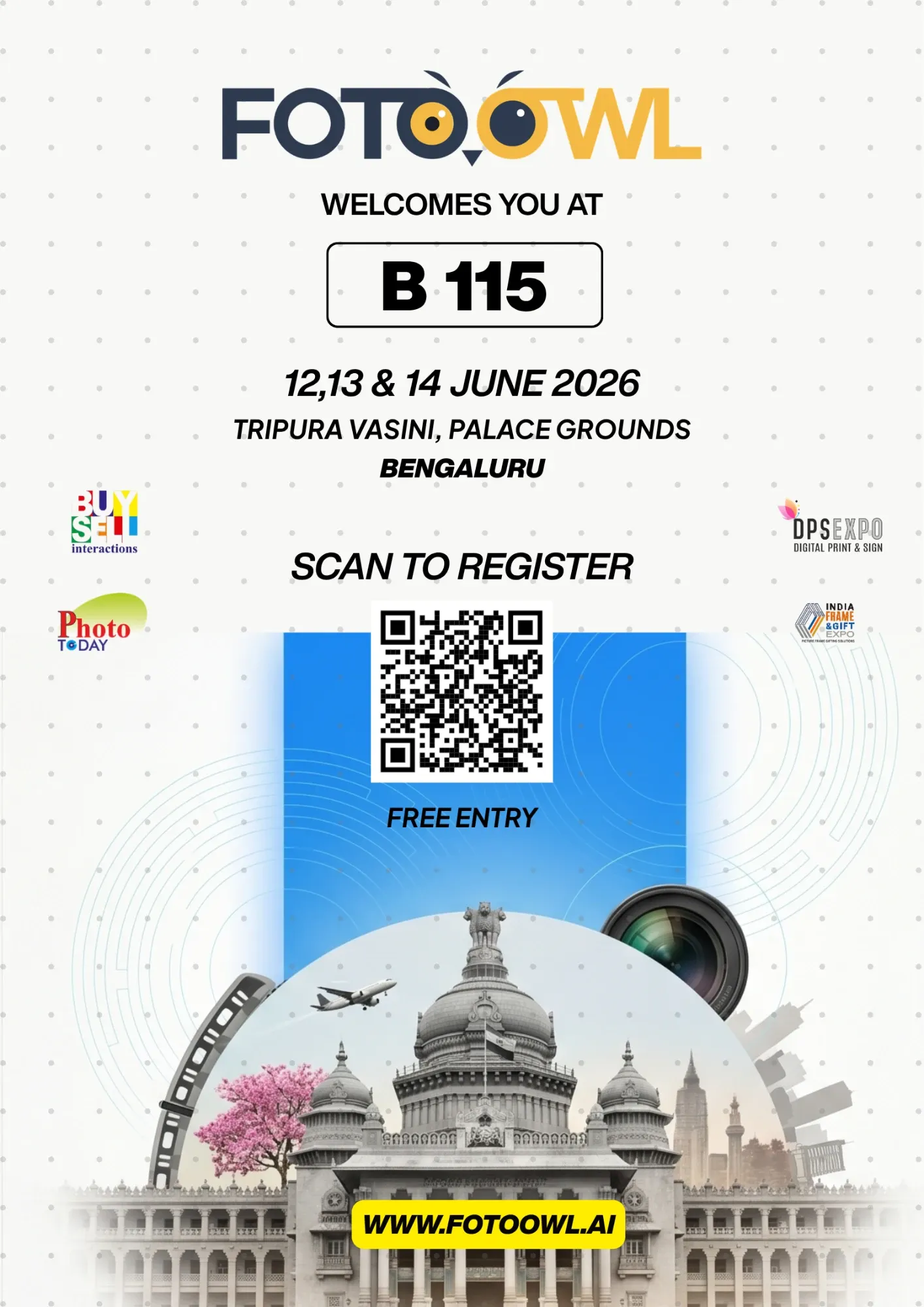
Photographers meet FotoOwl in person at photo expos across India. I designed the stand graphics with one panel per product, so anyone walking past could understand a feature in seconds.
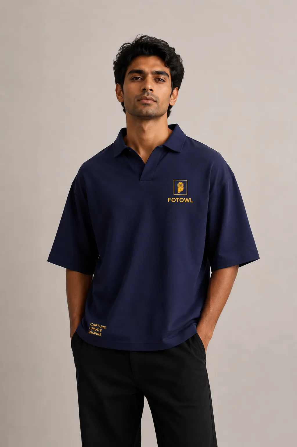
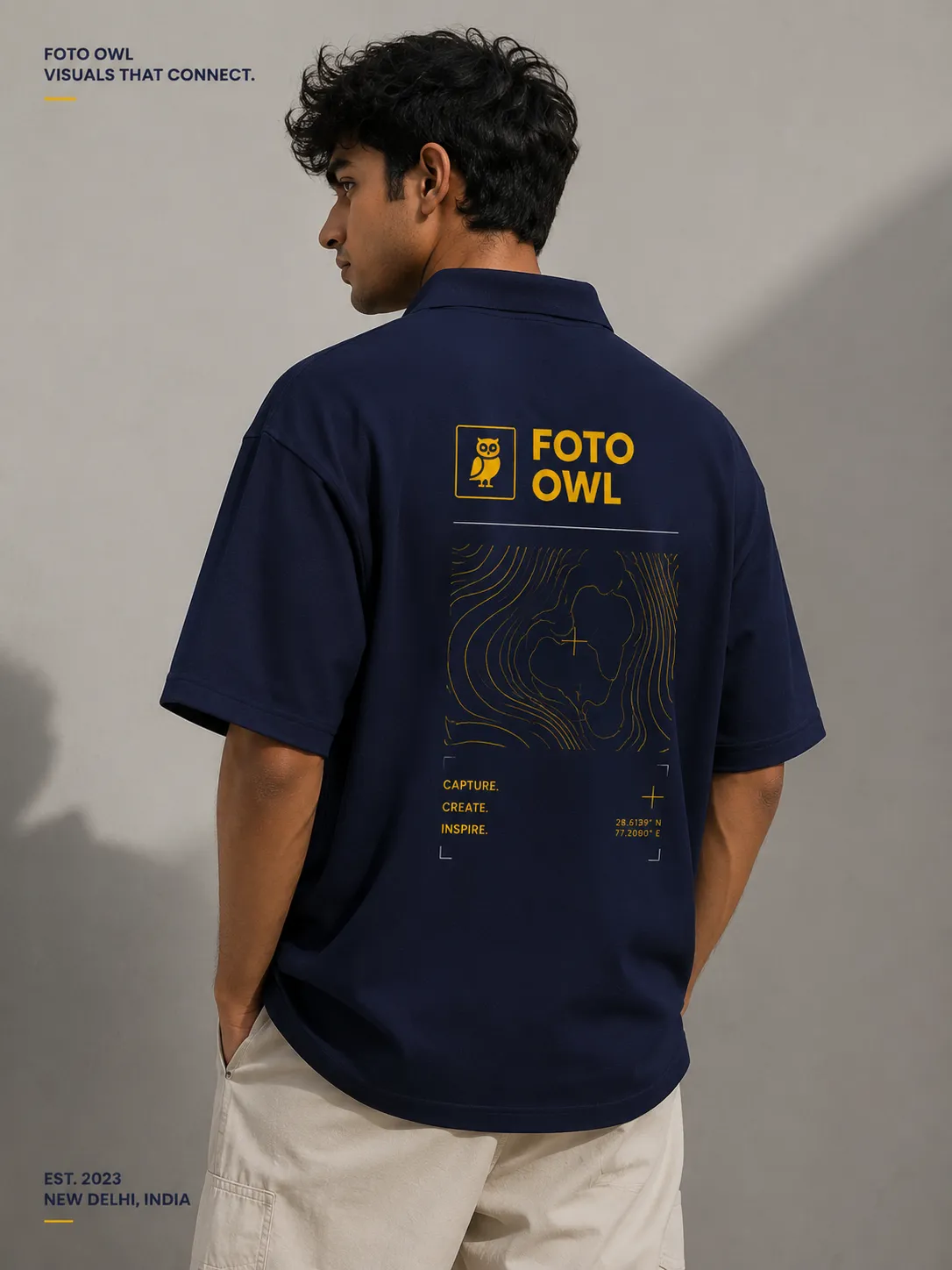
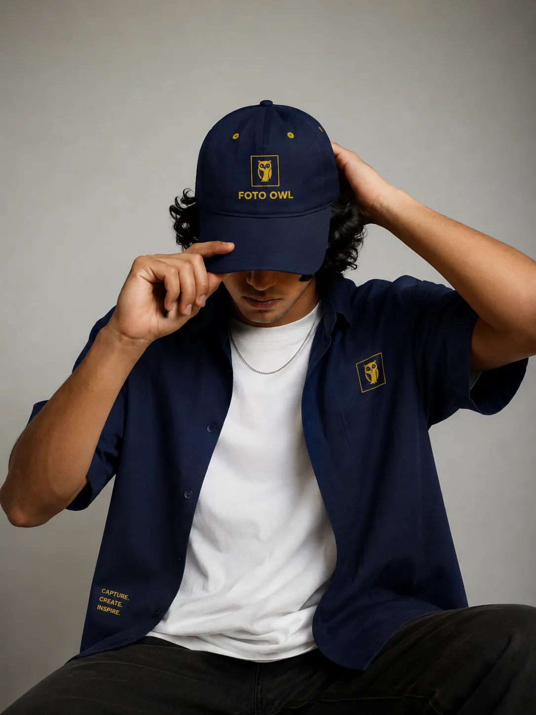
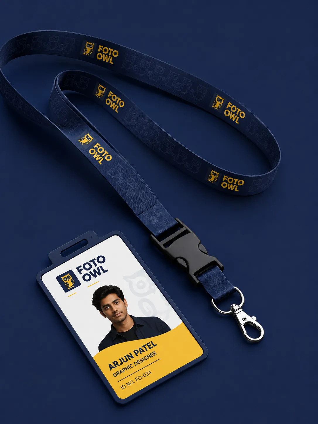
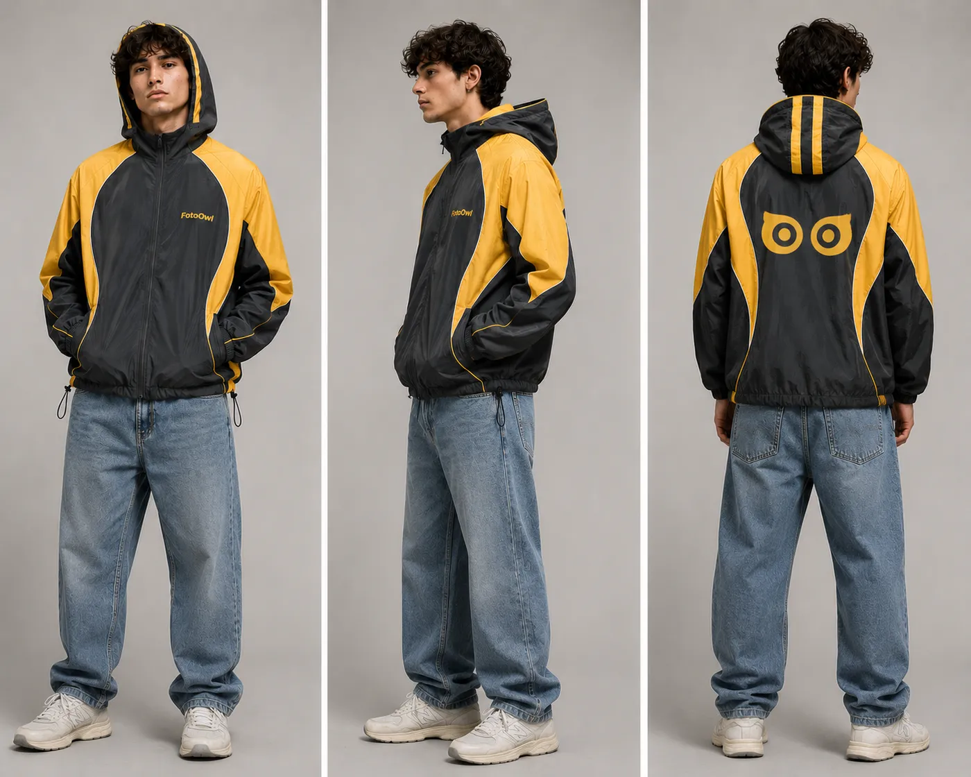
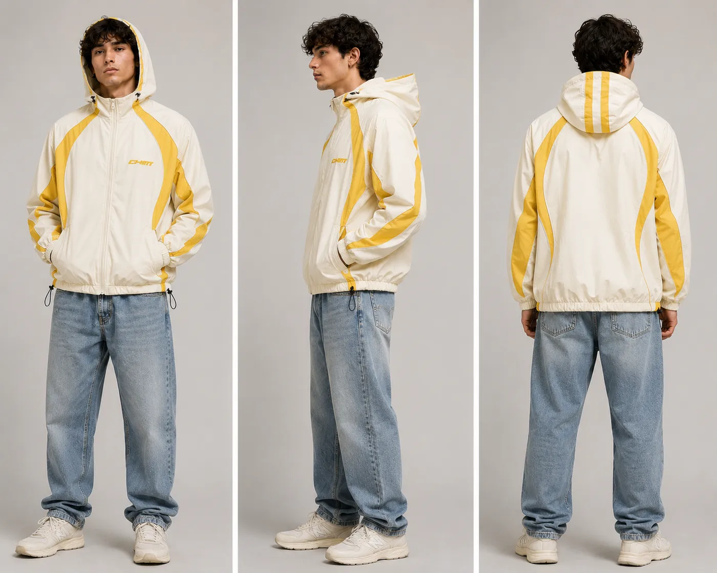
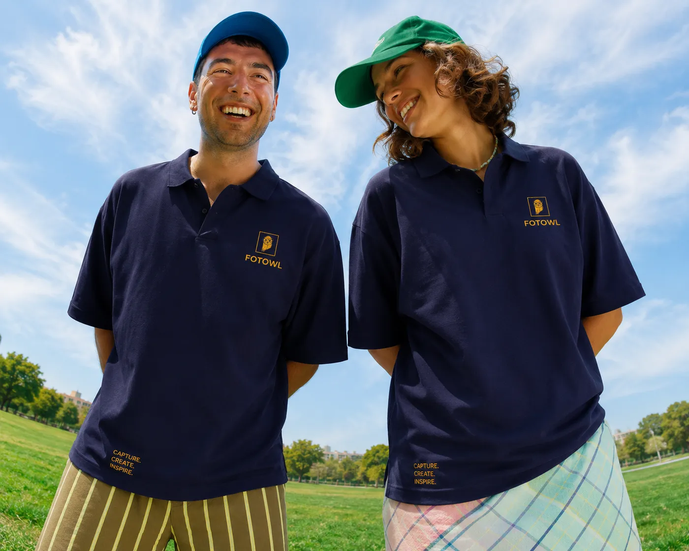
Then came the invitation posters with a QR code to register, and merch the team actually wanted to wear: hoodies, polos, caps and lanyards in navy and owl yellow.
12 · Toolkit
I don’t have one favourite tool. For every piece I pick the one that gets it to its best, fastest: vectors when a shape has to be perfect, Figma when people will tap it, Canva when a post has to go out today, and AI when I need many directions quickly.
AI sits inside my process, not in place of it. It widens the search and speeds up the first drafts. The choices, the taste and the final craft are mine.
How a piece moves through my tools

Facts, trends and references before I draw anything.
Many concepts, moodboards and mockups, fast.
Where the real design happens, by hand.
Posts, banners and every resize, on brand.
The owl and the reels come alive.
Why: when a shape has to be perfect at every size, from an app icon to a stand banner, I draw it in vectors, point by point.
In this project: the owl-in-a-Polaroid mark and its construction, the mascot line art, and print-ready files for merch and the expo stand.
Why: everything people tap or scroll starts here: components, layouts and prototypes the team can comment on in one place.
In this project: the website sections, the seven Play Store screens and the Studio CRM: dashboard, payments and the mobile calendar.
Why: some posts have to go out today. With brand templates in Canva I move fast without breaking the system I built.
In this project: social posts, LinkedIn banners and quick resizes for every platform and format.
Why: it turns a still idea into motion in minutes, so the mascot and the campaigns could move without a full animation pipeline.
In this project: the waving 3D owl, the animated error-state owls and the month-end sale reel.
Why: to explore many directions quickly: ideas, first-draft copy and image concepts that I then correct and finish myself.
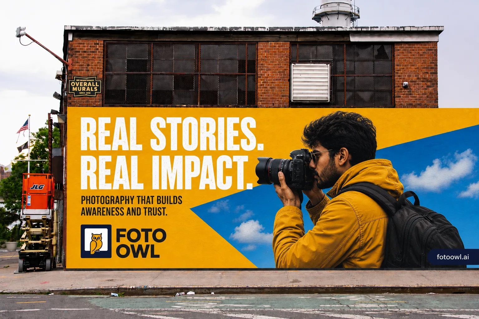
In this project: merch and billboard mockups, 3D mascot explorations and device scenes for the website and the CRM.

13 · Outcome & impact
Mark, palette, type, mascot and layouts that the whole team can reuse without starting from zero.
Outcome first, features in short blocks, solutions sorted by audience: FotoOwl in one scroll.
The owl turns ads, error states and the expo stand into moments that make people smile.
Social, LinkedIn, outdoor, print and merch now look like one company, at every expo and in every pitch.
Seven Play Store screens and a preview card for every product, so even a shared link makes a first impression.
Studio CRM: dashboard, payments and a mobile calendar, plus the film that launched it.
The scale this brand speaks to
Company figures from fotoowl.ai, October 2026.
14 · Reflection
People forgot feature names, but they remembered the owl.
AI tools helped me explore concepts and mockups quickly. Taste, story and the final decisions stayed human.
If a photographer between two shoots gets it in three seconds, everyone does.
Next project · 02 / 06
Dugout