Massive network, rich profiles
Overcrowded, poor matching, ghosting culture
Case study · AI hiring platform · UX/UI · College project
Designing where human insight meets machine imagination, from Mumbai.
An AI hiring platform for Indian startups and freshers: clear status for candidates, a calmer shortlist for recruiters, and a human in every final call.
All projects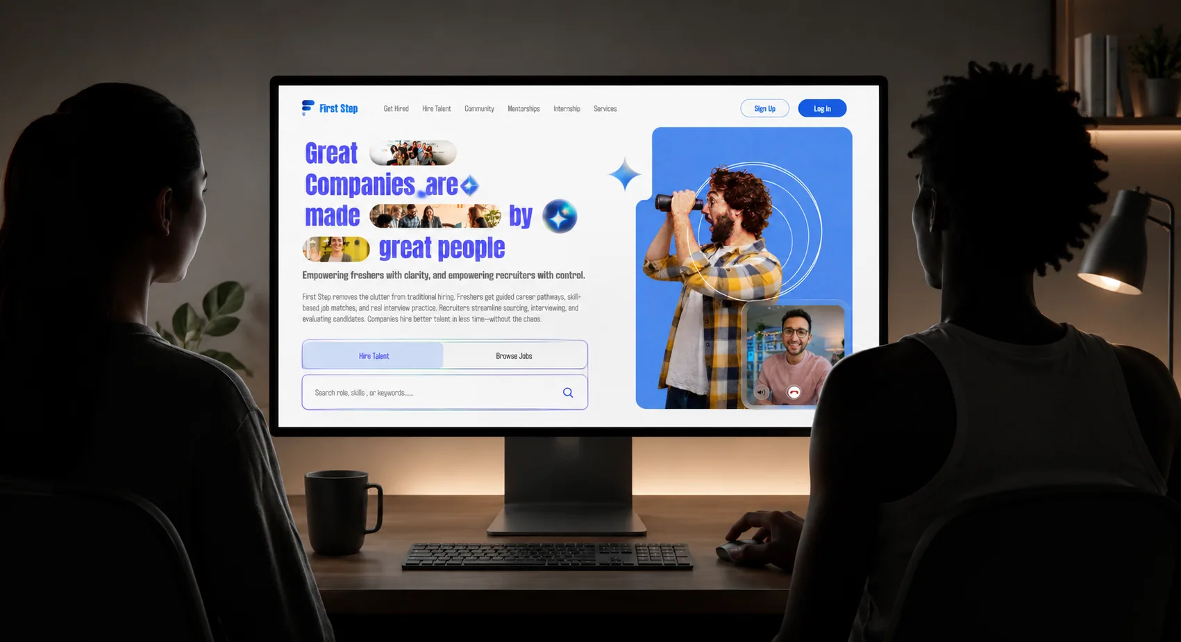
01 · Overview
A fresher sends fifty applications and hears nothing back. A founder opens five hundred resumes and finds ten worth reading. First Step puts both of them in one place and replaces the silence with status, feedback and fit.
What I designed
How I worked · double diamond
02 · The problem
want feedback after a rejection, and almost never get it.
sit through long delays with no update at all.
of 500+ applications per role are not relevant.
a day lost to hiring: 2 to 4 hours, away from the product.
From my survey (21 responses) and interviews with freshers, HR and startup founders.
03 · Research
Startup hiring, tech hiring, AI vs human screening.
LinkedIn, Naukri, Internshala, Greenhouse, Lever…
14 questions on trust, delays and feedback.
Freshers, HR, freelance interviewers, startups.
Every step of applying on LinkedIn and Internshala.
Startup workforce in India
The startup workforce grew 136%, yet the share of fresher hires fell from 53% to 41%. More jobs, fewer first chances.
Where hiring happens today
Half the market sits on one network built for volume. Referrals give the best hires but reach the fewest people.
Competitive landscape
Massive network, rich profiles
Overcrowded, poor matching, ghosting culture
Reach across India
Fake postings, spam, dated UX
Startup focus, direct chat
Spam messages, weak matching
Trusted by students
Entry level only, few tools for HR
From the papers
AI screens resumes about 70% faster, but rejects people with non-traditional backgrounds about 18% more often. The answer is not AI or humans: it is AI for the volume, people for the decision.
From the survey
The loudest wish was not a smarter search. It was “tell me what happened”: a status, a reason and one thing to improve.
04 · Users
Why won’t anyone tell me why I was rejected?
Is this really a banking job, or insurance sales?
Drowning in resumes, but starving for talent.
The problem isn’t finding candidates. It’s finding the right match.
05 · Synthesis
I wrote every quote and number on its own note, then grouped them until the themes named themselves. A few from each group:
The problem, redefined
Both sides lose time and trust because hiring is a black box. Candidates need status and a reason; recruiters need fewer, better matches they can act on fast.
How might we…
06 · User journey
I mapped both journeys on existing platforms, step by step, then redesigned every stage. Tap a stage to see the pain, my answer, and the number it should move.
Curves are illustrative, drawn from the feelings recorded in the journey maps (overwhelmed, sceptical, anxious, impatient).
07 · Ideation & priorities
SCAMPER on today’s hiring
Resume filters → AI skill checks
Hiring + upskilling + feedback
E-commerce style verification
Interviews that ease anxiety
Data → career plans
Fake profiles and scam posts
Screen → fit → technical
MoSCoW · what makes the first version
08 · Information architecture
The landing page splits people in one click: hire talent or browse jobs. After that, each role only sees what it needs, and Lumi, the AI assistant, sits in the same corner everywhere.
User flows · merged into one
In Figma these were separate diagrams. Here they are one flow: everyone enters through the same door, and the three journeys hand work to each other where the dotted lines cross.
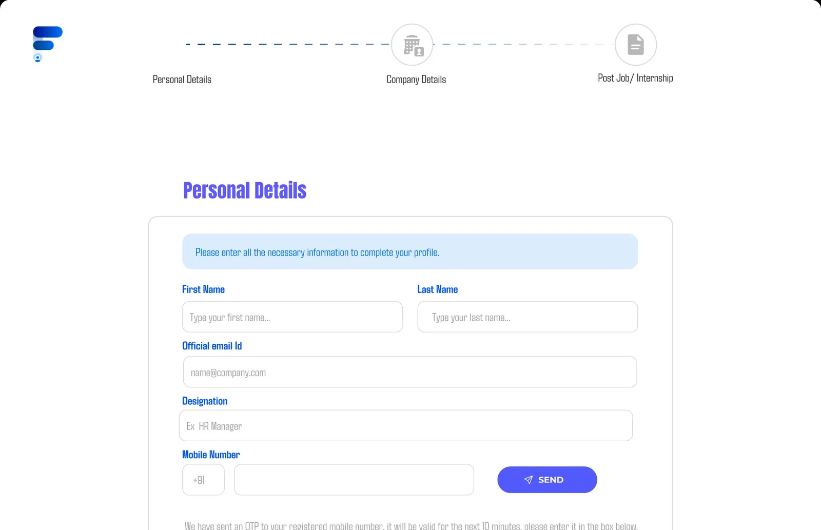
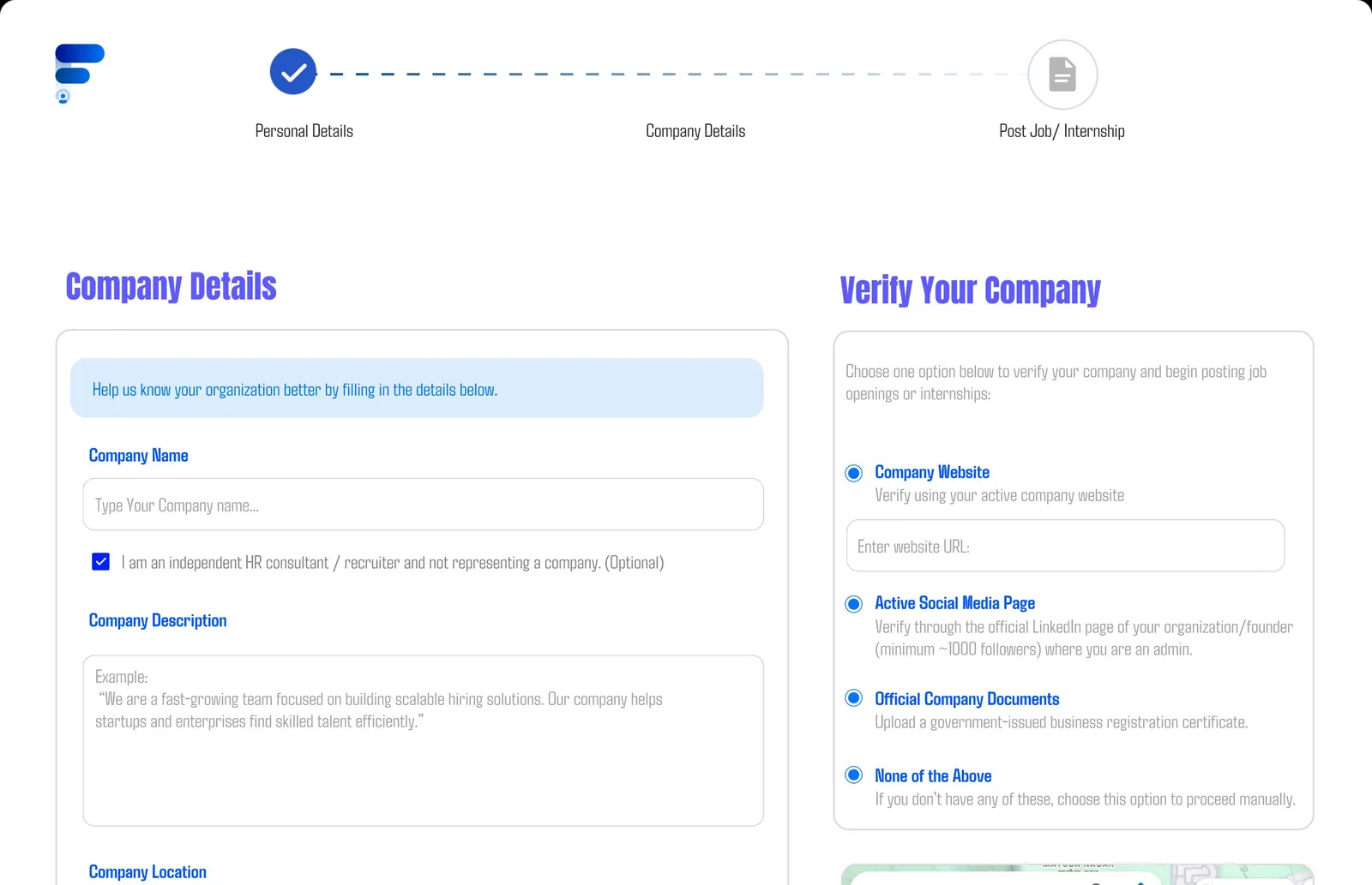
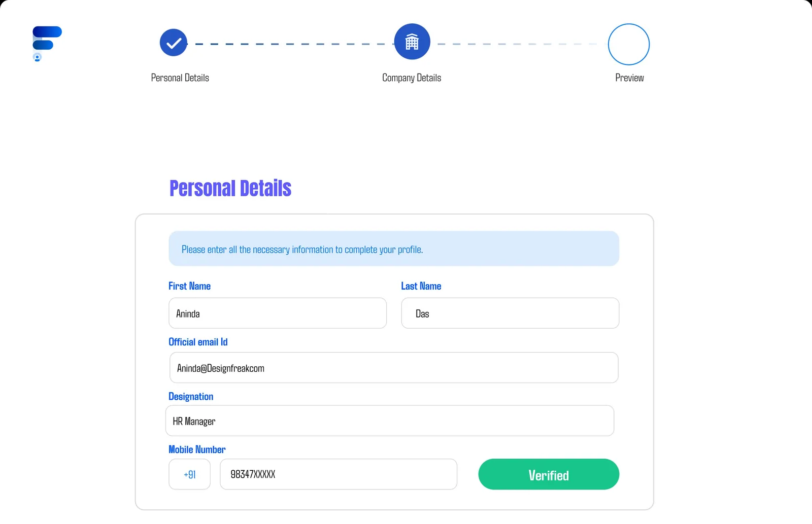
Sign-up asks for three things. Company details and verification come step by step, with a progress line on top.
A candidate’s home opens on where each application stands, not on more jobs to apply to.
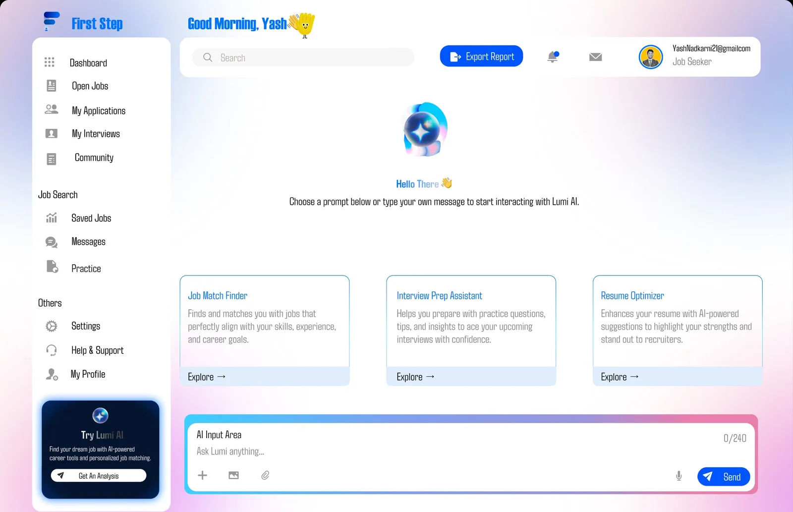
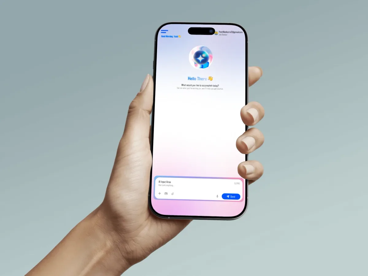
Lumi lives in the sidebar: same entry point, same tone, whether you hire or apply.
09 · Mood board & inspiration
The mood board started with people, not interfaces: the rejection letter with no reason, the fresher lost between job posts, the recruiter buried in tabs. First Step had to feel like the opposite of these moments.
From this… to this
How users feel today





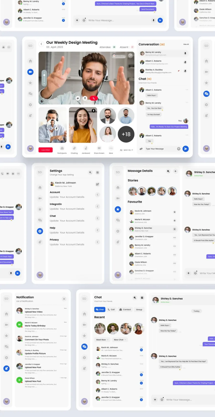
UI inspiration · what I took from each
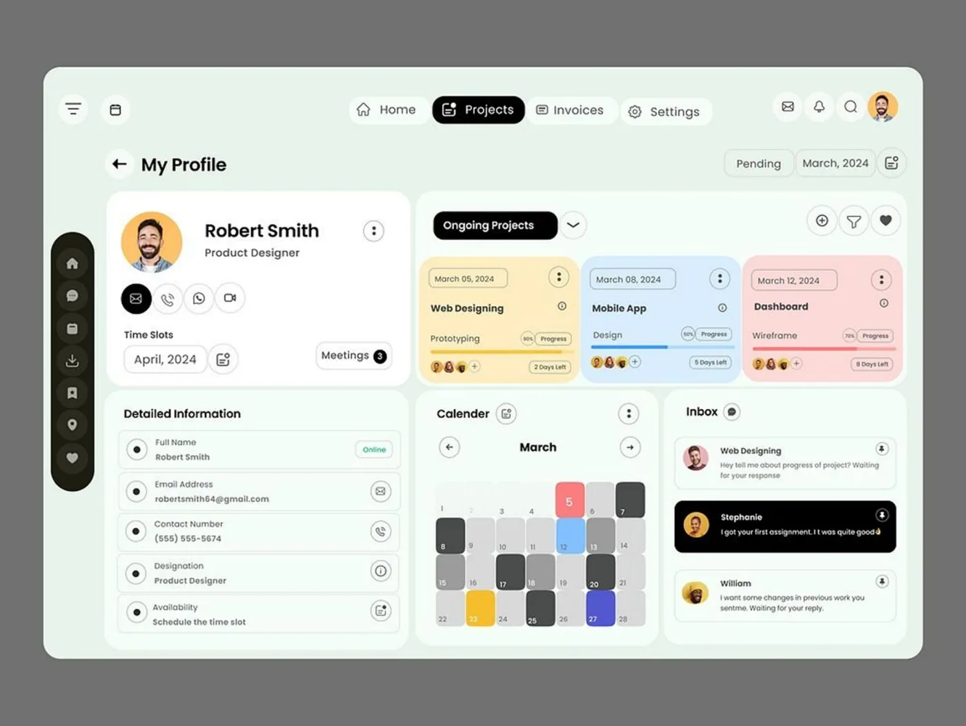
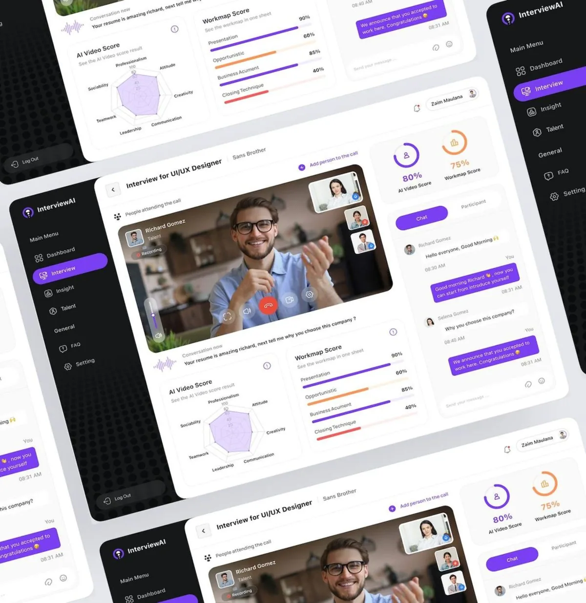
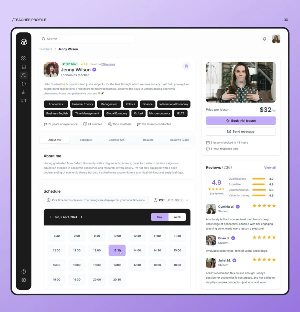
10 · Wireframes
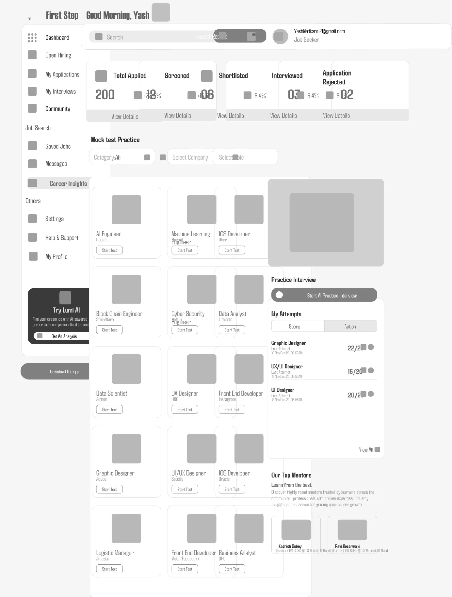
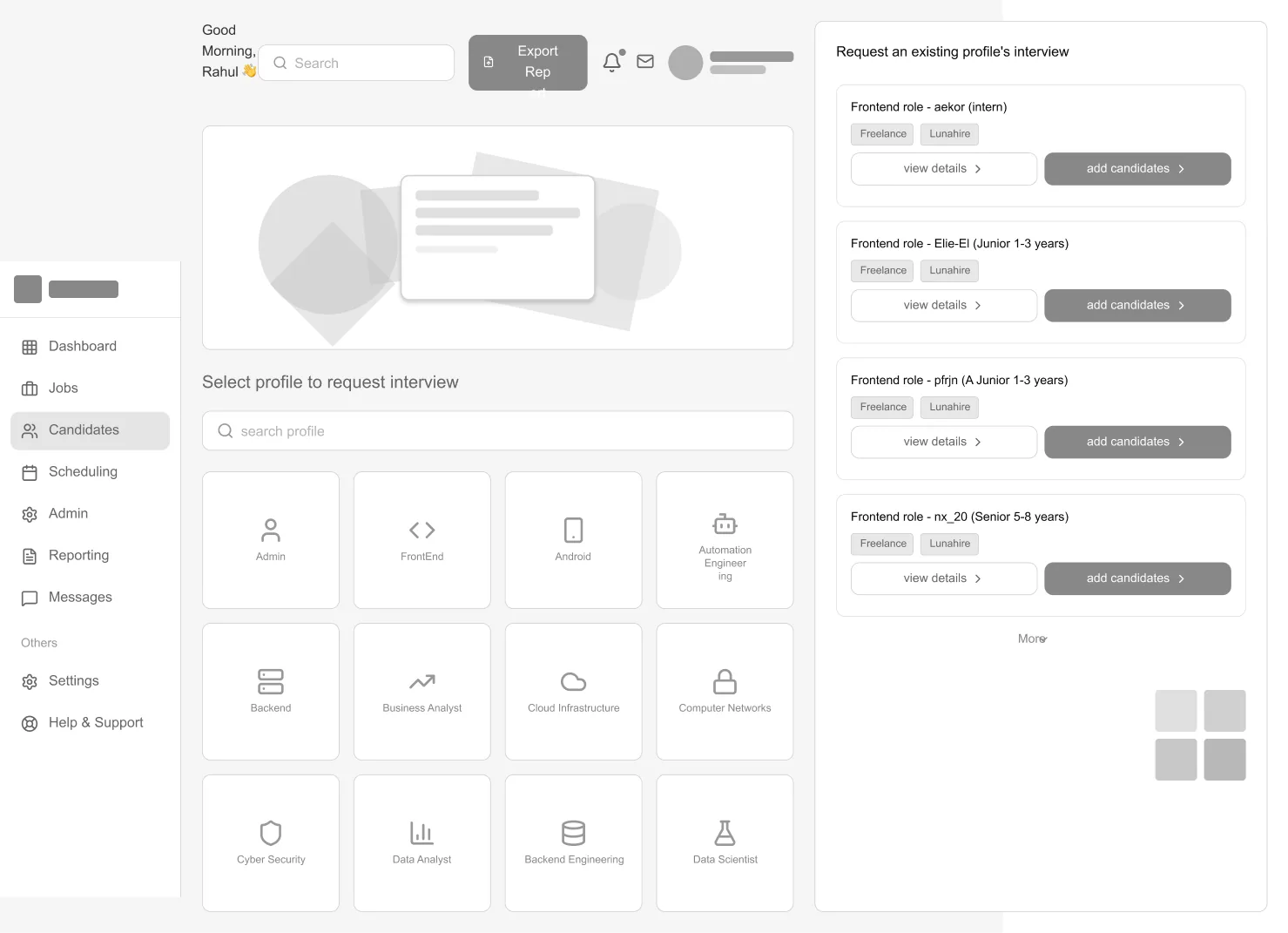
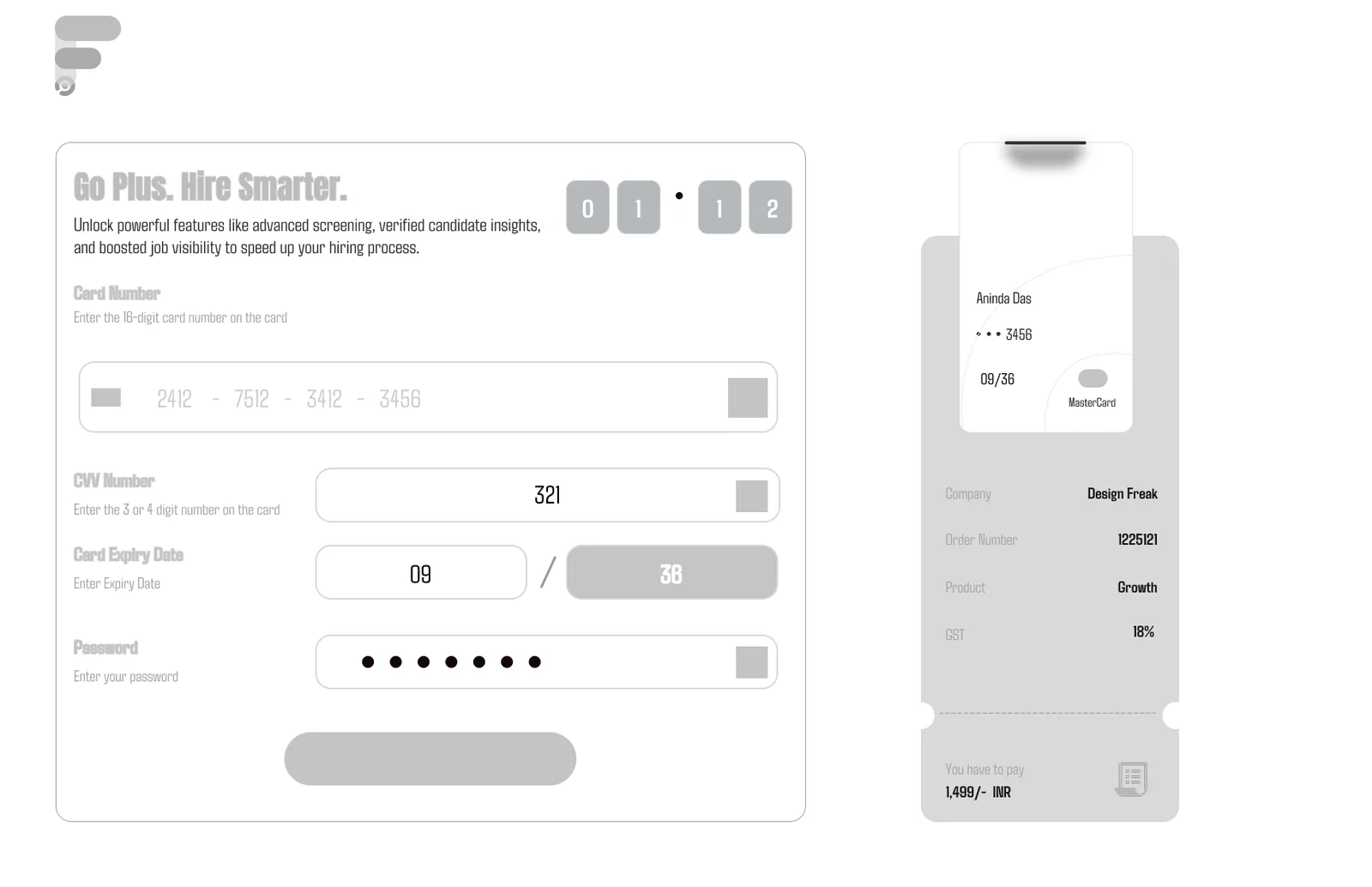
I wireframed the landing page, the HR workspace, the candidate flow and the collaboration screens in low fidelity, tested the flow, then moved to visuals only once the structure held.

11 · Branding
The name is a promise to freshers: your first step into work. I explored a person inside a search pin and a focus ring, then kept the simplest idea: two rounded bars that read as an F and as stairs, with a small person at the bottom, about to climb.
Why blue and violet: blue is the colour people already trust with money and careers; a warm violet keeps it from feeling like a bank. Tall, condensed headlines give the product a confident voice in very little space.
Explore 1 · Pin
Clear, but it looked like every job portal.
Explore 2 · Ring
Friendly, but no story of growth.
Final · Steps
Reads as a letter, as stairs and as progress bars.
Lockup
The full lockup for splash screens and posters.
Colour
Typography
Start Building Your Future
Tall and condensed: big words in little spaceLabels, forms and dashboards stay light and narrow, so dense screens still breathe.
Light for reading · Medium for labels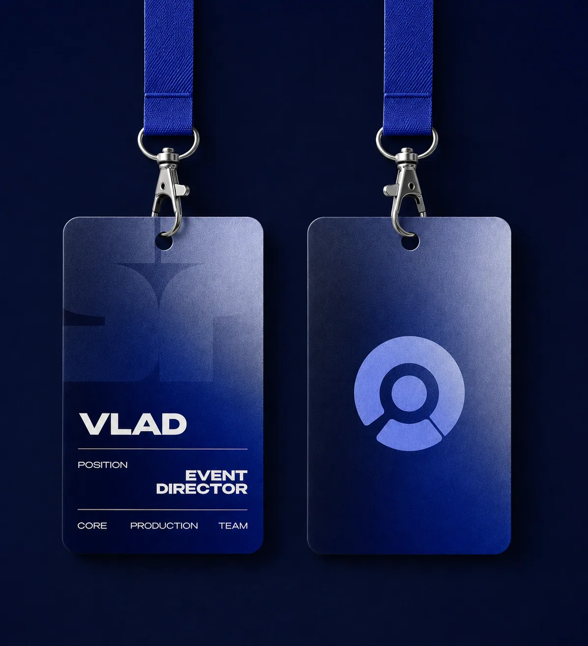
12 · Final UI
Every screen below is from the Figma prototype you can open at the end of this page.
The landing page
Keep scrolling: the page runs inside the frame. Real faces first, then the vision, Lumi, why First Step, and the way in for both sides.

Flow 01 · HR workspace
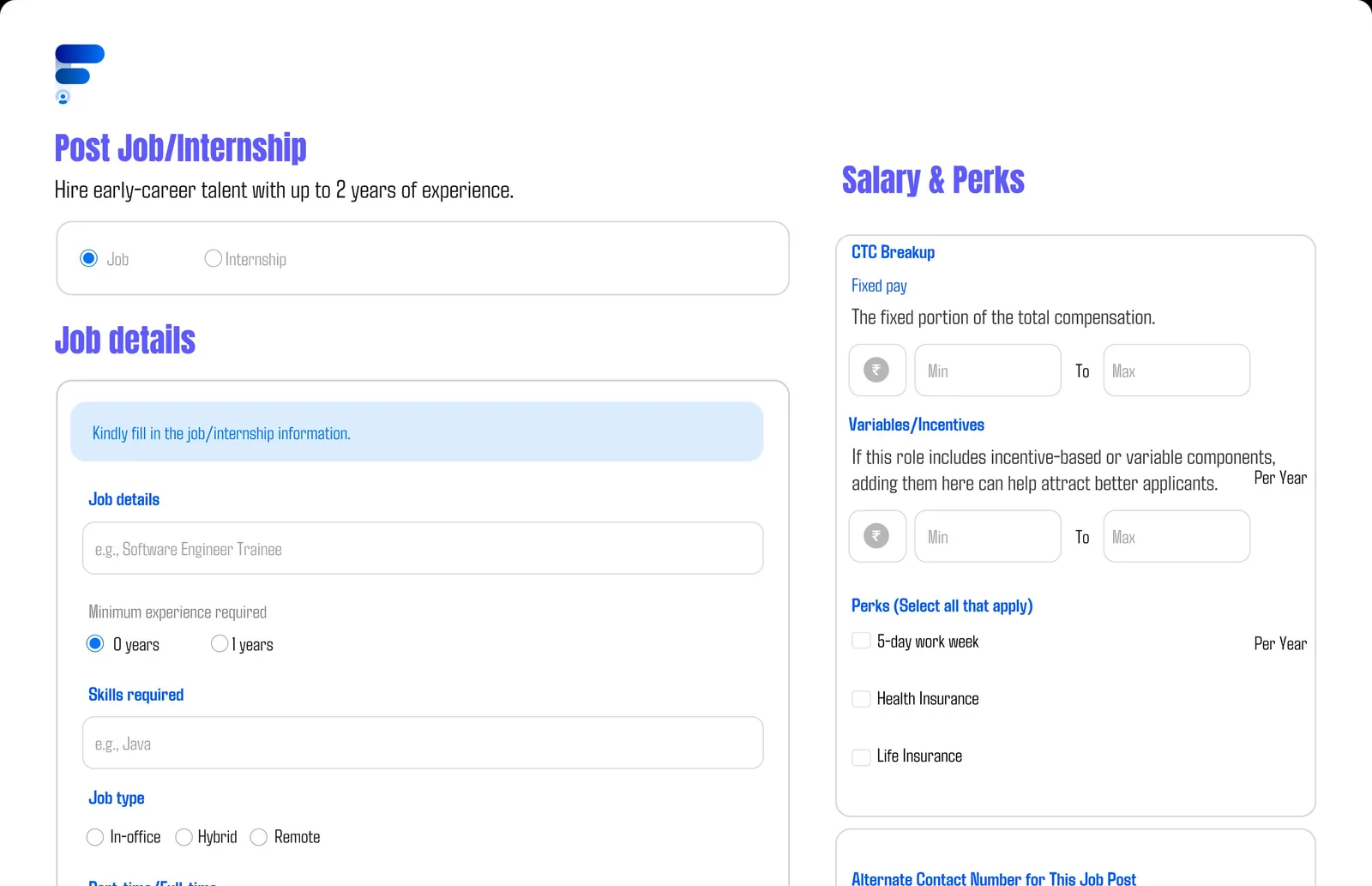
Sign-up asks for three fields. The company comes next, then verification (website, LinkedIn page or documents), so fake employers never reach a fresher.
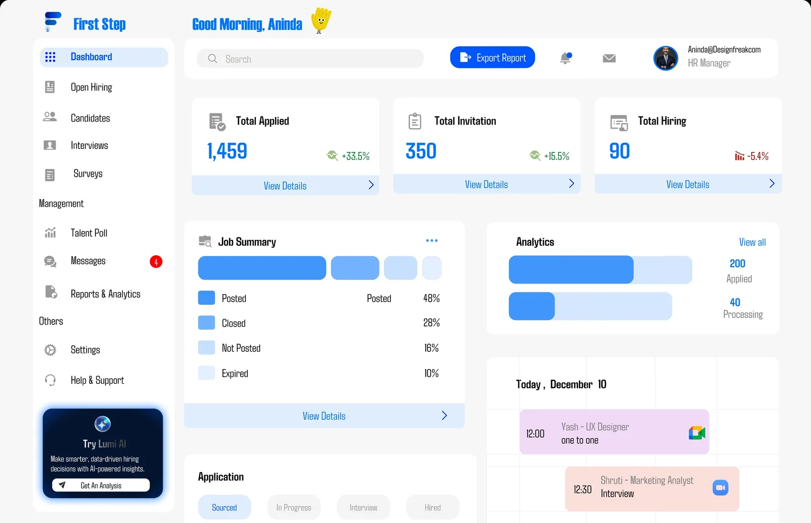
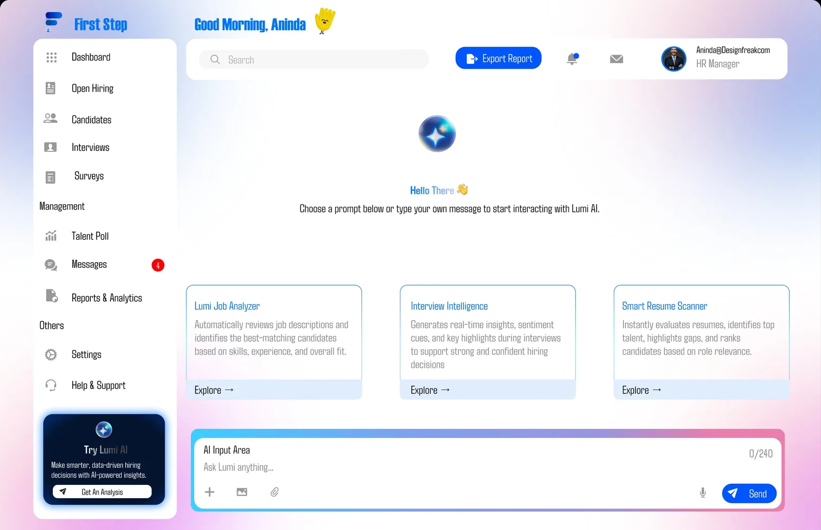
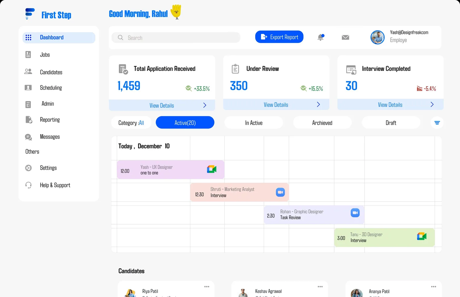
The dashboard answers the recruiter’s first questions at a glance: how many applied, who is invited, who got hired, and which interviews are today.
Scroll · the HR flow
01 / 07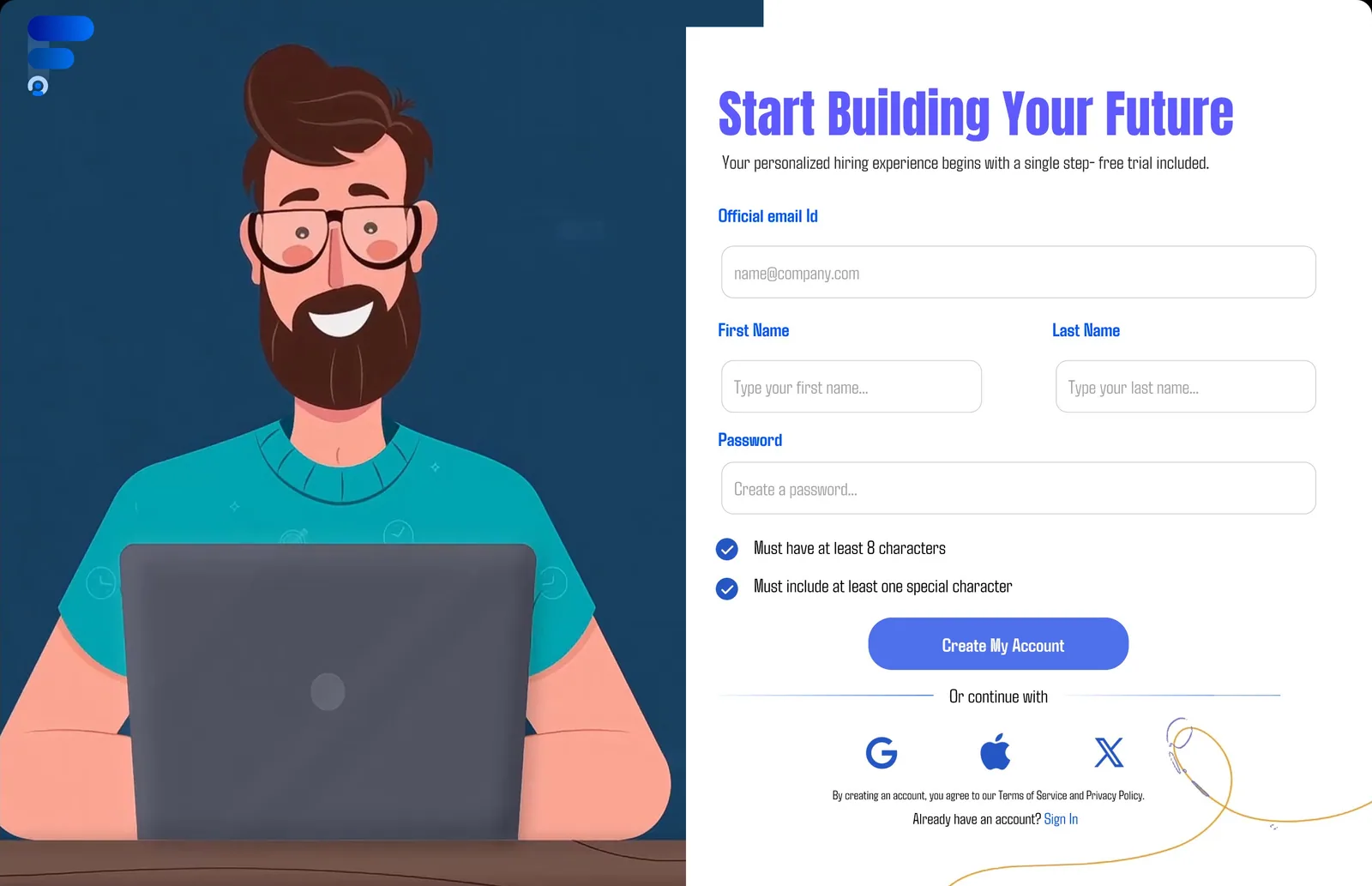
Flow 02 · Candidate app
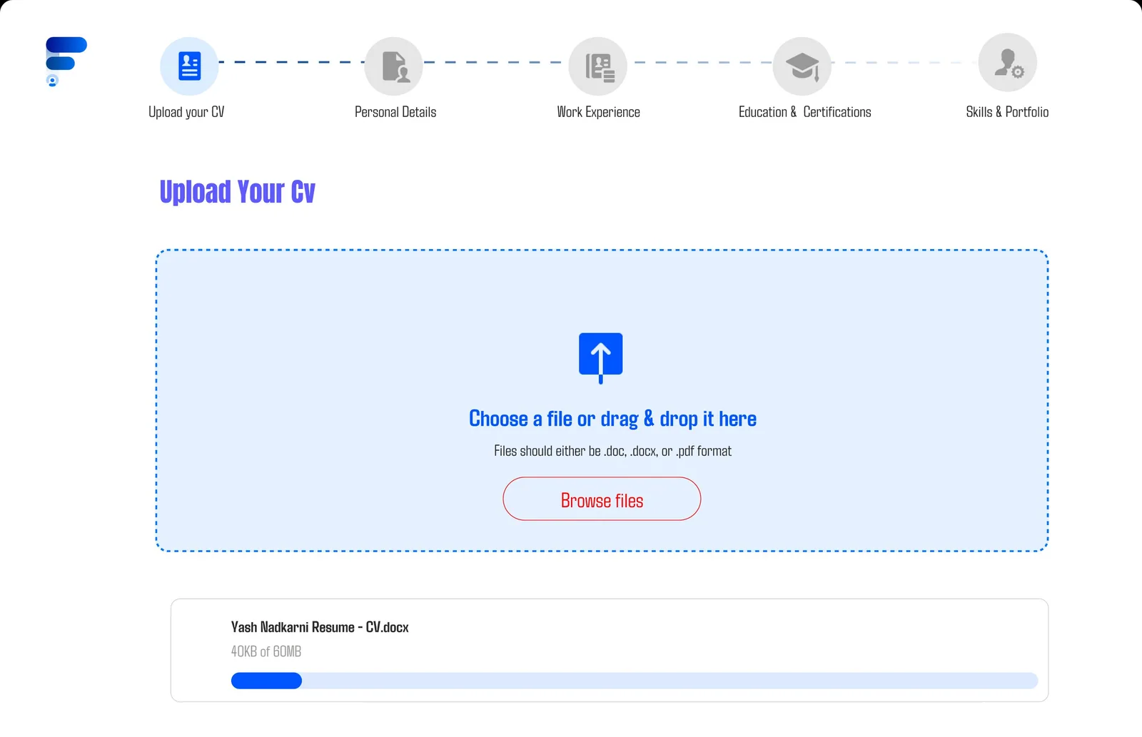
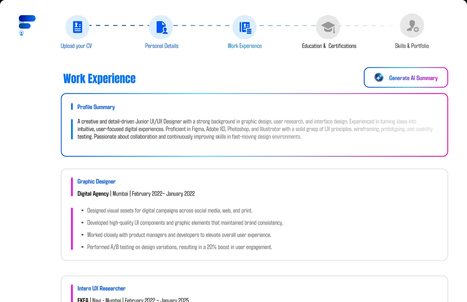
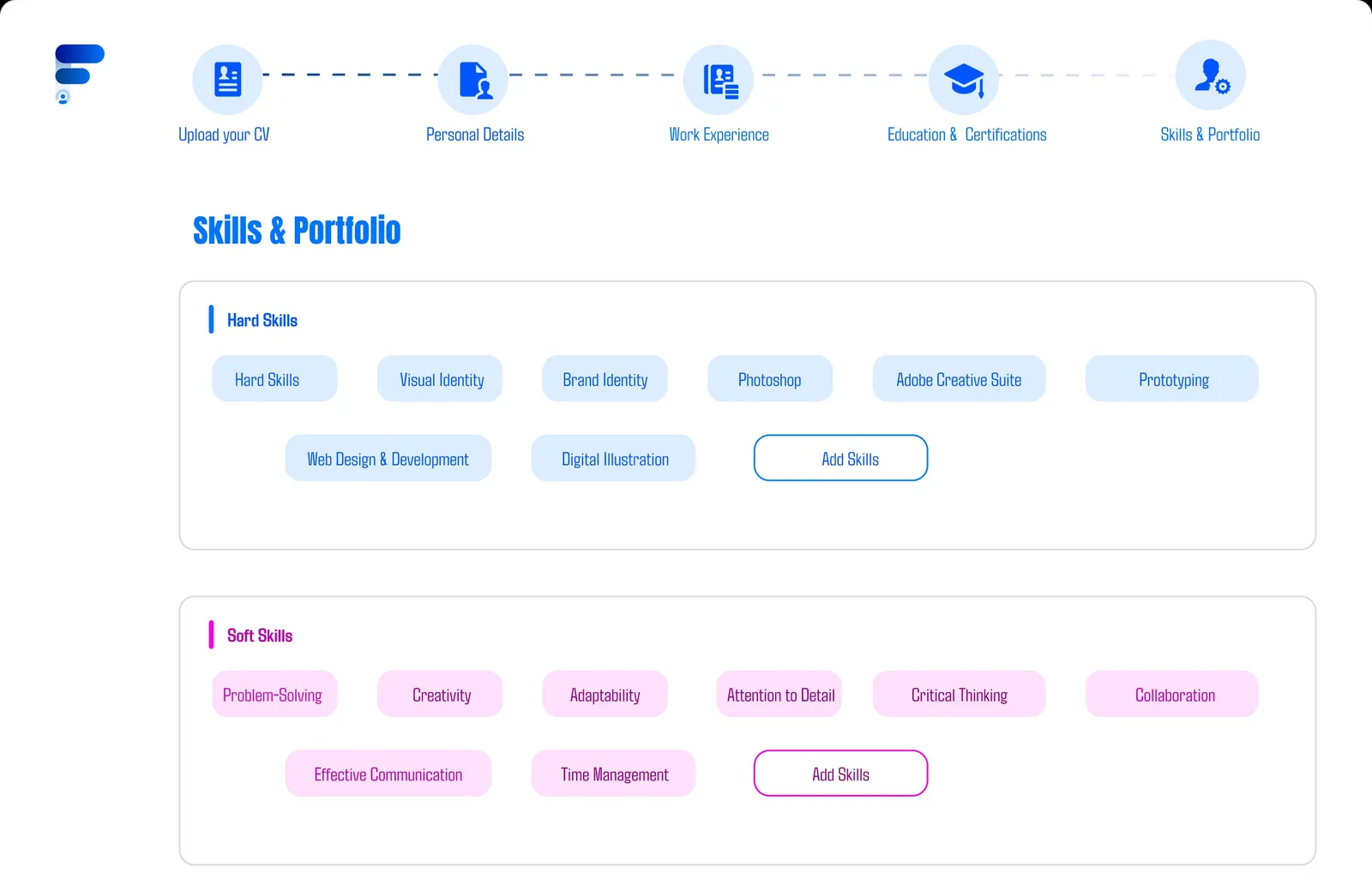
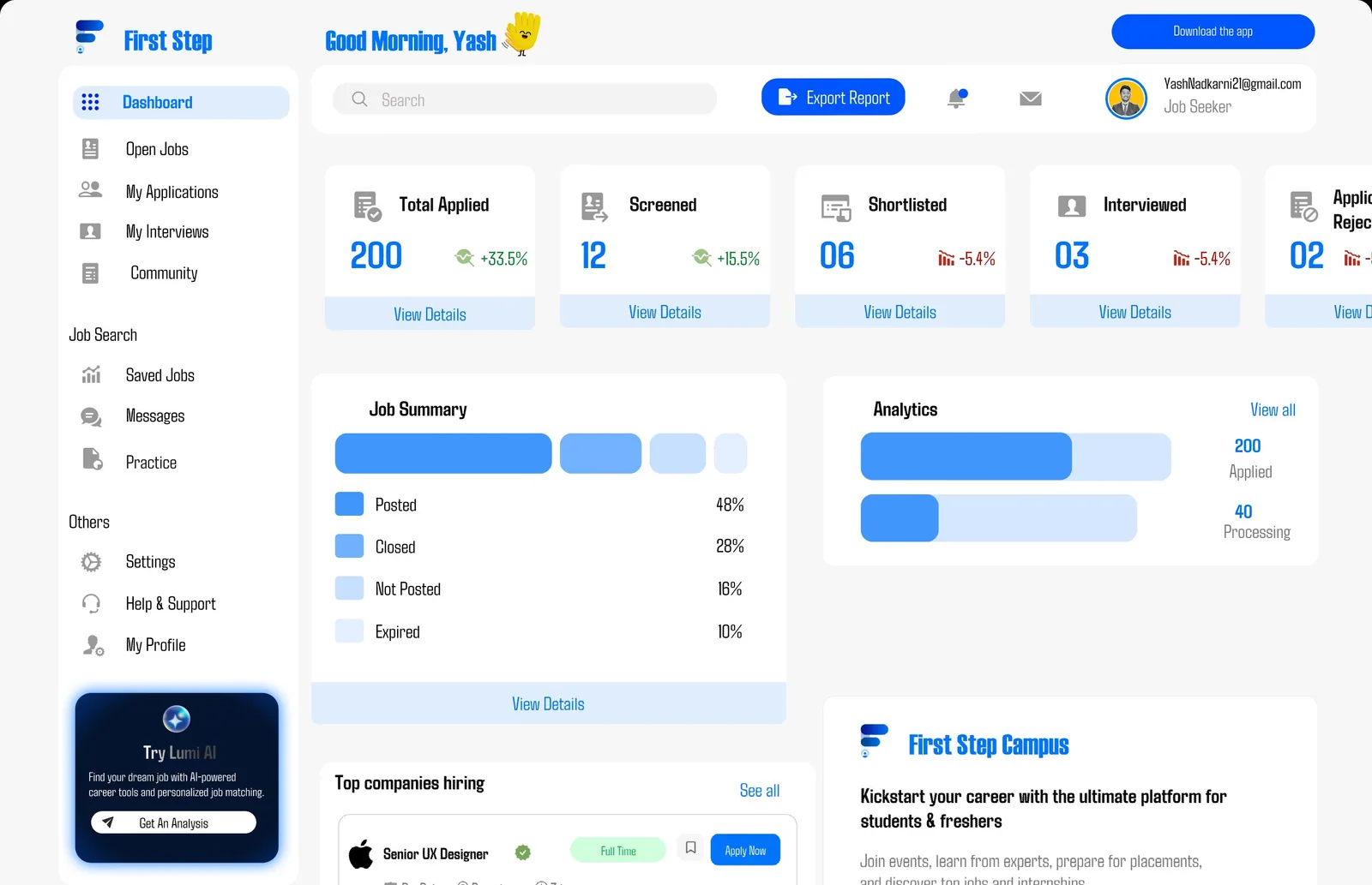
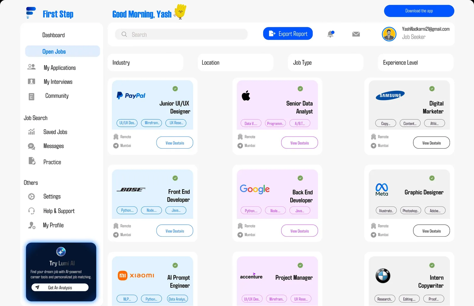
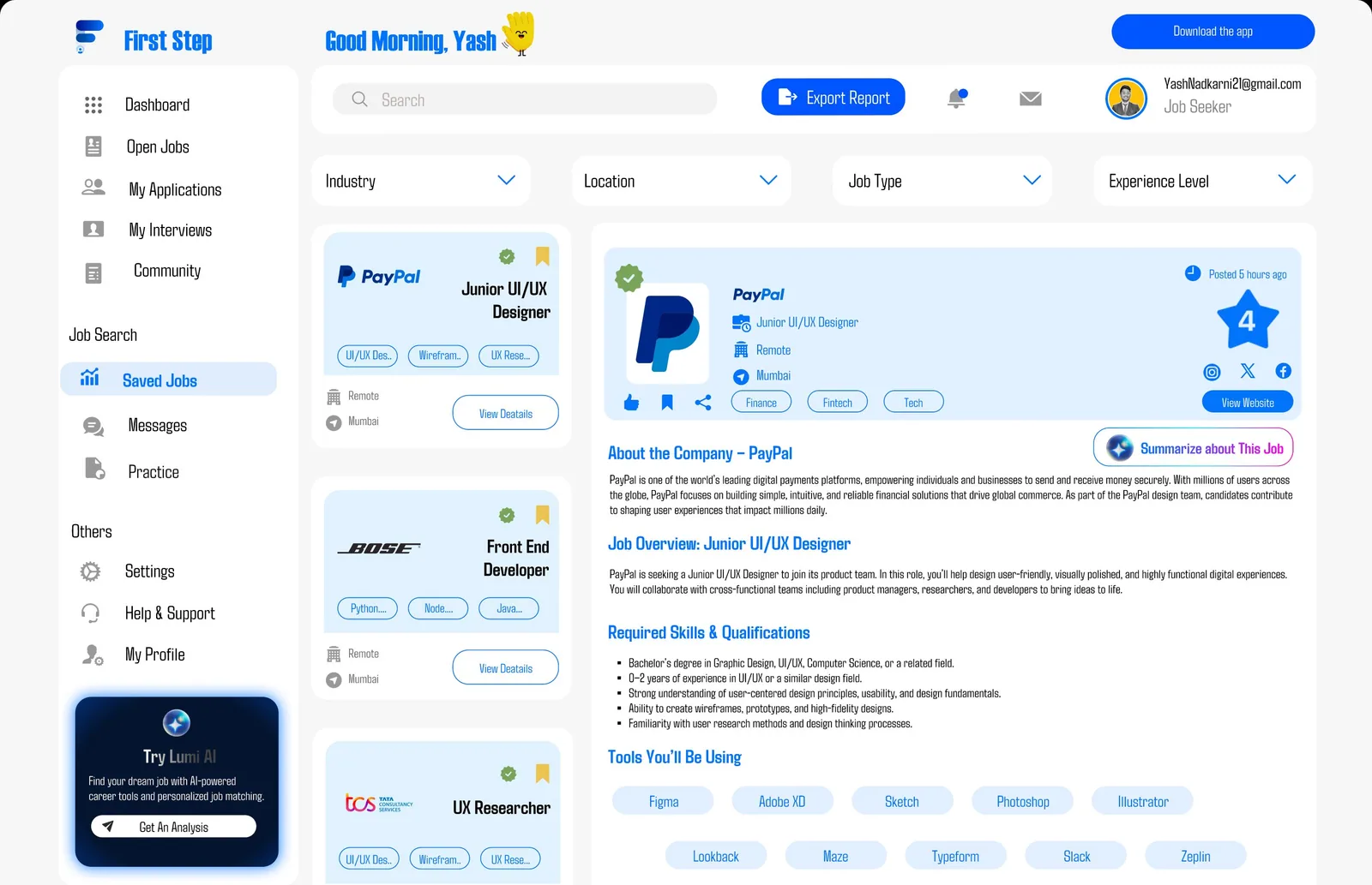
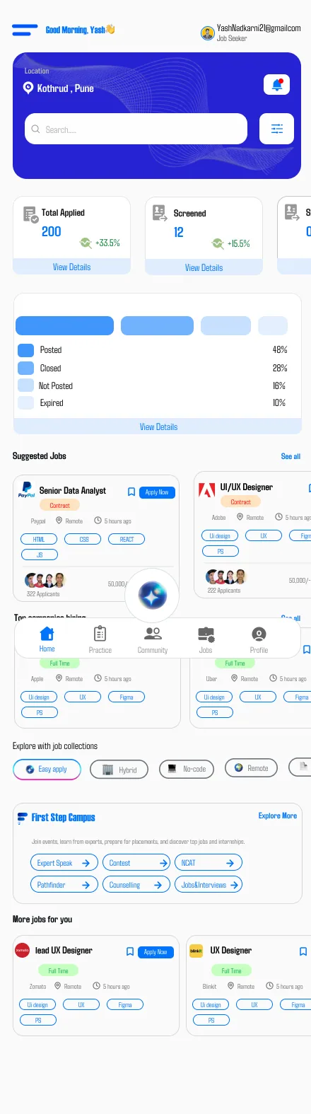
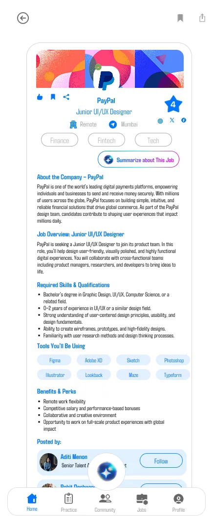
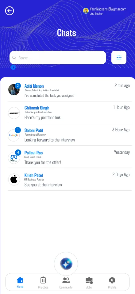
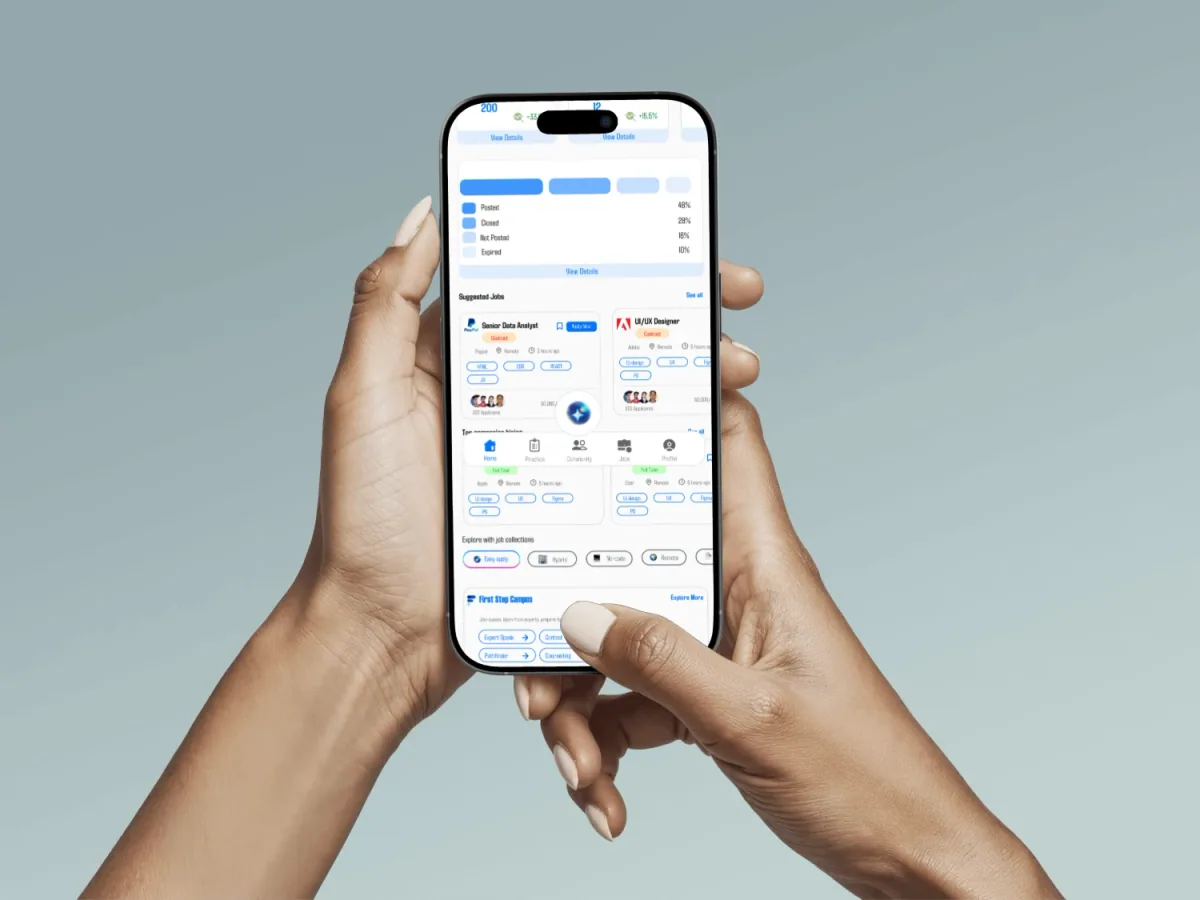
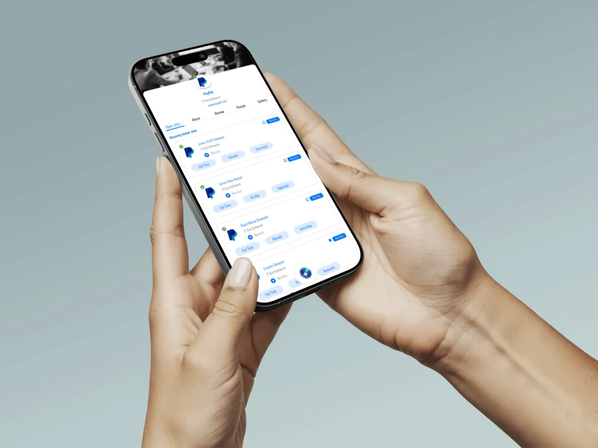
Upload a CV and the profile fills in; Lumi drafts the summary. The dashboard is a pipeline, so a fresher always knows if they were screened, shortlisted or interviewed.
Lumi · the AI assistant
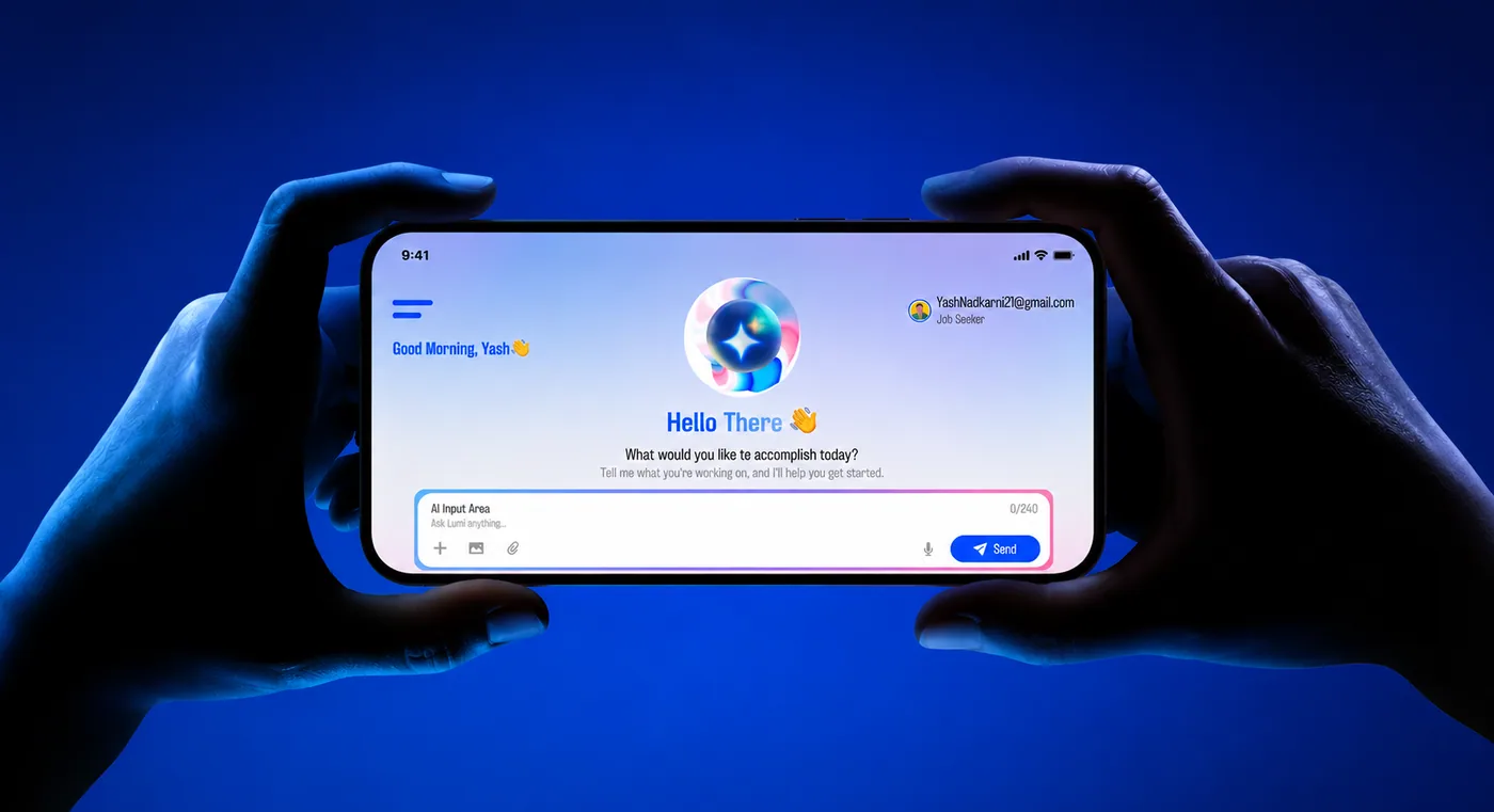
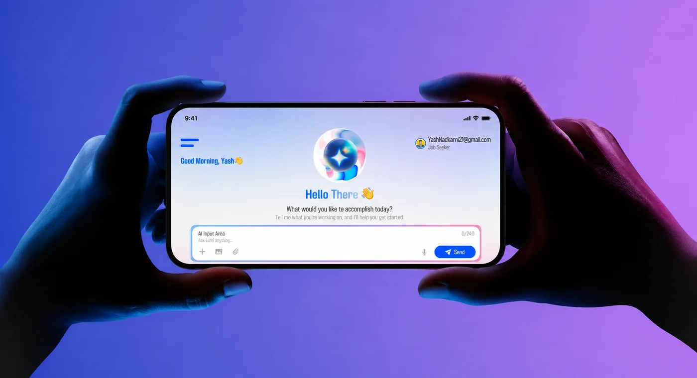
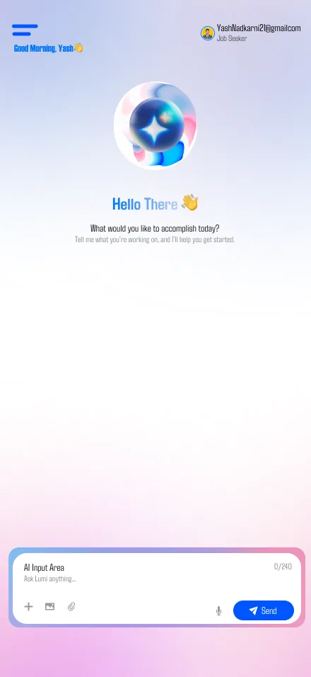
For recruiters Lumi analyses job descriptions, screens resumes and turns interviews into notes. For candidates it finds matching jobs, coaches interviews and improves the resume. Same orb, same place, same calm voice.
Flow 03 · Team workspace
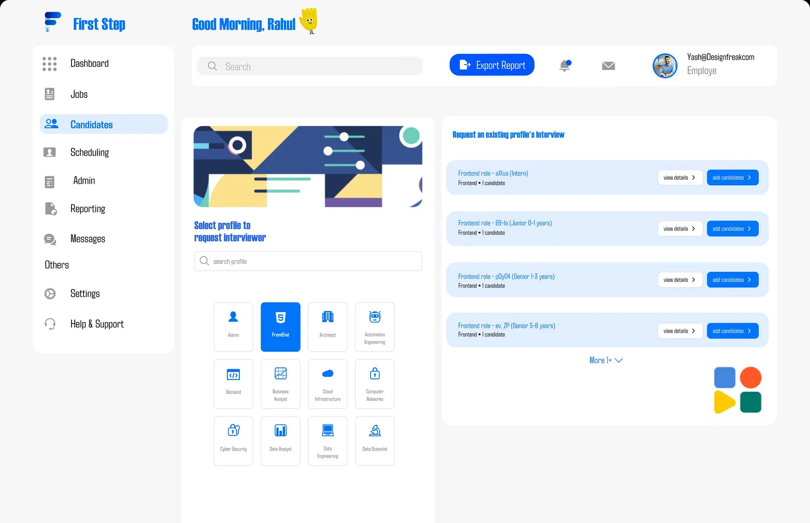
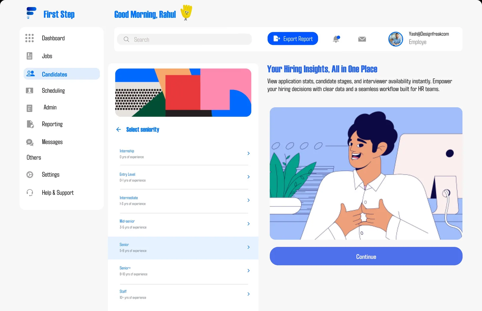
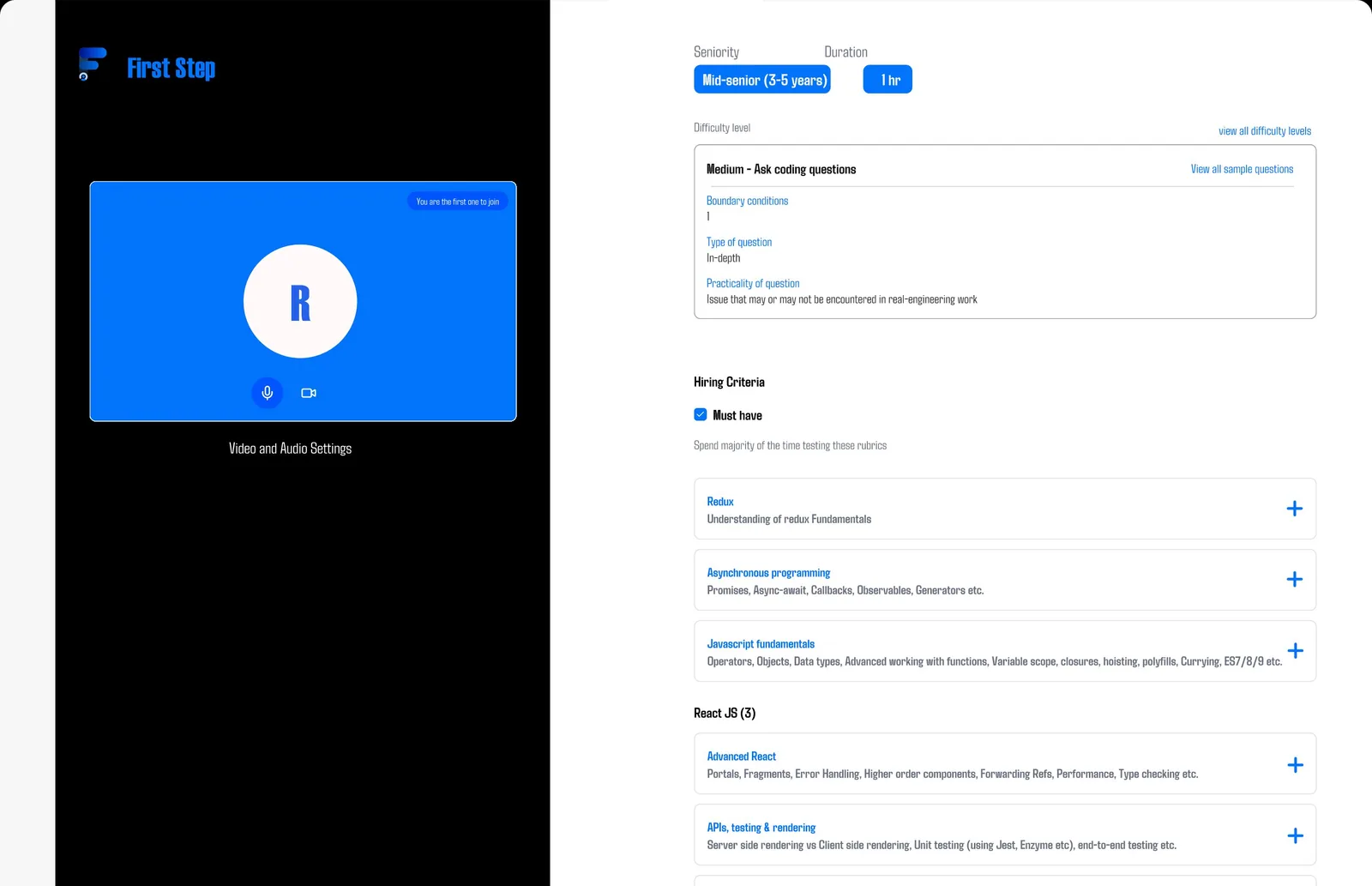
Interviewers log in with an employee ID. They request interviews by role and seniority, add candidates, and run the interview with the hiring criteria beside the video, so every panel judges against the same rubric.
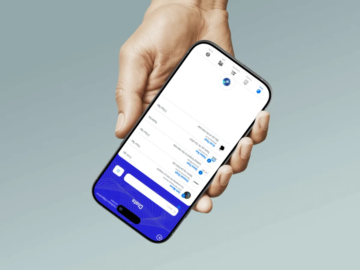
Mobile
13 · Usability testing
Candidates were asked to
Recruiters were asked to
What changed after testing
“Screened”, “Shortlisted”, “Interviewed”: no HR jargon on the candidate side.
Skill gaps and one next step, not a generic rejection.
Fewer clicks to update many candidates at once.
How success is measured
14 · Toolkit

Why: one file for wireframes, components and the clickable prototype, so testers could tap through real flows.
Here: 3 flows, 27 prototype screens, the research boards and the journey maps.

Why: a logo has to hold from a favicon to a poster, so I drew every option as vectors.
Here: the three logo directions, the final F mark and its lockup, icons.
Why: fast, clean layouts for the parts people read rather than tap.
Here: survey charts, persona sheets and the presentation of the research.

Why: to see the brand in the real world before it exists, quickly.
Here: the desk scene, the phone-in-hand shots, the logo on glass and the ID cards.
Why: turning a written flow into a diagram in seconds, so I could check it before drawing it properly.
Here: first drafts of the user flows behind the information architecture.
15 · Outcome & impact
Every application has a visible status and a timeline.
AI pre-screening and ranking, with a human making the call.
Structured feedback after rejections, with a next step.
Real-time updates and interview practice with Lumi.
Verified companies and clear pay before anyone applies.
Students, colleges, mentors and companies on one platform.
16 · Reflection
I expected “better search”. Research said “tell me what happened”.
Trust grows when the AI explains itself and a human signs off.
Every candidate feature needed a recruiter action behind it.
See the full project
Next project · 05 / 06
Vow