Every age at once
Kids, teens, college groups and parents, all in one place.
Case study · Game zone · Branding · Live project · 2024
Designing where human insight meets machine imagination, from Mumbai.
A family game zone under one bright name. I shaped its look: the logo, Koko the mascot, the themed zones, the spaces, the uniforms and the launch campaign.
All projects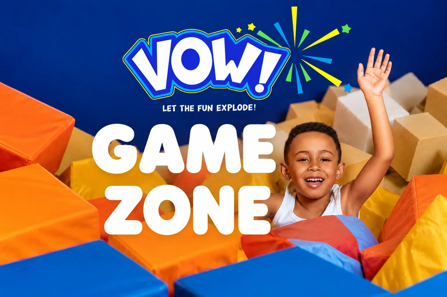
01 · Overview
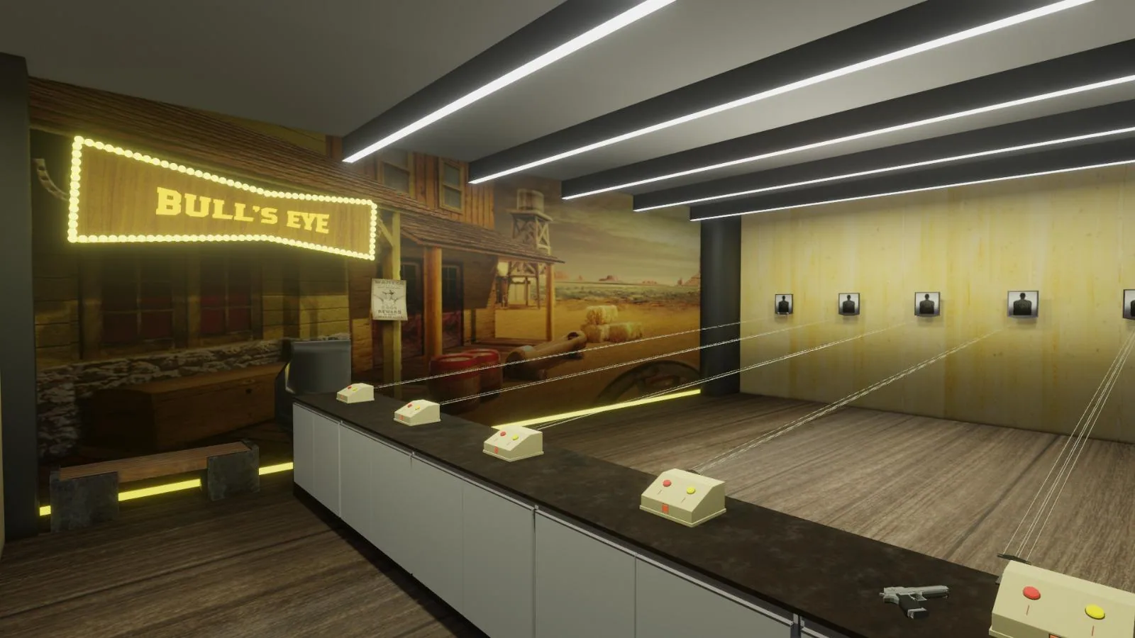
Vow! is a family game zone: bowling, arcade games, a shooting range, soft play and a food court. Its name is the sound people make when they walk in.
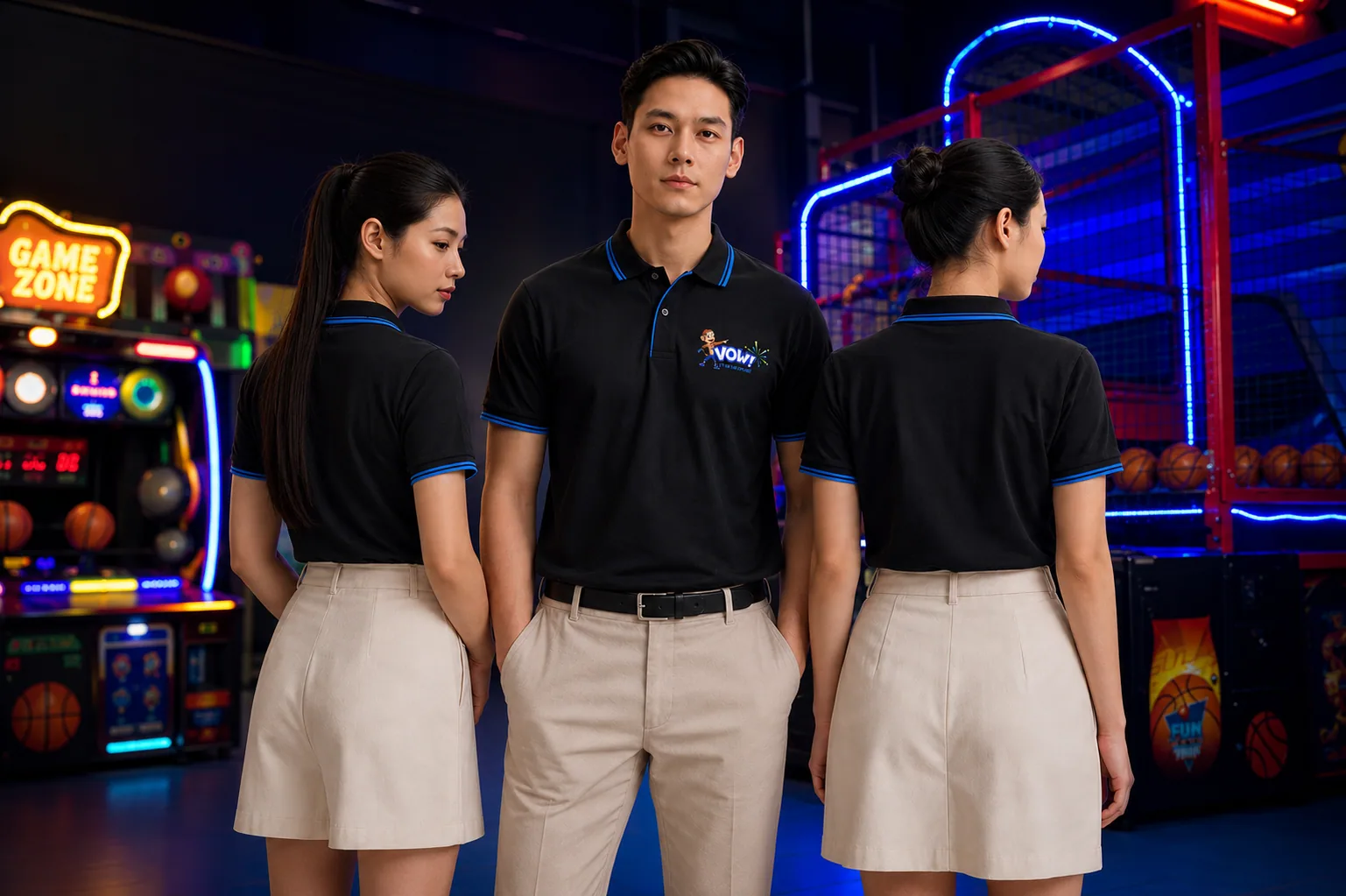
As the visual and graphic designer, I gave the whole place one voice: from the logo on the door to the screens at the lanes and the shirts on the staff.
What I did
02 · What & why
What: a brand for a new game zone, ready for launch: name mark, character, spaces, staff and ads.
Why: most game zones look the same, dark rooms and neon. Vow! needed a face that families remember and friends come back for.
Kids, teens, college groups and parents, all in one place.
Bowling lanes to chaat counters had to feel like one brand.
Stand out in a city full of look-alike game zones.
03 · Research
Who comes to play
Soft play, characters and a safe, bright space.
Arcade scores, bowling nights and photos to post.
Group games, a shooting range and food after.
What I learned
Not logos. So the brand got a mascot.
Themed worlds make each room feel like a new level.
On screens, walls and shirts: a system, not just a logo.
04 · Inspiration
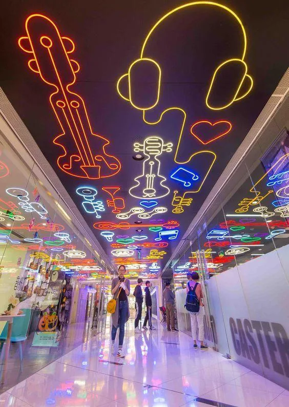

Neon shapes on a ceiling turned into the light lines over the bowling lanes and Koko’s glowing signs.
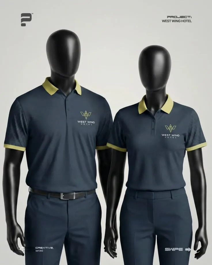
Clean polos with a coloured collar became the staff kit: easy to spot, easy to wear.
05 · Mood board
Three worlds for three areas, each with its own colours, creatures and line.
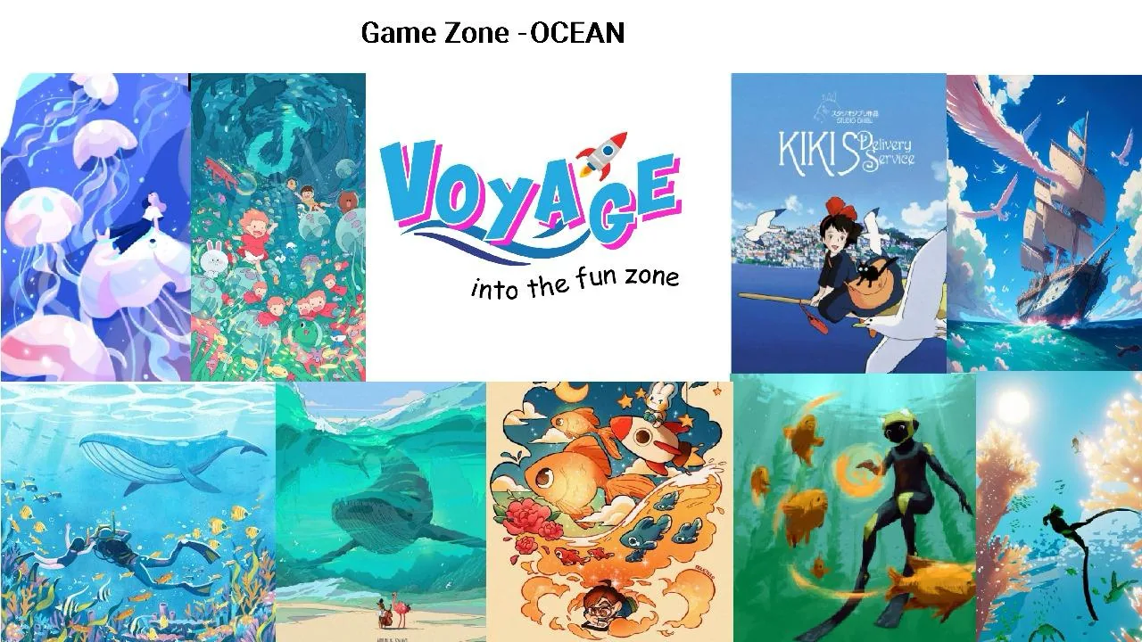
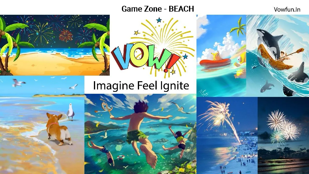
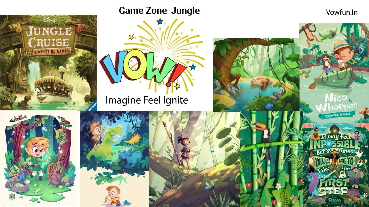
Ocean · “Voyage into the fun zone”Became the reception
06 · Logo
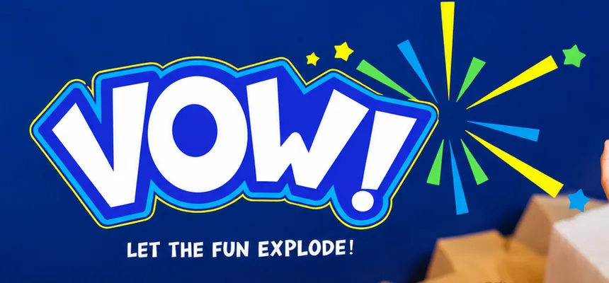

07 · Character select
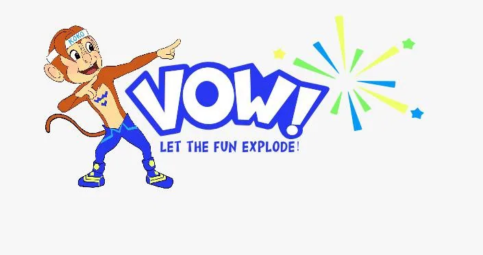
A cheeky monkey in a headband: fast, playful and a little bit of a hero. The W on his chest is Vow!’s.
Round 1 · Four outfits
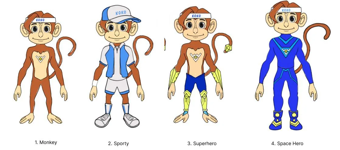
Same face, four personalities to choose from.
Round 2 · The pose
A dab that leads the eye to the logo.
Final · In 3D
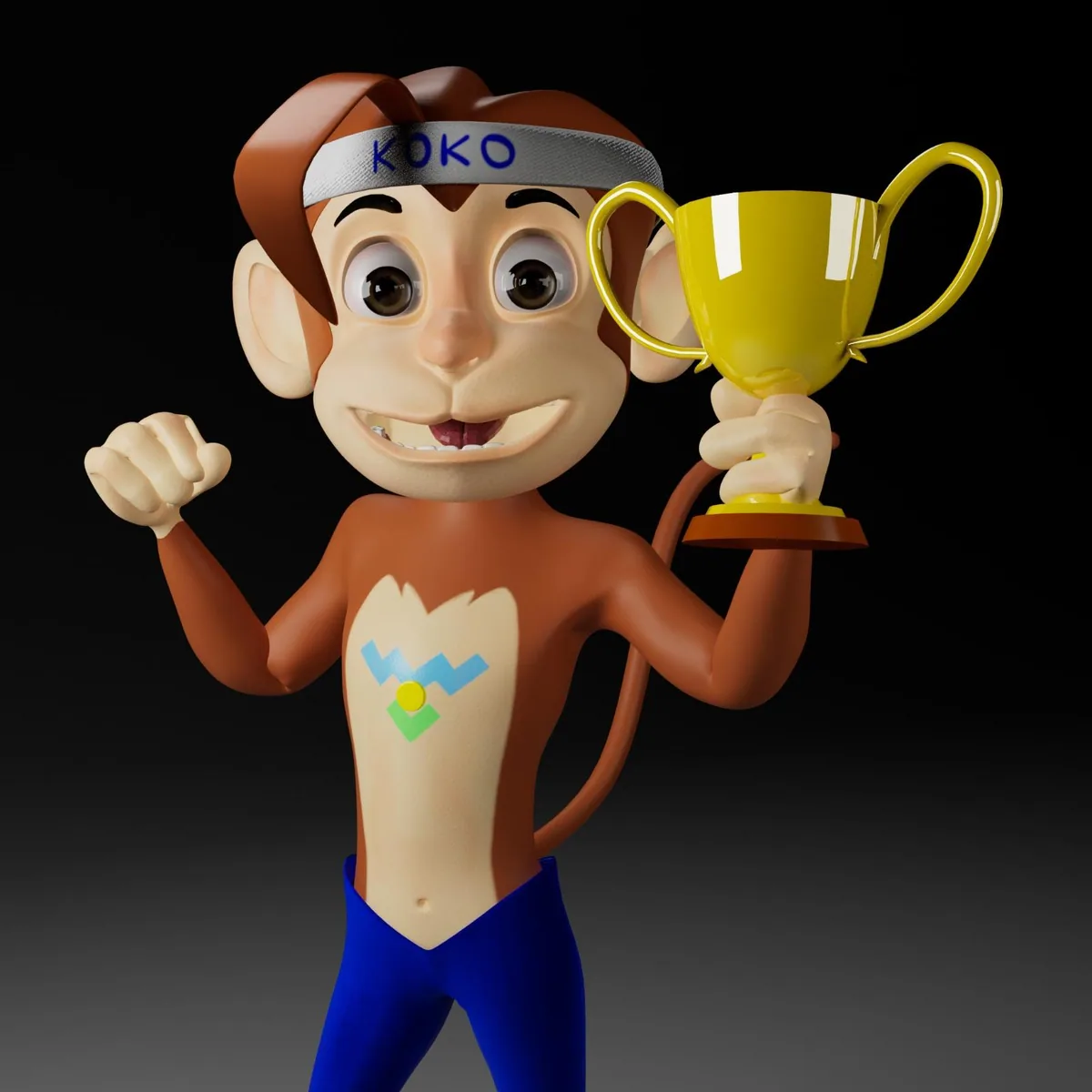
A 3D Koko for screens, ads and big walls.
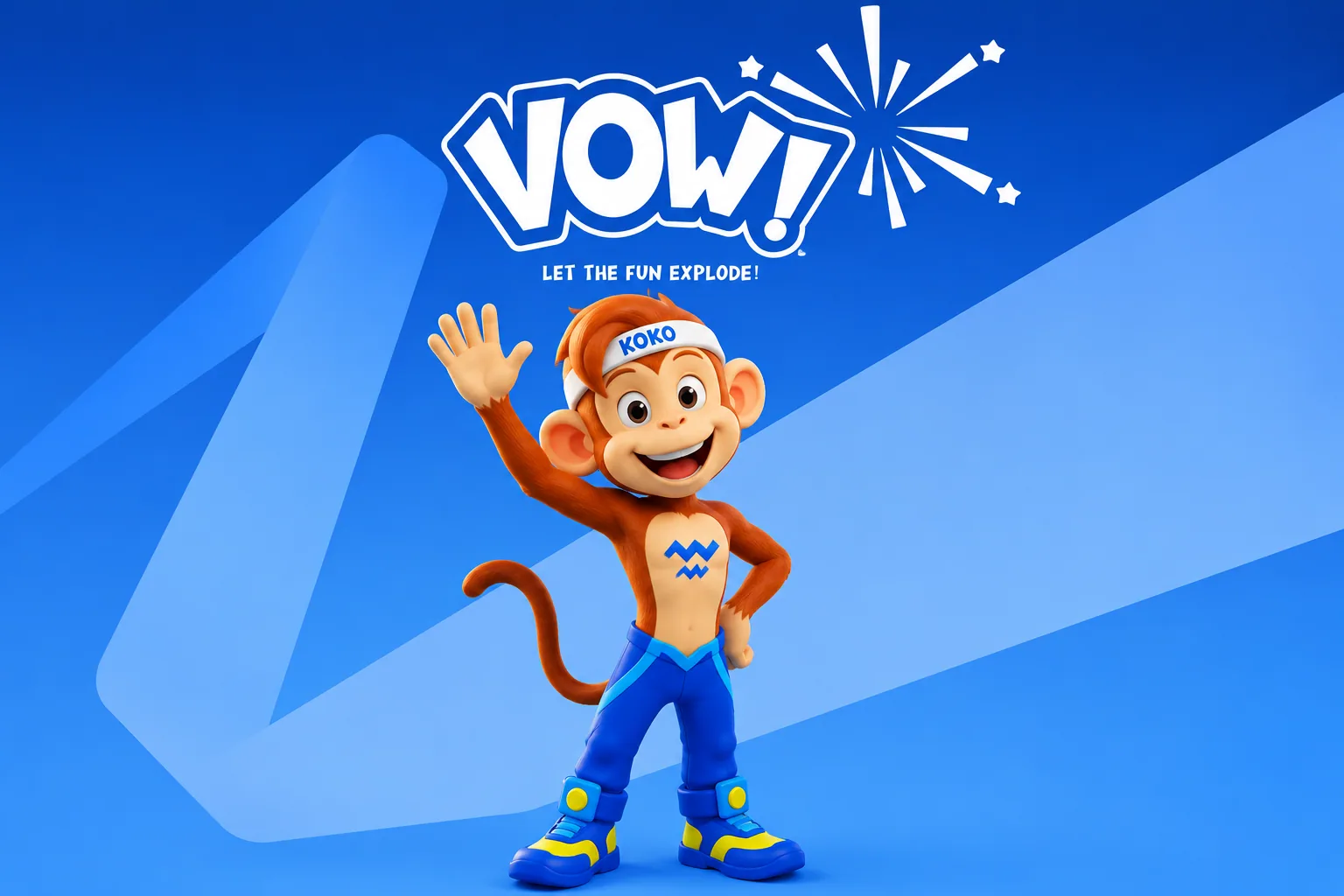
08 · Identity
Colour · taken from the logo and Koko
Big friendly words that read from across the hall.
The logo’s burst, used on its own on screens and walls.
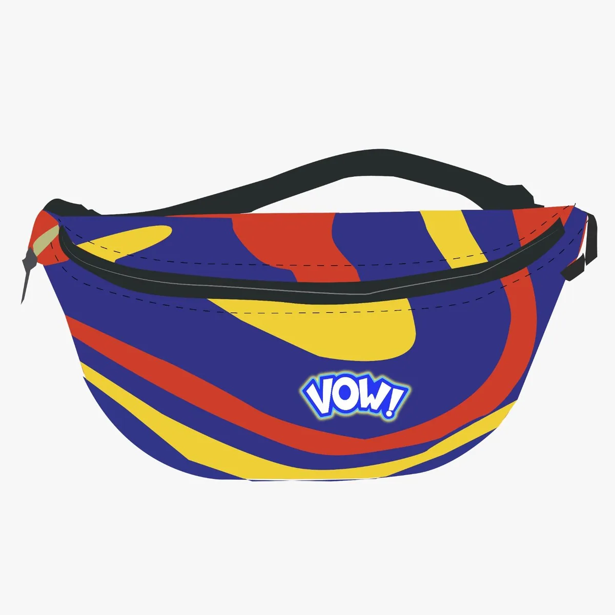
Blue, yellow and red waves for merch and soft play.
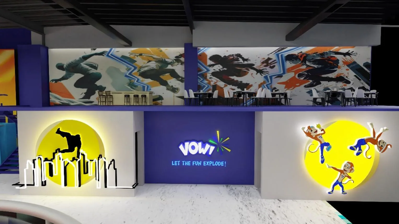
09 · Spaces · mockups
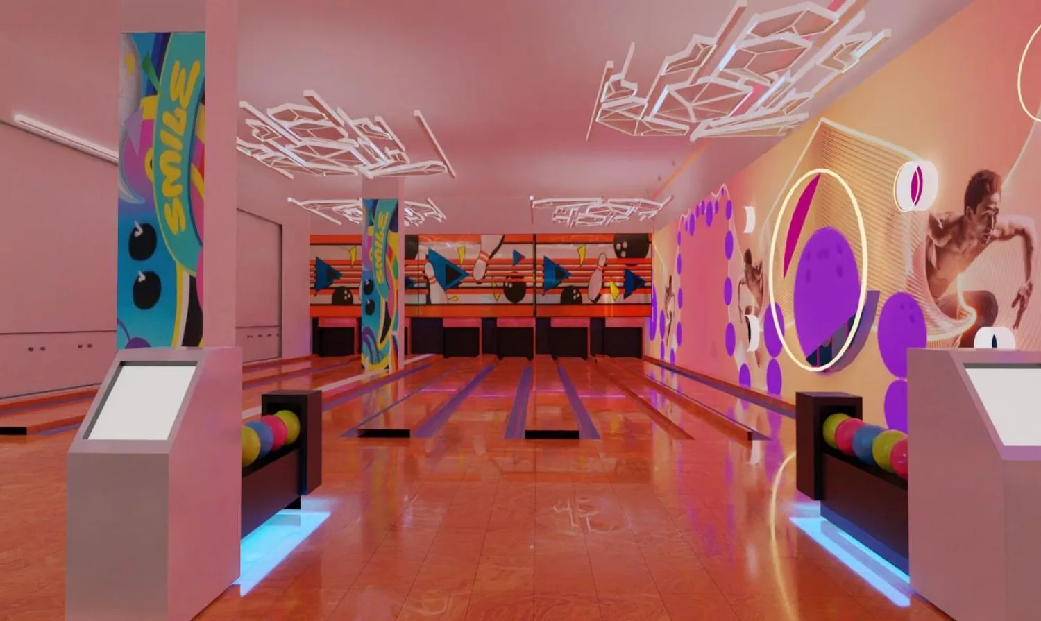
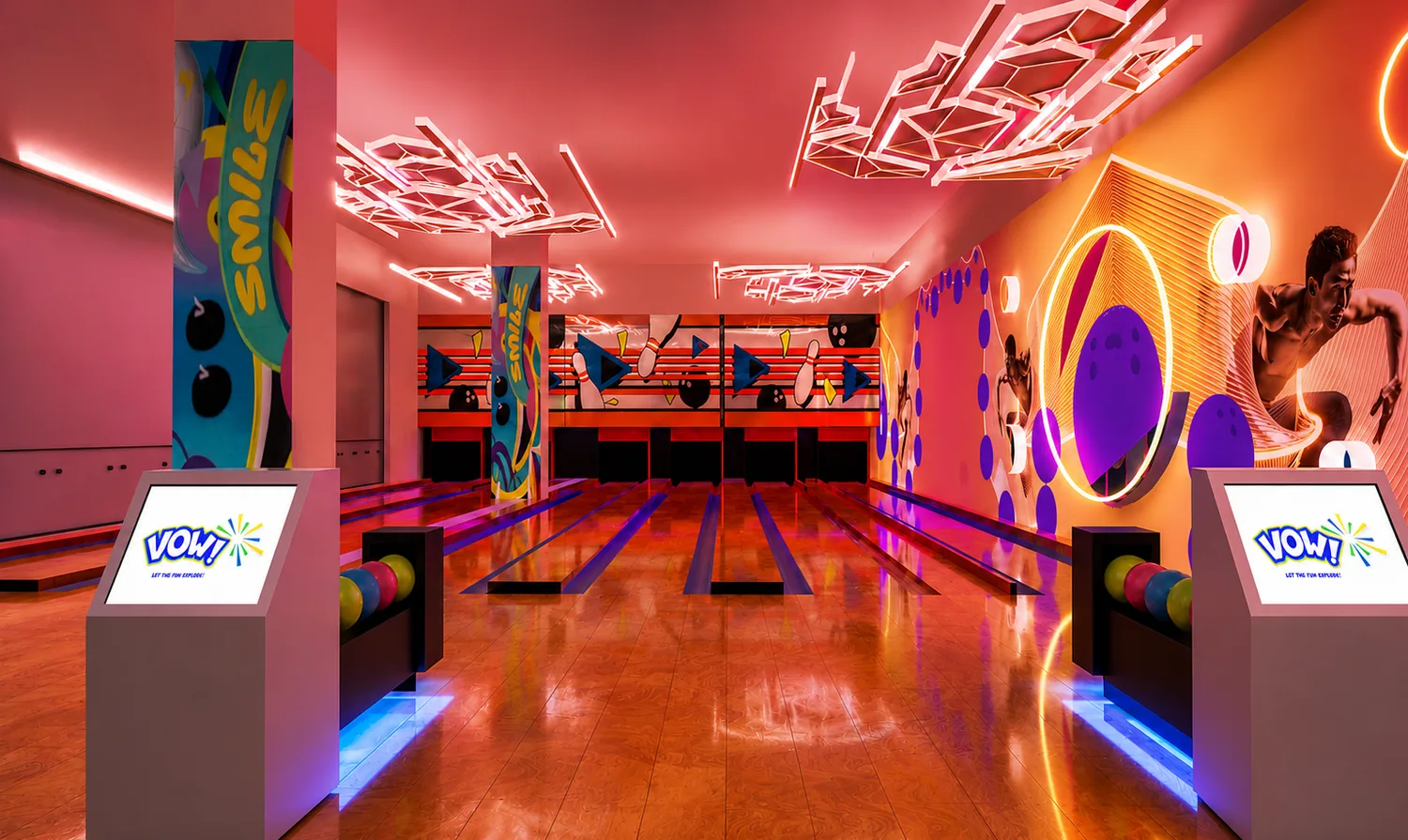
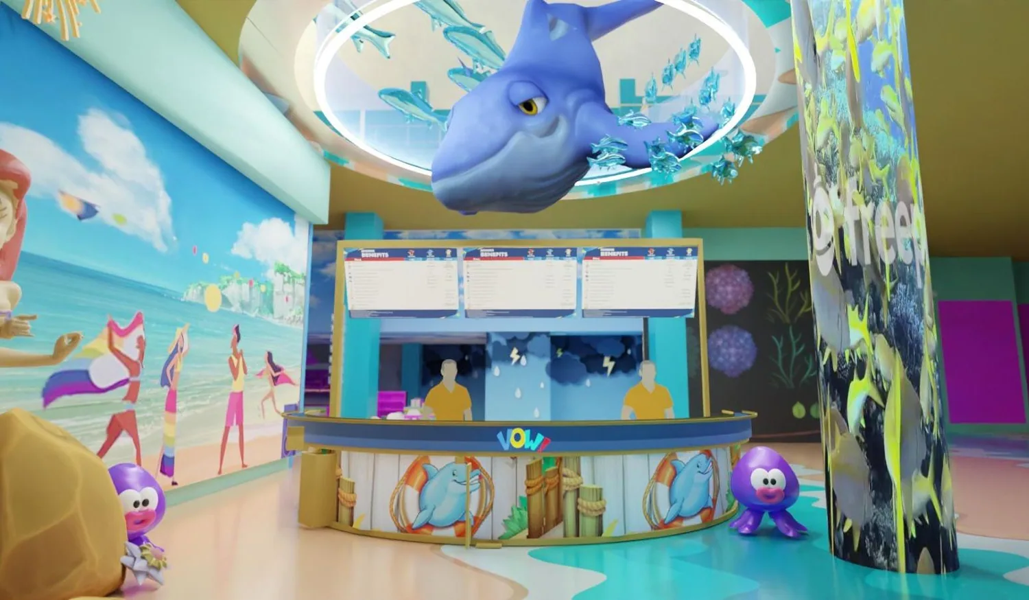
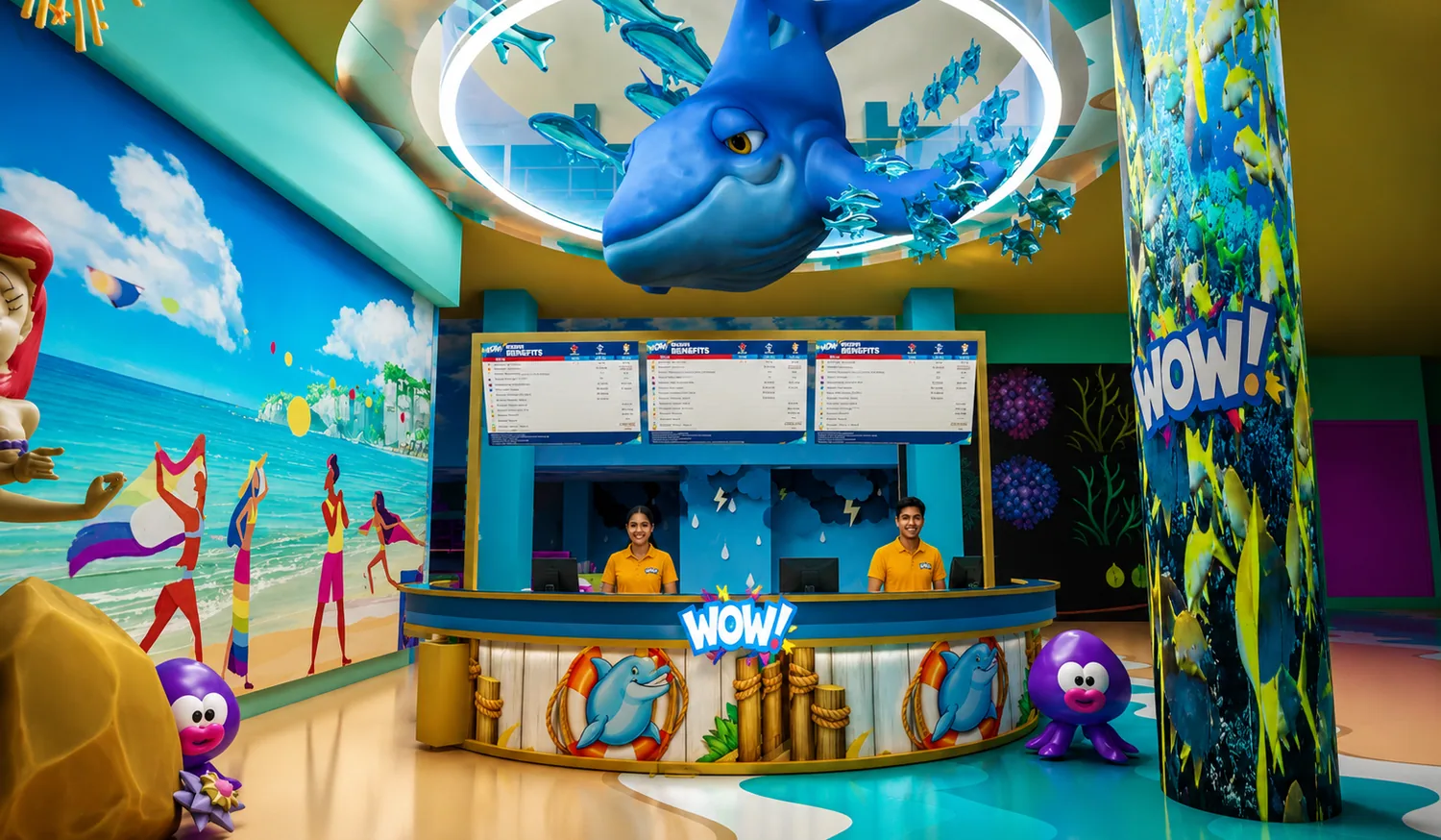
Drag the line: the plain render on the left, the Vow! version on the right, with the logo on every screen.
 3D renderVow!
Bowling · neon lines from the mood board, Vow! on every lane screen
 3D renderVow!
Reception · the ocean zone, brought to life
10 · Brand in use
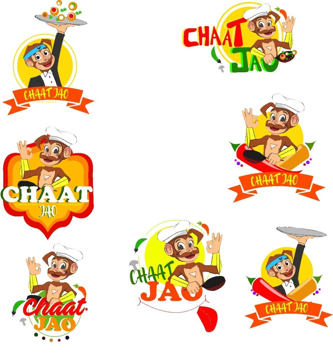
Chaat Jao · the food court
The food court got its own badge, with Koko as the cook. Seven layouts, from a ribbon to a street-food sign.
11 · Campaign
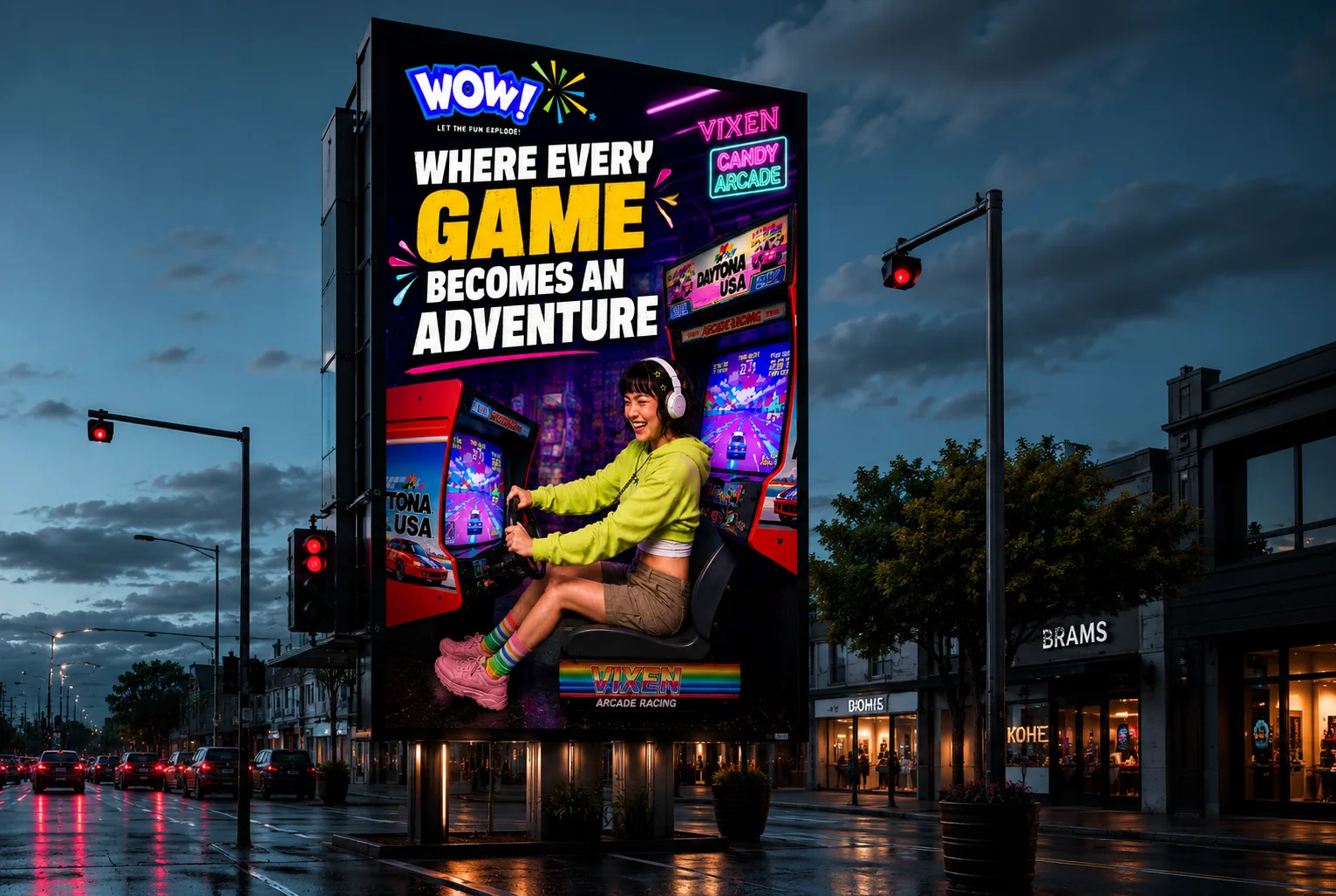
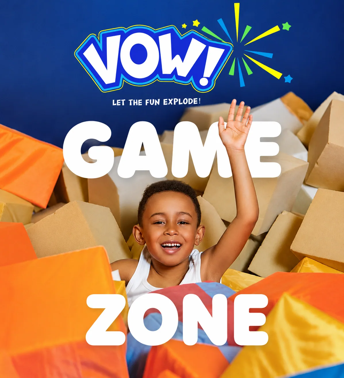
One big line per ad, Koko or a real player, and the burst. Readable from a moving car.
Scroll · the launch
01 / 04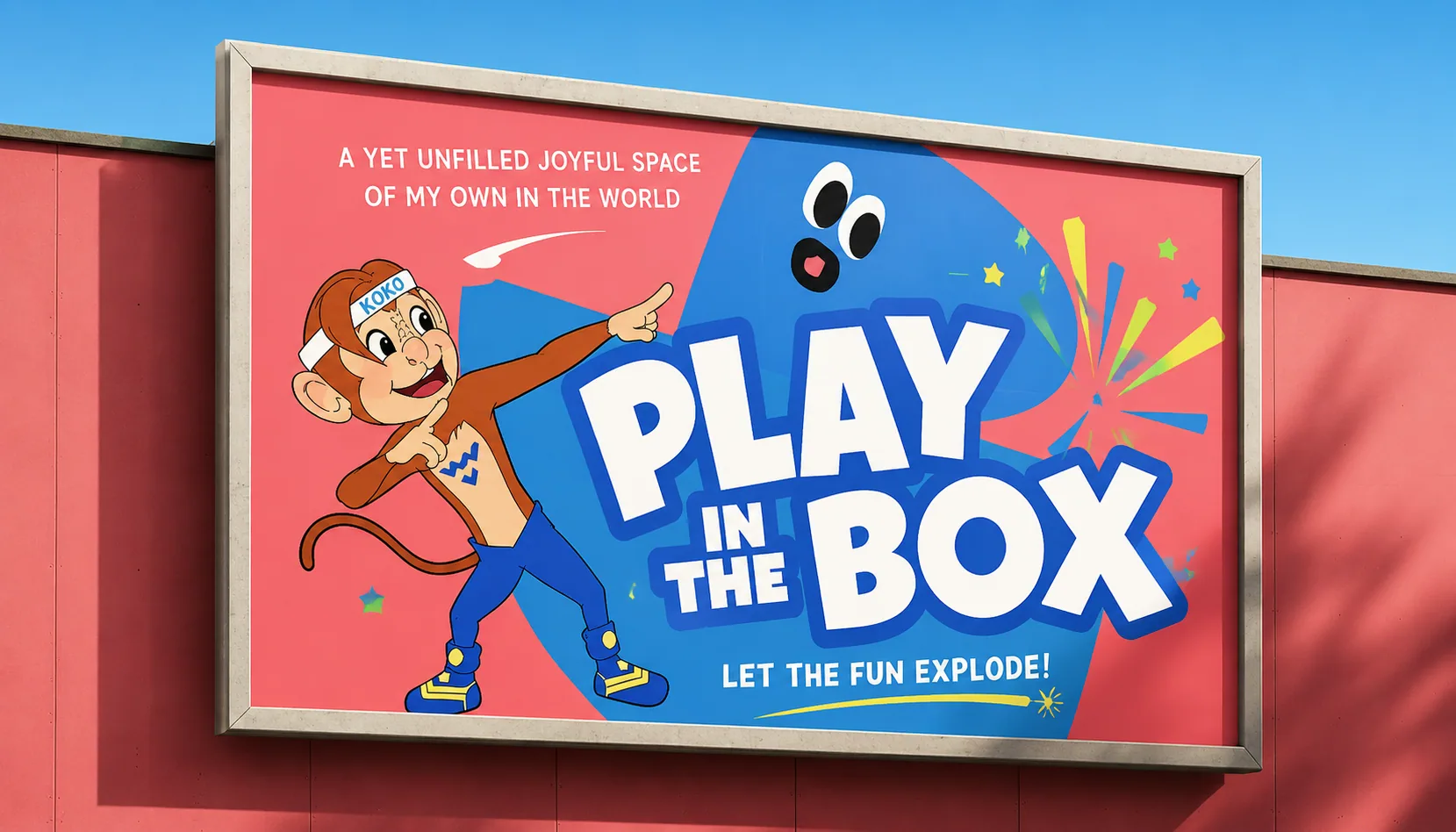
12 · Outcome & impact
Kids get Koko; their older siblings get neon and bowling nights.
Screens, walls and staff all speak Vow!, so every photo shares the brand.
Billboards, posters, uniforms and merch from one system.
Next level · 06 / 06
Explore Ease